
So I've been tinkering around with the notion of process for the past two quarters now. For a long time I've been taking route that's much more of a bottom-up kind of process: identifying specific challenges, problems, etc. Through an iterative sequence of research, analysis, diagramming, I'd utilize primarily organizational solutions to create generative diagrams that would lead to the formalization of the project. The last two quarters, starting with the Tsukamoto studio, to a large extent, I've been experimenting with a more top-down formal approach to the process. Still I go through a basic series of analysis and research and some diagramming, but these would all lead to a more intuitive series of sketches in which the issues would be more loosely addressed by a larger formal sketch or idea. This formal sketch would slowly then be hammered out to architectualize it. It's been quite an interesting process and it's certainly helped develop a better series of techniques for me especially in computer modeling.
I've also begun to try to introduce some Maya into my workflow. The best way I can describe Maya when compared to Rhino (which we've largely been using at UCLA) is that it seems more touchy-feely. Unless you're working purely in NURBS, and even sometimes then, I feel like I have a lower degree of precision and control over the tools than in Rhino. While manipulation of more complex surfaces is much more easily done in Maya, I find the process somewhat loose and sculptural; something I'm completely unaccustomed to.
In any case I'm not drawing any conclusions yet and am giving it a final go for this quarter.
Tsukamoto Studio
Final comments about the Tsukamoto studio are that it was really fascinating to work with Yoshiharu Tsukamoto. His approach to architecture was fascinating and he's a brilliant guy. There was an overall sense of poetic description that pervaded the way he talked about our studio. He's largely interested in challenging conventions and norms in domestic culture through architecture. It was great to see how our studio has long been fascinated with smallness in Japanese architecture which has been a huge driver for contemporary Japanese architects. However, when Yoshiharu came here, he was fascinated by the prospect of modernism and outdoor space and living in Southern California. I guess the grass is always
greener.
But without further ado, the project... here are a few of the initial sketch renderings which are what I've deemed the ideal prototype in terms of the largely formal process I tried. I think the difficulty in working in this process is balancing between trying to achieve what your initial sketch is doing formally and always pursuing that direction with allowing the project to change and morph into something else that may be wholly unexpected.
The overall strategy was to look for lots that had potentially to be developed by piggy-backing off of an existing house. Small lot subdivision is an ordinance that was recently passed in parts of LA and we wanted to take advantage of that. My project specifically was designed as a live/work daycare. I've seen a lot of these around LA where a few parents will drop off kids at a caregivers home for the day and pick them up in the evening. The house is intended to allow the kids a large internal space to explore and run and play while allowing separation from the personal living spaces. By enclosing a central courtyard, it allows for a controlled outdoor space for them to use. In a larger scope, the idea of the house is really to seamlessly transition and flicker between indoor and outdoor space. By wrapping the building in a spiral, there's always the opportunity to layer glass upon glass so the reflections and transparency never allow a fully coherent reading of internality or externality. This was largely inspired by the predominant gestures towards indoor/outdoor space in our Case Study House research but filtered through the idea of Rowe's phenomenal transparency vs. literal transparency. The layers of surface and the trees would create an ambiguity layered over the continuous and infinite space generated by the looped spiral.
Initial sketch: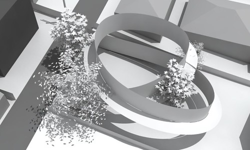
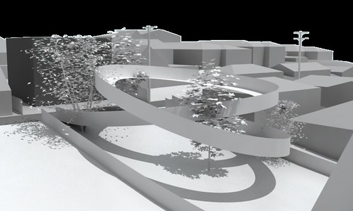
Considering enclosure and the actual volume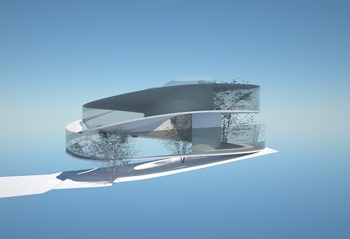
Introducing structure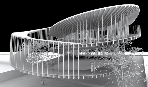
Looking towards the interior courtyard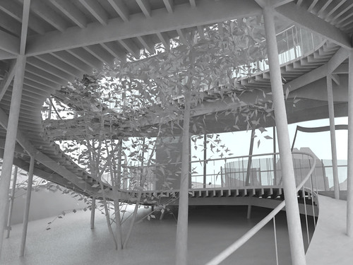
A few more images to be posted soon including drawings. The model is in disrepair and needs to get photographed. Updates soon...
No Comments
Block this user
Are you sure you want to block this user and hide all related comments throughout the site?
Archinect
This is your first comment on Archinect. Your comment will be visible once approved.