
Happy Thanksgiving! And thank god for it. The quarter definitely started off a little easier than usual. Very light and well paced. So I thought it was going to be nice and easy. Then the storm clouds rolled in. I participated in a 6 week long competition called the NAIOP Southern California Real Estate Challenge. It was intense and tough but finally we get a VERY much needed break. Because of the competition I definitely fell behind in studio and now am racing to try to get back on top of things.
Now first a huge disclaimer, this is NOT an architecture competitiong. It's actually more focused upon real estate and finance. I participated with a team of 4 students from Anderson. In not so many words, you are given a site and a timeframe and have to come up with a development proposal which you pitch to the jury as you would a group of investors. We would have our UCLA team of 4 Anderson MBA students plus myself up against a team of MREDs and MBAs from the Marshall School at USC. They'd been winning the annual competition and led us 6 years to 4 but only last year did UCLA really start hunkering down and taking the competition seriously. Yes, it seems a little mercenary and outside of our usual scope, but my friend did it last year and said it was fascinating. So I saddled up and gave it a try.
Details: We were given a site along the 101 freeway adjacent to Universal City and situated on the Metro Red Line station at Universal.
The premise is that the project assumed the phase I program of the overall Metro Studio at Lankershim project by Thomas Properties was going forward (arch. by DMJM). It's currently in draft EIR and facing some pretty stiff opposition. http://www.metrostudiolankershim.com Anyway. We had to assume phase I which has the site to the northwest of Campo de Cahuenga and Lankershim was on its way (24 story office tower with amenity retail, 3700 parking, and production media space). We had to have the project break ground in Jan 1, 2012. We were also imposed a $15 million dollar mitigation fee since the phase I project was spending a lot getting it through.
In light of the current economic meltdown in real estate it was actually a great case study. I got to watch the best financial and real estate students at Anderson tackle this problem head on. I was quickly a whir in all these acronyms and numbers they throw around, but luckily some work experience came in handy and I had my own ideas to contribute as to keeping costs low. In the end we decided to go with a mixed-use, transit oriented development. 360 units of residential, 30,000 sf of amenity retail and a 125,000 SF hotel w/ 225 beds. All targeted for LEED silver. The massing of the buildings was just a residual of getting the max amount of building built with enough open space, and keeping the construction type III. Though as you guys might gather, it would probably have to go beyond type III construction. But at least we never made the claim like the other team that we could go to Type V construction. But I digress. The challenge was that the Red Line tunnel runs under the site, so we opted to stay away from that as much as possible so no excavating for parking etc. Excavation for parking cost too much anyway.
The Anderson students I was working with were all really open minded as far as developers go. But through the competition it became abundantly clear that developers ultimately want to see precedents (they call them comparables or comps) that show that a certain "product" type will work and can be profitable. They also like to look at property in terms of overall value per square foot as opposed to per unit. So if I bumped up the unit sizes a tad, it wasn't that much different even if I lost units as long as the overall square footage remained the same. During the judging, it seemed like it was a really conservative field. Every move made had to be justified by a comparable project that had been done. You're looking at a parking reduction based on your project being a TOD. Is it on par with other TOD projects that have been approved by the city? etc. etc. The financial side of things were much more confusing to me at least and I didn't have a major hand in it but I did help with making sure hard costs on the architecture seemed correct.
In the end, it was enlightening and informative. Definitely was a great insight into the way that developers think. They like to think of themselves as risk takers and vision-minded but it's a far cry from what architects (especially the more academic and avant-garde) do. The students themselves also are encouragingly open minded about design, but it definitely seems that their education has been bent towards a very new urbanist, pomo kind of urban planning. Also, it was a very encouraging environment. In arch school we tear ourselves and others down on a moments notice. Everything is always short of perfect and we never have enough hours in the day to get what we want done. Maybe the proportion of the modules aren't quite right. Your font sucks on the boards, the drawings could be a lot better. Your lineweights are all off, the entourage is poorly placed, your architectural intentions are a little weak, etc. etc. But present these guys with a few renderings of something and they're oooh-ing and ahh-ing. It definitely was supportive and a nice change from the barage of criticism laid upon us.
MAJOR DISCLAIMER:
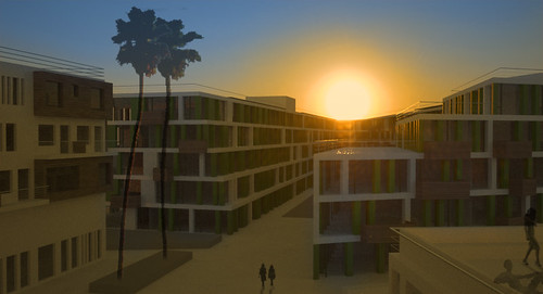
I'd love to show you the renderings. The one thing you have to understand is that this was, again, NOT an architectural competition but a developer/real estate/ finance one. Thus, I had to be conscious of making sure nothing looked, well... expensive. I'd have loved to do some wonderfully inventive building but the conditions weren't quite right. I figured I might as well to some kind of thing that looked "developer-modern" [sic] or along those lines w/o getting too academic. It was a competition after all with a conservative judging panel in architectural terms and I definitely wanted to win. I'm well aware that it's not well... lets just say it's not the most architecturally compelling building(s) in the world. It's what I like to call California Developer Modern. Basically Dwell. Without further ado... 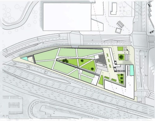
Site Plan
Leftmost building is residential. Right side building is hotel.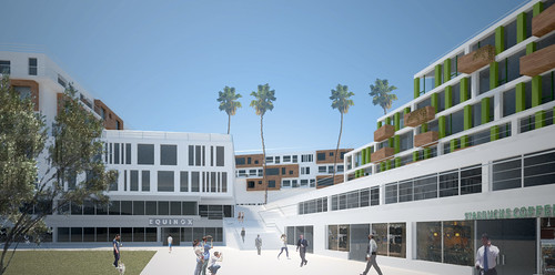
From the "Retail Court" looking up at the Hotel on the left. 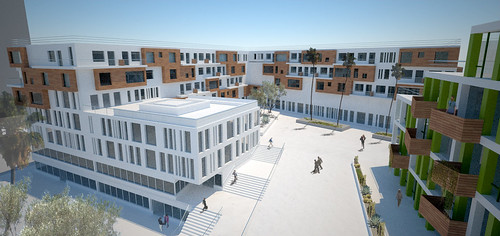
Hotel.
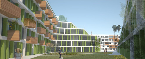
Hotel
10 Comments
"Basically Dwell". Ha. It's not so bad. I love how you go to such lengths to explain why it's not revolutionary. But that's a whole other debate.....so when do you find out who wins?
Also, please forgive me for what I am about to do....
Oh duh. We won. :)
Oh congrats! BTW, who are these Anderson people you keep talking about?
what was the prize?
see how i am curious about the money? that's because i am being topical. ;-)
actually, you know what you describe is exactly what my partner and i have been doing for the last 2.5 years or so. all the things you discovered, about precedents and so forth are totally flashbacky for me...i am in fact THRILLED that you are learning about that stuff in school, because what we have been trying to work out lately is how to get beyond that block about precedent and hedging bets. it isn't easy and i think we are only now getting a hang of it, slightly (my partner btw does the spreadsheets which is pretty cool as he is a licensed architect). if we had done what you just went through in school we would have been sooo far ahead of the game.
i am also glad that there are still investors out there interested in new build. our clients all walked away when the banks shut their doors (meh, what can you do?). and NOW we are dealing with clients who want to buy distressed assets and do no value added work. which is great for brokers, but means no work for us as architects. we are still working on how to deal with that. very frustrating.
all i can say is that experience, regardless of the architectural quality is probably the best you will ever have. reality 101. oh yes. very impt stuff.
I think you just made a bunch of friends with future clients that know your potential - great job. And I think you take ownership of that style reference, "basically Dwell"
Agreed. It definitely wasn't an architectural exercise, but rather it was really informative in learning how developers think and come up with their proforma.
I think that it can only be to our professions benefit to really educate as much as we design. Better understanding of what we do only helps foster better clients. The MBA students were all well meaning but it seems tough when New Urbanism or "place-making" is presented to them as the newest sliced bread. Now, where'd I leave my Christopher Alexander?
Congratulations on the win! Do you have a list of clients waiting for you to graduate now?
how did you make such nice renderings? teach us!
Grid-
I have a growing list of contacts that are waiting for the economy to rebound so they can secure capital and find investors.
Ryan,
Thanks for the compliment. I've played a lot with rendering aesthetics. Personally I love pure white renderings with minimal materials but for the audience (developers) I was presenting to, it was better to add a little more photorealism rather than stay abstract. These were all rendered in Maxwell and modelled in Rhino. Trees and people are usually added post render in Photoshop. I know there's a heavy contingency (some at Sci-arc) that maintain that the rendering should be self-contained within the model. Meaning that you should just have to hit render and never have to do any post-work. I'm of the other school of thought. I feel extremely comfortable in Photoshop and just get the rendering "close enough" and then make it shine in PS. Maybe cause I hate waiting for renders to finish and we don't have a render farm.
I usually try to follow a couple rules. The first is to model cleanly with the proper amount of detail. You'd be surprised how much it helps just to add a few reveals here and there. Handrails always give you instant scale as do stairs. Little things like door frames and mullions are nice but take a while to add. You'd be surprised how far stairs and handrails can get a very simple model.
Materials should be quality ones. No visibly repeated patterning. Also stick to a minimum of materials. Too much just looks tacky. Color materials with just a bit of gloss of your choosing are much better than crappy materials.
Photoshopping is the other key. Learn to use it well. It can make an OK rendering look fantastic. Too much to go into here. Maybe another time.
In the end, trust your eye because a rendering is a visual object. Make it look right as opposed to constructing it right. If the vanishing point says the tree should be X tall but it looks funky, just make it look right. That's always really what the bottom line is in a rendering.
FYI,
A nice trick to add a little more depth to the renderings is to use a .PNG format when you save the image [at least this is the trick I use in 3DS, not entirely sure about Maxwell].
Anyways, when you save the image as a .PNG the background is the alpha channel and it doesn't come in when you open it in PS. This allows you to drop in a different sky should your clients want some clouds.
If you're really feeling ambitious, check out some HDRI maps/tutorials to bring in during the render, they make the window reflections oh so sexy as well as awesome backgrounds [think creamsicle sunset].
Block this user
Are you sure you want to block this user and hide all related comments throughout the site?
Archinect
This is your first comment on Archinect. Your comment will be visible once approved.