ok.
we had our pin-up for our computer representation class today. apparently garpike thought mine was decent. maybe the inclusion of the garwondler got his attention... (i didn't really put one in). my board was blue. it was ok. but nothing i'd throw in a portfolio. lots of people basically redid their projects to cater towards the boards, but in the interest of time, i just used all old materials.
but i did get a nod on my font choices. (which i think is quite important). the discussion migrated towards use of font and it was really really really nice to hear other people saying, " put down the bank gothic". whew.
one project got a lot of flak for using courier new. i also distinctly remember one board last week that utilized comic sans ms. which happens to be the font i hate most in the world.
anyway. that finishes up one class. the theory paper/exam due date got pushed back so that makes things much easier. i'm wrapping up my building construction case study. drawings are done. details are done. i'm just building a little basswood structural model now.
tonight i will indulge myself and go to bed before 2 am i hope. good nights sleep. a building const. pinup in the morning. and then it's full-bore, no-holds barred, bare knuckle studio...
in studio i've got a clear direction for the project.... i think.
still struggling with a few formal things, but i think it'll come together. getting concerned about the model, as mine will be quite time consuming to make. and i'll need to do some good renders as mine is about natural light...
charette cart comes at 6pm on tuesday night. (they're making us get rest before the big day).
best of luck to everyone else in the home stretch.
8 Comments
no fucking way, a designer used Comic Sans???? ah hahahahahahaha...
oh how cute, they do a real charrette cart! Or should I say, charrette. That's pretty cool.
When's your studio review? Maybe I'll come since I'm bored and unemployed in southern california.
I hate hate hate hate Comic Sans. This goes without saying. You might enjoy this.
But Bank Gothic? Grrrr...
omg, I didn't know what Bank Gothic was until I just looked it up... and my first thought was, "oh man, that's that horrible font everyone started using when the first 3D models started being presented in studio!" I seem to remember it being used frequently in a black-on-dark blue background, to boot. UGH! I HATE that thing!! It's so clichéd for fancy graphics presentations!
what was your font choice, after all?
garpike that lead me to an awesome site that has me gasping for air:
Not Fooling Anybody
i wound up using angostura, which is a nice sans serif, with the mid point (where A's crossbar is, etc.) is offset maybe 75% down. it has a nice 50's modern feel, so it was appropriate for the project.

i'm very picky about fonts... oh and i used PLENTY of kerning to give it a nice spacing.
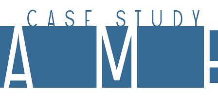
clip from my board:
myriam, look for my photo on that site. Exaco, used to be Texaco. On Sunset near Guitar Center.
Block this user
Are you sure you want to block this user and hide all related comments throughout the site?
Archinect
This is your first comment on Archinect. Your comment will be visible once approved.