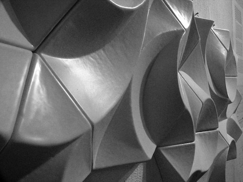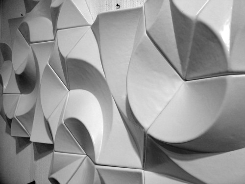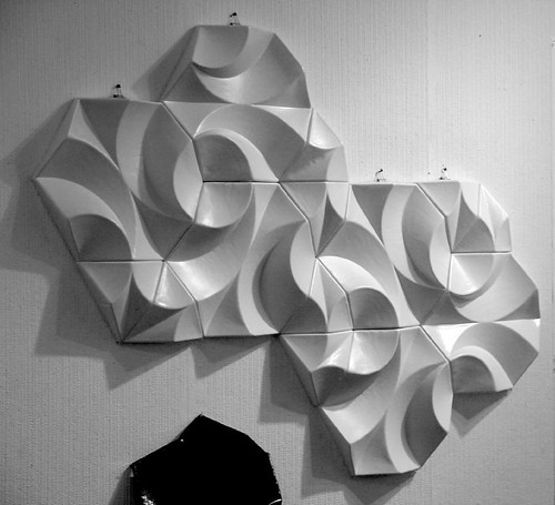
First mid-review for tech seminar. Went really well as a whole. Every group has put in a ton of work and everyone has some really nice results. Our half scale mock up came out quite nicely. We finished it in semi-matte white and it turned out nicely.
More work to be done on nuancing the seamwork/edge/valley/ridge work to create a greater richness...
Some photos:


4 Comments
that is very nice looking work. cool 60's vibe for me somehow..
one thing to mention is the versatility of the two tile tesselation. the edgework is such that you can put together any two tiles along any edge and the continuity of line still holds. this way you can use the two pieces to create any amount of gradient you want in either linear or radial fashion.
any chance you could post images of the other projects too?...they were all really beautiful.
Block this user
Are you sure you want to block this user and hide all related comments throughout the site?
Archinect
This is your first comment on Archinect. Your comment will be visible once approved.