
Sep '06 - Jan '11
(Kent State University)
&tSo I thought I'd jump on the archinect bandwagon and post my portfolio. Now what you see isn't all of it. I thought for this portfolio I would make it a series of "pamphlets" which each profile a separate project. I only have three done at the moment.. there are possibly three or four more to come. All will eventually go into some sort of case, still to be determined.
Think buying that Star Wars DVD pack.. each movie is individually packaged, yet all are put together in a larger case.
This portfolio is for nothing specifically, I wanted to be able to make a versatile portfolio that I could easily take out/put in projects specific to the application.
So all comments and crits are welcome. I have one worry, however, that it may eventually get rather large. Each pamphlet is in the area of 8-10 full pages (4-5 sheets).. with a total of 6-7.. could run me up to 60-70 pages.
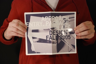
"Approach, Entry, Passage, Place"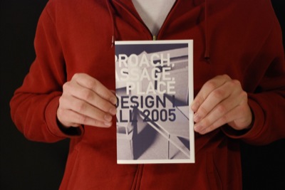

")
17 Comments
great self-portrait series of pics, you just may make the next edition of 'men of archinect' calender.
don't take the following too harshly:
if your book was a starchitect monograph, your slick graphics would be appropriate. since I can't read the text, your two projects seem empty of process (or are those collage/diagrams the entirity of the process?) and concept beyond the mid 90's fragmented cubes/tesselated forms (is this endemic to Kent State?). Oh well. the redundant 13 (I counted) pictures of the same(?) model is urge overkill and seems that you are hiding a lack of site, gravity, materiality and inhabitable spaces. A section would be a huge help for both projects along with some sketches/study model pics.
the layout and flow from page to page is nice- just need better content.
after checking out the photos on the previous post, you do have some nice work. I was just responding to the two projects as shown here.
treekiller, let me explain a little
thanks, first, for the honest truth and advice. you should understand where I am coming from, when these projects were done.. Most of first year at Kent State is model making and drawing, with little attention on process, site development, etc. All of this comes as time goes on. The projects I have recently completed in 2nd year are more focused on process and site... all the thigns you've mentioned.. and they will be included in the respective sections.
however, the earlier work is devoid of a lot of the stuff you are looking for. For this project specifically, we started with the diagrams, moved onto massing model/plans.. then spent a week or so editing model and plans. There are no sections, as they weren't a requirement (and I wasn't yet on to the fact that I could--and should do more work to get my idea through). i hope whoever reviews the portfolio understands that "design 1" means I wasn't too deep in the architectural world.
I hope this clarifies things for you.
ps.. I added the text so you can read it.
the work is quite good, presentation clean and easy to undersand.
this also is not to be taken too harshly, especially cuz the quality of your work is i think quite high...
if i were to offer any criticism is that there is no evidence of process (as said above), and even less feeling that you are developing your own approach to design. amazing hadid, libeskind, eisenmann (and of course malevich) inspired work, but not so much an idea that you arrived at your current style on your own or in response to some sort of critera or other (this is cuz of forementioned lack of process content). it looks a bit like you just picked up a style and went to town applying it to whatever the assignnment was.
at least that is how it looks from my perspective, which is altogether un-informed.
if i were a professor or an employer looking at the portfolio i would be wondering a bit about what your goals in architecture are; style, space, program, etc. it looks the former, which is personally for me very off-putting (not for others though, truth be told). but having read your blog i don't think that is the case. would be nice if somehow the struggles you talked about in the blog showed up in portfolio...or maybe not. frank gehry never bothers to expain himself, nor have a deep concept wither, and he seems to be doing quite fine.
i am quite interested to see where you go from here...
this looks good to me as far as i can see. i don't know what everyone is so critical about. it's clear, direct, and makes your work look good. in my opinion, "process" is often highly overrated when included in a portfolio, especially when the finished product contains more than enough information to get the point across.
i think maybe what others are responding to is the kind of confidence required to show large images of your work overlaid with large text, which perhaps can seem intimidating or at worst arrogant...so you will have to back it up...but good job and good luck.
watch out with the case though...there's some interesting debate on that subject floating around here. and the pamphlet thing is floating around as well--see this year's princeton brochure, held together with yellow rubber bands...
for a first-year student to already be so self-aware, self-critical (in a positive way), graphically skilled, and technically skilled (models, drawings, etc) is outstanding.
i also think the self-portrait series is a great way of presenting your concept for the portfolio itself: "obviously the pamphlet idea works - see!"
your portfolio will evolve over your years in school and ultimately (probably) become much more simple and normal/professional. i think this is a great one for where you are and what you want to project.
Danny- I missed that you were just a 2nd year student. was thinking that you were one of the many, many, wannabe grad school applicants. this changes my perception and criticism significantly for the kinder.
You greatly exceed my expectations of what a 2nd year undergrad can produce, and show promise of great graphic sophistication and clarity. Your models are very well crafted (as noted by others) and you seem to have mastered the challenges placed by your instructors.
Now you can start to blow them out of the water and figure out how to get what you want out of your architectural eductation. Carpe diem and best luck this next semester...
sevenA, can you explain more on what you mean about the pamphlet thing?
and to everyone else, thank you. your encouragement keeps me going.
ditto man, great work, especially for just beginning level undergrad. you're work is strong and eventually your own thoughts will become more integrated into what you show....but that's a lot to ask. right now you are working well within the methodologies that exist out there and finding how they can be useful for understanding the process of design. definitely inspiring to see such strong craft and graphic skills for your level.
best of luck. i would actually feel any critique i would render would be one that would become self evident in the making of the product, so continue to charge forward and everything will unfold.
cool stuff danny. here of some portfolio tips that i have found helpful. maybe you will too:
1. i would note the difference between a. information drawings (e.g. plans, axons, sections, diagrams) and b. final images (final model pics, rendereings, etc.) information drawings should be narrative and can be "busy" with text and graphics while final images should be simple, and BIG like the double-page spread of your model. i like to devote each double-page spread to either/or, rarely mixing the two. to me overall, a good portfolio has a balance between the two. too many final images shows lack of "process" while too many information drawings show inability to follow through.
2. always put your strongest project in the front (i prefer this over sequential order), and put one, single strong image as the center-fold. make sure the last pages are not just an afterthought, but end with some stong images.
3. vary the size and format. ive seen a lot of bad protfolios where they try to squeeze every project into a singe template for every page. each project will have its own narrative.
4. i dont think process is overrated. from what ive experienced, the demonstration of process is always appreciated. just make sure you show craftsmanship as well (which you clearly have).
keep rockin.
oh yeah, no matter how computer savy you are/will be, i think every portfolio should have sketches. this is from personal experience. ive been told that "i don't know how you sketch" in a job interview before. now i use sketches (no matter how quickly drawn) as project dividers in my portfolio.
malevich's ideas and declarations regarding suprematism are concerned with the non objective. to create an object from a non objective painting and philosophy is backwards but that's what architects do i.e. misinterpret and appropriate the ideas of others working in adjacent yet entirely different fields to satisfy their own ends.
don't blame me, blame the assignment..
yes i should have qualified that danny! the work looks great by the by.
Sure, Danny, I was just referring to what seems like a current trend in the publication of architectural brochures--the current brochure for Princeton's SoA is published as a set of four small booklets, one for each of the programs offered (undergrad, master's, PhD, etc.). They are all held together by two yellow rubber bands, like the ones you sometimes see on broccoli. Some like it, some don't, but it's inventive. Send an email and get them to send you one--it's free.
Also, let me vent for a moment about sketches: NOT EVERYONE SKETCHES. Having gone through five years at the most technophobic school around (I only learned to use computers as a professional), five years working in offices, and 1.5 years of grad school, I seriously do not think I've EVER done a sketch I would put up on a wall, let alone in my portfolio. All my undergrad work consists of hard-line hand-drafted drawings, collages, models, photos, etc. Strangely enough, as a student, I was known for the "sensitive quality" of my hand drawings, without a sketch in sight. So for those of you who just aren't sketchers, it's really OK to have a sketch-free portfolio.
By way of explanation for this chip on my shoulder, full disclosure: I've always been unbelievably envious of those who can just crank out those beautiful, masterful sketches...
and to quote an architect friend sitting next to me at this moment--"Would you expect a novelist to publish a rough draft?"
??
My one criticism would be to pay more attention to how the title relates to the closed pamphlet. The cutoffs right now are not flattering.... for instance, the first word you read on the first pamphlet is "ROACH". I think a little overlap from front to back is ok, but you may have gone to far with it.
Block this user
Are you sure you want to block this user and hide all related comments throughout the site?
Archinect
This is your first comment on Archinect. Your comment will be visible once approved.