
Sep '06 - Aug '08
this semester we are in groups of three, meaning they expect the output of nine. each group is asked to start with one of four templates:
1. structure
2. membrane
3. circulation/core
4. cellular aggregation
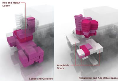
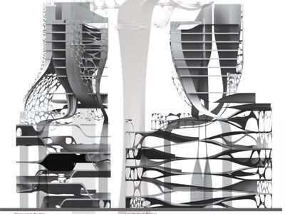
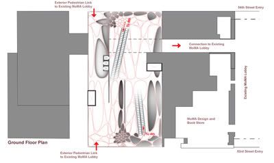
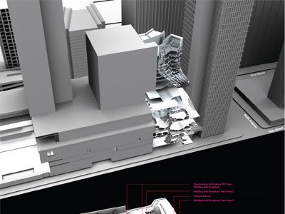
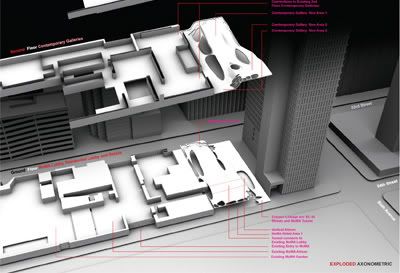
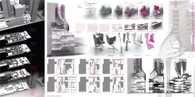
our project started with an analysis of circulation systems, described here as a network of nested loops that tap into, split, and expand the exisiting circulation system of the MOMA. this template was used to drive the buildings overall morphology, the floor plate system, and to some extent, the distribution of program.
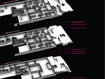
as described in a previous post - "the program is a 12 story mixed-use tower including 50,000sf of gallery space for MoMA. the new building will connect to the museums second, fourth, and fifth floor galleries. the new building should interface intelligently with the existing building (Taniguchi extension), considering urban massing, daylighting, and circulation."
the jury was comprised of the usual suspects: hernan diaz-alanzo, florencia pita, neil leach, david gerber, peter testa, tom wiscombe, and marcelo spina. overall the comments were constructive, particularly (in my view) comments from florencia who asked us to look at what else can be done with floor plates that hasn't been done before e.g. folding, pinching, wrapping, etc.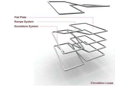


5 Comments
i am so tired of voronoi
sorry, didnt mean to be rude, its sexy
im just wondering what do the folded plates and organic openings do? and how do they make the architecture better?
or is it all just surface modulation for the sake of sculpture, what actually happens in the building?
seems like these projects are heavily influanced by the software and the previous data and the same instructors.
this, i will say after seing some of the projects in thesis show at sci arc, last year.
does anybody else have one paragraph critique of it? i am not put off or anything. but it is time for this work to move on.
seems like, too much time spent on the same drawing..
it does read like, it has became the same spin it initially departed from. by that i mean, hi rise condo is a hi rise condo.
see some of the similar projects from the thesis presentations last year, in this photojournal entry.
yes, more critique please, and you can be as rude as you like. i don't mind.
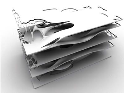
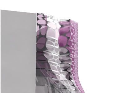
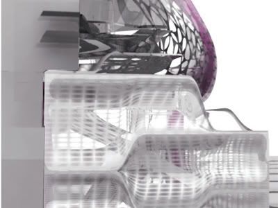
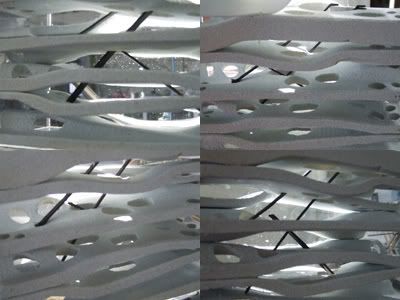
aseid, the undulating floor plates follow a system of ramps and diagonal circulation described in the first diagram, so they do serve a purpose. the openings allow for light to filter through the gallery spaces (see physical model pics) and allow for more visibility between spaces.
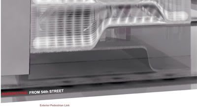
the overall intent was to challenge the striated and closed circulation system in the existing moma, creating an open plan and taking advantage of through street connections much like the ground floor of the taniguchi extension. in a sense, the gallery in our proposal is the inverse of the gallery spaces of the existing moma where in ours the circulation is distributed along the perimeter and art is viewed in a center space.
in the end, yes the formal language is sculptural but also follows careful consideration of circualtion flows.
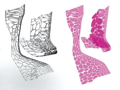
orhan, what do you mean when you say this work needs to move on? do you mean this formal language as a whole, or this project specifically? if you mean the latter, then i agree. from here we are taking the approach of understanding the structural relationship of plate and skin (and its inverse in the residential tower). as for a hi rise condo being a hi rise condo, i agree, it's a tough typology to shake, but hopefully something will come out of further investigations.
thanks for the comments,
tim
tim, i meant it 'formerly' which slides into the 'latter.'
i think this product has to pass one story tests first and than multiply vertically to museum avenue.
this whole drawing is running into the danger of limiting itself as a 'rendering culture'.
Block this user
Are you sure you want to block this user and hide all related comments throughout the site?
Archinect
This is your first comment on Archinect. Your comment will be visible once approved.