
Follow this tag to curate your own personalized Activity Stream and email alerts.

The Buckminster Fuller Institute has unveiled the eleven finalists of DYMAX REDUX, an open call to create a new and inspiring interpretation of Buckminster Fuller's Dymaxion Map from 1943. — bustler.net
UPDATE: Buckminster Fuller Institute Selects DYMAX REDUX Winner View full entry
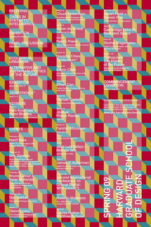
A selection of GSD events posters has been acquired by the Art Institute of Chicago for its permanent collection...Zoë Ryan, Chair and John H. Bryan Curator of Architecture and Design, described the acquisition as "an invaluable addition to the department's holdings." — Harvard GSD News
In the archives of the Architecture and Design department of the Art Institute of Chicago are one-of-a-kind drawings and models. These are artifacts of built and unbuilt projects documenting the process and ideas of architects from Adler and Sullivan to Jeanne Gang and Diller + Scofidio. There... View full entry

Chicago has many truly great buildings. It sits firmly on the map of global architecture and is the birthplace of the skyscraper. Creating a short video about just five great buildings is doing this city a massive disservice, as there are many and this is simply my thoughts. — vimeo.com

The Draftery is a curated drawing archive with multiple platforms. We promote graphic works by lesser known architects, artists, students, and other practitioners. Along with our web-based Archive, we also publish Figures, our printed biannual. It is the only journal that we know of that... View full entry
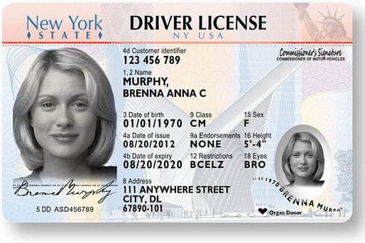
While the old-school images might seem odd, the new production method and a barrage of features both seen and unseen will make the licenses, officials say, virtually impossible to forge. — nytimes.com
New York has unveiled a new design for their driver’s licenses, showcasing Santiago Calatrava's WTC Transit Hub in the background. View full entry
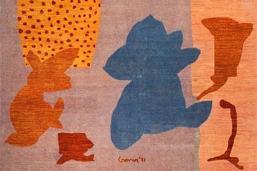
Frank Gehry, Michael Graves, Zaha Hadid, Robert A.M. Stern, Margaret McCurry, and Stanley Tigerman have designed rugs for Arzu Studio Hope’s new Masters collection. However, Arzu’s mission is about much more than making beautiful carpets—the Chicago-based not-for-profit organization is dedicated to improving the lives of Afghan women weavers and their families, based on a model of social entrepreneurship. — architecturaldigest.com

Creators of an online petition opposed to the change say the new logo "loses the prestige and elegance of the current seal." They want the 10-campus system to use the traditional circular medallion that shows an open book, the motto “Let There Be Light” and the 1868 date of UC’s founding. Or find a dignified alternative. The petition had more than 39,000 supporters so far. — latimesblogs.latimes.com
UC's brand guidelines can be found here. View full entry
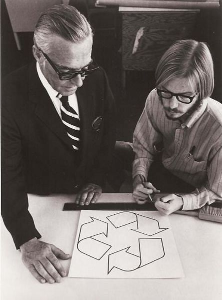
When I finished my studies, I decided I wanted to go into urban planning and I moved to LA. It seems funny, but I really played down the fact that I’d won this competition. I was afraid it would make me look like a graphics guy, rather than an urban designer. I didn’t even mention it on my résumé. Also, the symbol itself languished for a while. I remember seeing it once on a bank statement, but then it disappeared. — ft.com
The Financial Times has an interesting story about Gary Anderson, an engineer/architect/urban planner that designed the famous recycling logo in a competition in 1971. View full entry
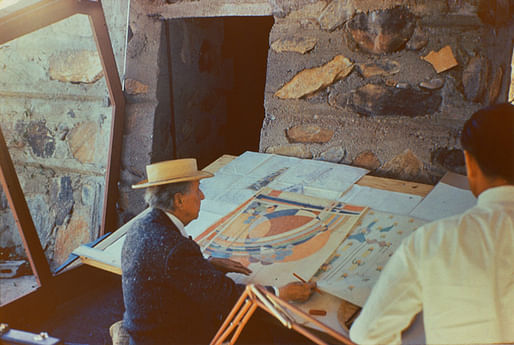
In Frank Lloyd Wright: Graphic Artist (public library), Penny Fowler examines Wright’s ingenious and bold graphic work — his covers for Liberty (some of which were so radical the magazine rejected them), his mural designs for Midway Gardens, his photographic experiments, his hand-drawn typographical studies, the jacket designs for his own publications, including The House Beautiful and An Autobiography, and a wealth more. — brainpickings.org

Around the world, only a few hundred people make a living as fulltime typeface designers. Two of them happen to live in Chattanooga, Tennessee, population 167,000, where they've embarked on an ambitious project to distill the city's artistic and entrepreneurial spirit into a font called Chatype. The goal is to help the city and its businesses forge a distinct and cohesive identity through custom typeface [...]. — good.is
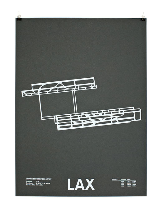
Self-initiated screenprint project featuring runway patterns from airports around the world. — nomodesign.com
Jerome Daksiewicz is a Chicago based architect / designer who moved onto independent graphic/interactive design work in 2009, after the architecture firm he was working with went under. Check out his very cool airport runway diagram posters, and buy them here. View full entry
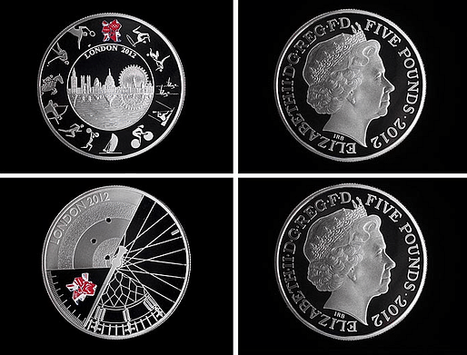
Saiman Miah, studying for his Masters degree at Birmingham School of Architecture designed the Olympic coin which features architectural elements of London's skyline and pictograms of athletes around the edge to create a clock face inspired by Big Ben. — telegraph.co.uk
")
In 1972, Massimo Vignelli designed a diagrammatic map for the New York City subway. It was a radical departure. He replaced the serpentine maze of geographically accurate train routes with simple, bold bands of color that turned at 45- and 90-degree angles. [...] Its abstract representation of the routes was elegant but flawed. To make the map function effectively, a few geographic liberties were taken, something that didn’t sit well with New Yorkers. — tmagazine.blogs.nytimes.com

Beautiful executed ads for 3M Noise Cancelling Headphones.
Made by Grey, São Paulo, Brazil.
— bumbumbum.me
Advertising Agency: Grey, São Paulo, Brazil Executive Creative Directors: Guy Costa, Alexandre Scaff Art Director: Daniel Prado Copywriter: Alexandre Scaff Illustrator: Leandro Esparca Published: April 2011 View full entry

Our auction features a small collection of covetable artwork, collage and constructions from twelve unique talents from our incredible New York creative pool, with whom you are all on a first-name basis: Milton, Seymour, Ivan, Paula, Massimo, Maira, Todd, Christoph, Rodrigo, James, Gary and even Stephen. — aigany.org