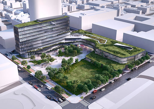

Since Cummins Inc. appointed Deborah Berke Partners back in September, the company finally revealed DBP's design of their new global distribution business headquarters in downtown Indianapolis to the City of Indianapolis’ Metropolitan Development Commission today. The Commission could vote on the plan as early as December 17.
Deborah Berke went against Tod Williams Billie Tsien Architects and SHoP Architects for the development. The new distribution headquarters appears to have been receiving a very warm welcome from locals, as the project is considered a refreshing sight that can bring more architectural innovation into the city.

Located in a 4-acre plot in the Market East cultural district where the Market Square Arena previously stood, the plan includes a 10-story tower that will provide flexible office space, views, and natural light, a conference center, retail spaces, a parking garage, and an ample amount of public green space. The building is expected to break ground in early 2015 and will open in late 2016. Cummins' corporate headquarters will remain in its original founding place in Columbus.
Previously:
It's Deborah Berke for downtown Naptown!
Cummins picks Deborah Berke, SHoP and TWBTA to design its Downtown Indianapolis HQ
5 Comments
How uplifting, a gift to our city; very easy to say.
I really, really like this. This is the forward thinking design J.Irwin Miller imagined when he created the Cummins foundation.
Great work by Deborah Burke and her team.
Deborah Berke hit it out of the park, here! I'm very excited. It's lovely and elegant and restrained while also being totally unlike anything else in the city of Indianapolis. It's perfect for the Hoosier-Naptown ethos.
I like how permeable the ground level is, and I'm assuming the lawn is for future expansion, which is optimistic! We also have a LOT of locals who, whenever downtown is brought up, start screaming that "What downtown needs is more parks! It's too dense and hard and urban!". These people are totally wrong, and don't understand urbanism and density at all, but the appearance of lawn and trees will help them embrace this design. (They'll cry when/if the lawn turns into a building in the future, or maybe they'll have learned something by then.)
For those who aren't familiar with Naptown, the tall white curvy thing behind this building is a proposed mix use tower that I sincerely hope will happen - the relatively low scale of Berke's proposal will play nicely against its height. Also, the City County Building is due west of this site, and it is a very blocky and erect Mid Century Modern tower that the curves on Deborah's building foil very nicely. Almost like Fred and Ginger.
I'm so excited for this project! So pleased with the proposal, so happy Cummins appreciates good design!
Nice to see some green in urban architecture. Wondering if it goes beyond the roof ...
I would be stoked to work in this building.
Well done.
One of the few projects where it will probably look better in reality than the renderings.
DB4Life
Block this user
Are you sure you want to block this user and hide all related comments throughout the site?
Archinect
This is your first comment on Archinect. Your comment will be visible once approved.