Hi Archinect!
It looks like a cat sat on my keyboard, but "pre.text / vor.wand" is the title of Jürgen Mayer H.'s lecture tonight in Piper. This has been the first week of classes. (I'm in my thesis semester and second last semester of my M.Arch.I.--more on thesis soon.)
6:36pm: Scott Cohen makes introductions. PSC: It's like "welcoming a friend back." JMH has taught all over the world, and has won many awards; he has accomplished a lot in a short period of time, "most of it in the past ten years."
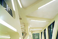
The 'metropol parasol' project in Seville is the largest (?) structure in the world in wood. Certainly it's monumental, and his most famous work. In it, he mastered the 'single surface' idiom. This project, and his buildings, are like (the future of the past? PSC mentions the 'Jetsons.') His 2D curves are 'shamelessly turned into graphics' and then extruded back into 3D form. He uses the fillet--a trope of our time. "Often his buildings seem to have no particular reason to be the shape they are. They intentionally produce an inscrutable condition; they're not a rhetorical condition to give truth to anything."
PSC: I've been startled, amazed, even revulsed looking at his projects. ...It has provoked me to consider a new investigation on the question of signature. I'm very pleased to welcome Jürgen Mayer.
JMH: ...A lecture like this is a good time to go back and think about what went wrong...or what went right.
About the fillet, JMH said: it's always about revisiting your childhood; and mine was in the 70s. The chamfered corner in brutalist architecture, is a kind of beginning of the fillet. It's where we begin, in my office, to rethink the notion of 'future' and single-surface. "Somehow it's about regaining our future again; the future that was taken away from the generation from those who grew up in the 1970s. And I still like it. (laughter)
JMH: This lecture is a lot about the last 10 years and a lot about the 2D to 3D translation, from small to urban, from installation to nation.
6:47: He's showing collages from the paper from envelopes, with repeated patterns on the insides. "I collected over 300 kinds of patterns...moiré, points, logos..." This became a visual noise--"the last visual moment before everything turns into the digital world."


[all images from JMH's website.]
He's showing museum installations with the painted pattern of numbers. And cubes made of the extrusion of graphics of patterns.
A museum exhibition about sustainability and mobility.

6:55: He mentions that a modest budget on the below project forced them to become creative on saving money through the materials and construction methods that they used; they used laminated wood, which they weatherproofed with a spray-on coating; it's been an exemplar of sustainable construction "even though a lot of architects also criticized it because that's not what you do with wood."
When he mentioned the low budget he joked that maybe he shouldn't mention that when there are potential clients of his in the room. Not sure who that is.


"We try to be quite ignorant, or naïve, in designing spaces," but they can't remain so when it comes to construction. People often say of their work "it's nice in the rendering, but let's see when it's built, even when they're looking at actual photos--this is because they're often using a single surface, without flashing or different materials for the base or ground condition, which we're not used to seeing.


Now some private homes. The client had a house that they had added onto incrementally over decades; it contained all the popular materials, styles, and treatments of the past decades. They kept most of the footprint but covered it all over and whitewashed it.
Another residential project: an apartment block in Berlin. It has vertical strips that modulate in their thickness and therefore opacity, to give variable privacy. This strategy was motivated by a floorplate shape that allowed some apartments to face others, thus causing a potential privacy problem.
Their projects have gotten bigger and bigger over the years.
He's not really describing the construction or detailing, sticking close to the graphic expression and schematic design ideas. Which is funny; he's now telling a story about his first project in Georgia--he had sent renderings for a competition, and didn't hear back until he heard that they were already building the project.
It's all very stylish, but I have to go, because I don't have a seat and don't think I can crouch on the floor any longer. The lecture will probably be posted on the GSD's YouTube channel soon; I'll add a link when it is.
thanks for reading!
Lian
This blog was most active from 2009-2013. Writing about my experiences and life at Harvard GSD started out as a way for me to process my experiences as an M.Arch.I student, and evolved into a record of the intellectual and cultural life of the Cambridge architecture (and to a lesser extent, design/technology) community, through live-blogs. These days, I work as a data storyteller (and blogger at Littldata.com) in San Francisco, and still post here once in a while.


No Comments
Block this user
Are you sure you want to block this user and hide all related comments throughout the site?
Archinect
This is your first comment on Archinect. Your comment will be visible once approved.