
Hello Archinect!
I'm in Chicago with the ACSA at Do Good Data 2015, and Kristi-Lynn Jacovino from the Onion and Clickhole is talking about user experience on the web. The Onion has a very small design team (two people, I think?) and they just launched their new site today! (There's a nice slideshow of the Onion's website designs over the years here.)

KLJ is going to focus on:
CONTENT STRATEGY is the core of your website, otherwise it's pretty and useless. At The Onion, the editorial team manages this.
If you're not sure where to start, start with an audit of your website: What content do we need? What content can we get rid of? Is our content useful? Too often, people throw everything they've written or done on the website, which leads to people saying: TL;DR.
Are we speaking in a way that our users understand? Too often, people use jargon--names of programs or campaigns, discipline-specific language--that won't be clear to everyone.
Is our content optimized for the web, is it clear and easy to skim? What about for search? "Search changes every frickin' day." Just talk to humans, because Google is getting better at this every day. No gimmicks.
INFORMATION ARCHITECTURE
Too often, organizations present their content according to the organization's own internal structure. It's easy for the organization, but doesn't make sense for outsiders. Nonetheless, someone will ask: "So, where will my content go?"
How should content be organized? How do we prioritize the content? How should the content be presented?
USER INTERFACE
UI is the design of how things look, but also navigation: how will they know that a given button will take them to a donation page, or a content page, or something else? People often spend too much time on how something looks, and not enough on how it works.
What impression do we want to give? Is our site visually interesting and inviting? If you come across as disorganized and you have crap everywhere, it doesn't reflect well on you. Your website is your organization's public face, so people look at it to figure out if they can trust you or want to work with you.
What visual cues will our users understand? Should we present content with icons or photos?
Is our site clean and readable? Is our site mobile-ready and responsive? If your organization isn't ready for mobile, you should work on it. For example, last week Google downgraded sites that don't have a mobile-first design.
Blue is a color that increases people's trust, so banks often use blue. USAA bank also drives that home with messaging explicitly about trust. This is UI!
Steal ideas. KLJ keep notes on web ideas and interfaces that she likes, so that she can draw on them for projects.
EXERCISE: KLJ asks us to brainstorm: who are your users? After two minutes she asks us to group those users into 3-5 main types. Here's my list for the ACSA:
Who is your website currently primarily aimed at? For the ACSA, it's probably faculty and administrators.
For each group of users, write a primary goal. Then write a second goal. Again, here's my brainstorm for the ACSA--just a very quick brainstorm:
Know your goals! For the Onion, it's page views and video views, because of advertising revenue. The Onion uses Google Analytics to track clicks, and KLJ made this dashboard to track their key performance indicators (KPI).

For the Onion's old website, once you read an article and scroll down, the only way you could navigate is by clicking on 'previous' or 'next.' It didn't make sense, because you're often looking at the most recent piece so there's nothing at 'next.'
CREATE A TESTING PLAN

KLJ develops a plan to A/B test various features and hypothesis. The spreadsheet includes: Test name, test number, site, description, hypothesis, KPI to measure (which is always clicks).

The A.V. Club has a manually curated feature section, where they promote content. Nobody on their team liked the design, because the text is hard to read and the images have to be darkened to read the text at all. So KLJ tested a few new options for this section, using clicks as the KPI. The metrics can be separated by new/returning uses, and by mobile/desktop. They didn't come up with a better design in their first trial, though they did come up with small tweaks. Ongoing project.


Audience question: does testing confuse and put off users? KLJ: There's a risk of that, but the Onion tests on 5% of its audience, so they're impacting a small number of people. Also, "your users aren't as into your site as you are," so they're not likely to notice or be disturbed by things as much as you are.
For smaller audiences, you can A/B test using your entire audience (50% of your viewers for the control and 50% for the test.) For small changes, run a longer test with larger total numbers, because the differences will be subtle. For large changes, the results will be more dramatic so a smaller test is fine.
QUALITATIVE TESTING
What's it good for?
Tools of the Trade:
You can user test using paper mockups, by sitting someone down and asking them where they would click to do X task. When they point, show them a new paper.
An example of an organization's website goals:
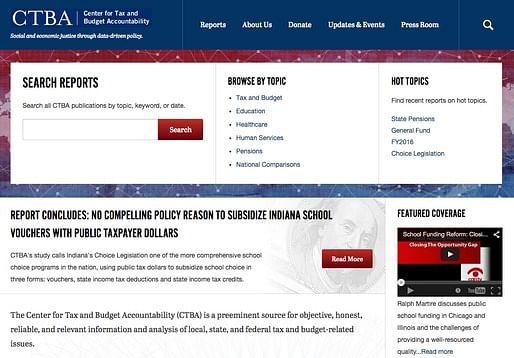
The previous site included a single list of links to reports, tools, and other resources. It had a lot of room to improve! KLJ called the site's users and asked them what they're looking for on the website. That drove the design a new feature section at the top, that includes a report search (the top priority), browse, and a manually curated hot topics. Secondary and tertiary goals for users are lower on the site as you scroll down.
Redundancy is good for your primary goal. You don't know where on the site people will enter, so there should be cues for your primary goal throughout the site.
KLJ hates focus groups. For example, SONY did a focus group on four colors of radios--black, red, yellow, and blue. The group was really excited about the colors. As people were leaving, they offered a free radio, and everyone took the black one.
DATA THAT IS QUANTITATIVE AND QUALITATIVE (i.e. surveys)
Surveys are good to collect large amounts of qualitative data (but be careful, as you have to read it); they are cheap and easy; and they give you ideas for testing.
Everyone from the top down has the same goals. If not, y'all got issues! But generally, an organization knows what it's goals are. So it's a matter of being methodical to pursue those goals.
Fabulous, energetic, useful presentation from Kristi-Lynn Jacovino.
Thanks for reading!
Lian


This blog was most active from 2009-2013. Writing about my experiences and life at Harvard GSD started out as a way for me to process my experiences as an M.Arch.I student, and evolved into a record of the intellectual and cultural life of the Cambridge architecture (and to a lesser extent, design/technology) community, through live-blogs. These days, I work as a data storyteller (and blogger at Littldata.com) in San Francisco, and still post here once in a while.


No Comments
Block this user
Are you sure you want to block this user and hide all related comments throughout the site?
Archinect
This is your first comment on Archinect. Your comment will be visible once approved.