
Hello Archinect!
At the beginning of September, I promised to write about our new workspaces, but as we settled in, I actually started to like them and found it less pressing to itemize for you just how many square inches we lost (although for the record, it seems to be about 1300 square inches less per person, or an approximately 20% reduction from the previous space of 45 square feet).
Nonetheless, a promise is a promise, and I thought I should cover this development, as this first overhaul of the workspaces in Gund Hall since its opening in 1972 is no small matter.
The old desks look like this: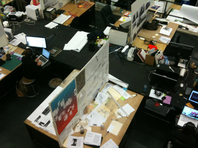
The new desks look like this: 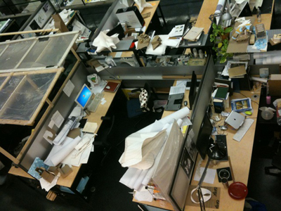
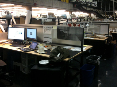
The first change is to get rid of the large common tables (or narrow table with high shelving units, for desks under the overhang) that used to separate the two aisles of desks, and to use that space to increase the length of the desks, which are then made much shallower and spaced closer together. The second major change is that the work surface is lowered from 34” to 29,” such that regular office chairs can be used (and indeed, are now supplied). There are three major results of these changes. First, we lost a great deal of storage space: instead of a sizable pinup surface, large flat file, gigantic cabinet, and ample 3D model storage space on the common tables and shelves, we now have a single lockable rolling cabinet, some open vertical storage for sheet materials, and a TINY shelf that is pretty much the Golden Gate Bridge for any model wider than 10 inches. Second, we now--in the words of one of our tenured professors--“can no longer make drawings [higher than 24"] even if we wanted to,” and have nowhere to either build or store models larger than 24 x 24”. Third--the silver lining--is that we have vastly improved ergonomics for working on the computer.
I might add that a fourth result is that the lowered height of the vertical elements means that even a person of, ahem, modest height (like myself) can now stand up and get a view of most of the people and workspaces on the entire tray. Personally, I like this very much, but most people lament the loss of privacy. With large groups of tourists snapping photos in the trays at least a couple times a week, we may as well be starring in our own reality TV show (which, it is rumored, was offered to the GSD in the form of a season of “Architecture School,” but outright refused by the administration).
The fact that we’re not plotting an all-out revolution speaks to how much time we really do spend at our computers these days. Nonetheless, there is a strong model-building culture at the GSD--the bigger the better and the more the merrier, especially in the architecture department, and especially in the core studios--and this is not disappearing anytime soon. So the simple fact is that something will have to be done to accommodate this. I’m one of the representatives for our class on the Student Affairs committee, which is one venue for us to voice our concerns to the various department heads in this Typhon of an institution, so I brought this up. Our main request, besides more ample storage solutions, was to get rid of the new small café tables in our shared “kitchen” space (a common area made for us in partial compensation for the reduced desk size), and replace them with a giant multi-use table that could be used sometimes for communal meals, sometimes for meetings, and sometimes for model building and other production. They’re pretty good at responding to our requests so I have high hopes of seeing this giant table appear sometime before the end of the semester. [Our current "kitchen" space. A sad state of affairs.]
Thanks for reading!
Lian
P.S. Between you and me, what irked me at the beginning of the year about the workspaces was not so much that they were smaller, but that the administration did not openly admit that they were smaller, and that this reduction in size was a primary motivator for the change. Instead, along with the complimentary box of drafting dots (given to us because in lieu of our old pin-up boards, we now have low plexi-glass panels to which we have to tape our drawings), we received a little leaflet that crowed about the modernized workstations and their attendant aesthetic and ergonomic improvements. I don’t think that was necessary; if the administration could be straight with us about the school’s pedagogical ambitions and financial and infrastructural pressures--and the fact that, for example, the MDesS students still don’t have desks of their own for lack of space--I think most of us would be on board. The school *is* growing in ways that I think are pretty exciting--Krzysztof Wodiczko’s new program in Art, Design and the Public Domain comes to mind--and I think we should be able to talk about that.
P.P.S. I just found this: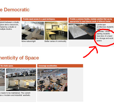 [As found here ]
At the student affairs meeting, I raised an issue that has been the subject of much conversation within my class: the fact that at the M.Arch.I end of the third tray, we’ve maxed out our storage spaces and work surfaces, while the urban planning end of our tray seems hardly occupied. So, phrasing this as diplomatically as I could, I asked if “the design and allotment of desks could reflect the fact that different programs and different years have different schedules and workspace needs.”
This was, understandably, a controversial point to raise, but in the above analysis, which the GSD published as part of the brief for the new workstations, you can clearly see the words: “urban planning students have less of a need for storage and work space.”
Damn straight! 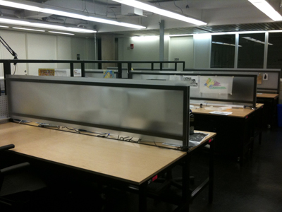 [The urban planning part of our tray; photo taken on the same day as all the rest, midway through the semester.]
P.P.P.S. If you're an urban planning student, before you start hating, please know that it's not that I want you to have a worse workspace, but just one that better meets your needs, relative to the needs of other GSD programs. Obviously, increased model production and storage space wouldn't do much for you, but maybe you'd appreciate better accommodation for group work (or something else--I know even less about the urban planning department than I do about landscape).
This blog was most active from 2009-2013. Writing about my experiences and life at Harvard GSD started out as a way for me to process my experiences as an M.Arch.I student, and evolved into a record of the intellectual and cultural life of the Cambridge architecture (and to a lesser extent, design/technology) community, through live-blogs. These days, I work as a data storyteller (and blogger at Littldata.com) in San Francisco, and still post here once in a while.


13 Comments
i think that it might be time consuming and difficult, but it might be worth like doing some sort of study on space usage/ time usage of various programs and their need for certain desks. Like i'm pretty sure and mdes student with a history leaning needs waaay less space than his classmate with a fabrication concentration... its prob the same as planning vs. architecture students... those desks look pretty empty to me as i'm drowning in models...
i always hated going to lectures @ GSD and walking around and seeing cubicles, it looked like people were hiding from others, or hiding work from others, and there was something inherently anti-democratic going on in a very democratic space.
also, if you think those desks are small, the ones i saw at columbia were maybe 1/4 of that size. and there were few if any models, and no drawings in the middle of the semester. it was a very odd scene.
@ holz.box: It's true, the new low profile gives the tray a more open look. But we also tend to feel that the new desks need to be optimized for their primary users, who have specific needs in terms of pin-up and storage space, and not for tourists, our professors, or other visitors to the trays.
damn that's alot of space... granted for grad school there were 12 of us in a loft type size the size of a small warehouse.
I'm with holz - the one time I visited Cornell I was horrified by all the tall, home-made enclosures built around everyone's individual little desks. It seemed so... persnickety, and anti-social, and frankly claustrophobic. At the time I read it as a fearfulness on the part of the students ('don't steal my idea!'), but now I realize it was probably just... I don't know, a desire for individualism, maybe. I've always wanted to ask a Cornell student why they did that... I'm sure there's a legit motivation, but at the time I reacted badly to it. Very different from the school I attended.
The last photo of the "urban planning section" features the desk of the 1 person who decided to leave the program early. His desk is empty because he never used it, ever. Out of 30+ of us, why did you decide to take a photo of that desk? I understand that you are trying to prove a point, but it's pretty misleading to do it this way.
If the comments would allow me to post photos I would a) post a photo of my beautifully cluttered desk, and b) post a photo of one of the beloved "old-style" desks that is empty because it was never assigned to a student (just go to the 5th tray, they are everywhere... OMG, architects don't use their desks properly!!!)
Don't misrepresent!
Sincerely,
-GSD planning student who fully uses his desk and would like more space.
Hi MUP, thanks for your comments. Yes, I fully admit that I choose photos that illustrate the point I'm trying to make. I didn't know that one of your classmates had withdrawn from the program, and had I known that I probably would have aimed my camera differently. That being said though, it's also true that the whole aisle encompassed in the photo shows nothing on the central shelf except one lamp, as well as (although this isn't visible in the photo), very few things in the central vertical storage space. This is a very different scenario from the desks in the M.Arch.I side of the tray, and surely points to some of the ways in which our work and storage needs are different.
I don't know who you are, but you know who I am, and I sit right beside the central stair. Come by to say hello sometime if you like.
i think this may also something to do with fire marshal's requirements and codes. it was in a similar studio environment in one california university. did you ask?
orhan - I also think it was the fire marshal.
I read something a while back about office planning (I want to say journal of environmental psychology - but it could be somewhere else) where people were brought in to "fix" places that had a sea of low-partition cubicles because they discovered that it tends to make most people unproductive, skittish, and anti-social (some of the interviews reminded me of descriptions of the psychological effects of totalitarian states). I know a lot of the problems centered around poor acoustics, though...
as for the anti-democractic nature of the old desks - that's BS... only dictators and architects think a sea of heads in an open field is "democratic." democracy best happens through intense smaller-scale social interactions and builds up through representative leaders of smaller (community) groups... and then gathers in central "public" nodes... you cannot dump a 100 people in one space and say "it's democratic!" that doesn't make any sense.
Amen, Mister/Miss Toaster Oven! This is exactly what I was trying to argue in my current post, but you achieve the same much more vividly.
I'm glad at least one person over at gund seems to think I know what I'm talking about...
hey - I'm local, if I ever make it to a lecture or need to use the library for some reason I'll drop you a line... my friends are no longer there anymore so I tend not to head over as much these days...
Yeah--you should read my 'in defense of homasote' post and tell me what you think. :) Definitely, let me know when you're in the area. My email address is in my archinect profile.
Block this user
Are you sure you want to block this user and hide all related comments throughout the site?
Archinect
This is your first comment on Archinect. Your comment will be visible once approved.