
Hi Archinect!
The full title of Jen Christiansen's talk is "Visualizing Science: Developing Information Graphics for Scientific American Magazine."

From the OpenVis Conf website:
From its first data-based chart (on the topic of inertia, momentum, and projection) up through to today's web interactives, Scientific American Magazine has been communicating topics in science and technology to non-specialist audiences with the help of graphics since 1845.
Jen will walk through the process of developing print, web, and tablet data visualizations for Scientific American, from identifying source datasets, to working with freelance visualizers--with an eye to developing graphics that embrace their skills and style, but still feel at home within the context of a monthly publication (with an established framework and aesthetic identity on paper and online).
From initial concept through final production, we'll examine projects such as Jan Willem Tulp's flavor connection network (Sep 2013 issue), and Moritz Stefaner's bee graphic (Dec 2013 issue) from the art director's point of view.


Christiansen opens with some history of Scientific American, which has long used images to describe technical information and ideas.
Above, examples from 1921 and 2001, with some embarrassing drop shadows. Christansen says "we could criticize" the drop shadows easily, but the point for her is that in the 2000s graphics have been working more as overall page layout elements, to invite readers to look more closely at the content. "My goal is to produce graphics that honor the data and entice the reader." 
For example, in the above set of spreads, the graphic-heavy layout could do more work in terms of data, but they chose not to, because in a text-heavy article that page also has to perform in terms of inviting the reader in.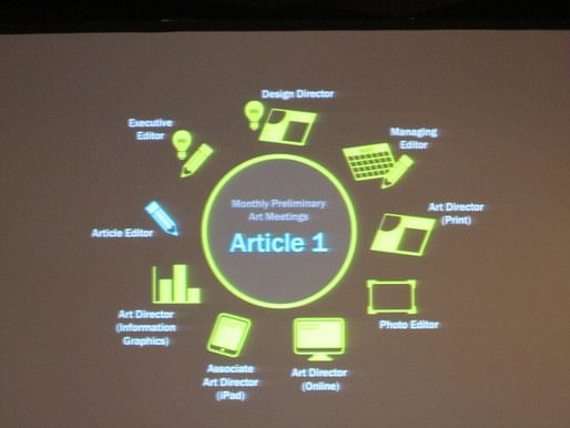
Christiansen talked about the editorial and production process. Two issues tend to be in production at once, so the next issue is in its early stages while the previous issue is in final development and production.

She walks through the design process, from her point of view as the art director for a more recent interactive called "The Flavor Connection" (screenshot above). The original research paper had its underlying dataset open, which gave a helpful hint that the scientists might be open to re-visualizing and sharing the data in another context.

First, above, here is the original visualization that accompanied the paper in its initial academic publication.
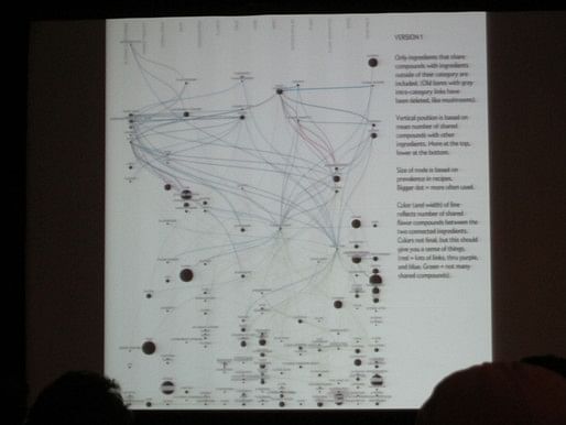

A series of iterations, deciding how to order and show the complex data. They iterated quite a bit to decide what data is used to sort the circles along the vertical scale.

The data requires a hefty "how to read this graphic" section (above), which evolved organically from notes that Christansen would write for herself and for her colleagues on drafts to verbalize what each iteration was doing. These sections are often casual and narrative, rather than a stiff "legend," which she says can give more leeway in terms of presenting a complex or unfamiliar visualization style.

When people move from web to print work, Christiansen says, they're often overly optimistic about what they can fit on a print page.
Another interactive produced at the same time, the "produce finder," didn't attract nearly as much media attention and as many views as The Flavor Connection. Is it because this interactive was more open-ended--"exploratory" rather than "explanatory," as Bostok might put it? Or is it because the meat and cheese in "The Flavor Connection" is more enticing for readers than kale in the produce graphic?
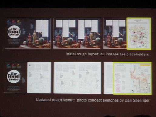
A lot of what Christansen talked about was how she works not only on the graphics themselves, but on figuring out how and where they fit in the larger contexts of their stories. For the print version, she puts mockups into a layout as early as possible, in order to better understand how much space it needs and how it might look (below).
Thanks for reading!
Lian
P.S. The talk following Christansen's was by Arvind Satyanarayan, a Computer Science PhD candidate at Stanford University who is building visualization design software for use by non-technical audiences. Satyanarayan is "chief architect" (yep) at Apropose, a startup working in this space, and he presented his work on Lyra, a piece of software that aims to be as user-friendly as Tableau while offering more control and design options, like D3.


This blog was most active from 2009-2013. Writing about my experiences and life at Harvard GSD started out as a way for me to process my experiences as an M.Arch.I student, and evolved into a record of the intellectual and cultural life of the Cambridge architecture (and to a lesser extent, design/technology) community, through live-blogs. These days, I work as a data storyteller (and blogger at Littldata.com) in San Francisco, and still post here once in a while.


No Comments
Block this user
Are you sure you want to block this user and hide all related comments throughout the site?
Archinect
This is your first comment on Archinect. Your comment will be visible once approved.