
Tonight's feast is the second installment in the series "A New Innocence: Emerging Trends in Japanese Architecture," which is sponsored by Dean Mohsen Mostafavi with the support of Harvard University Asia Center. Here's a description of the series that Mohsen emailed to us earlier today:
The Graduate School of Design has planned a series of individual lectures entitled A New Innocence: Emerging Trends in Japanese Architecture. Speakers include Sou Fujimoto, Junya Ishigami, Toyo Ito, and Ryue Nishizawa and Kazuyo Sejima (SANAA).
This group represents one of the most significant informal collectives in architecture and design today. Their dedication to the simplicity and pleasures of everyday architecture and their engagement with location and interior distinguish their work from that of many of their contemporaries. They approach their task with a freshness and delight which in many respects is reminiscent of the innocence of a child’s eye; however, in their case this innocence is deliberate and highly artificial. One characteristic of many of these architects’ projects is the integration of landscape and nature within buildings; another is the subtle fusion of furniture and architecture. Toyo Ito, a mentor within the collective, counterbalances this lightness of approach with chthonic and seemingly excavated interiors, such as his designs for the Taichung Opera House.
**
6:07 pm: It's a packed house in Piper for Junya Ishigami, and Mohsen is giving the introduction. Before we started he recapped the (many) events and student group projects organized for the coming weeks to raise funds and learn more about the disaster recovery in Japan. Then he spoke about the extreme lightness and ephemerality in Ishigami's work...and then mentioned how significant it is that Ishigami won the Architectural Institute of Japan Prize in 2009: "It's not an emerging architect's award. It is the major award for architecture in Japan, and for someone so young to win this award is an incredible accomplishment. Without revealing too much, Ishigami-san was born in 1974..."
"Originally we thought that this lecture would be translated, but Junya's English has improved so much recently that this will not be the case."
..Ishigami looks so young--I saw a young, punky-looking man setting up at the podium and thought he must have been a staffer, so was looking around for Ishigami--but it was him!
6:15 pm: table
Ishigami is explaining the first project--an impossibly thin (3mm) table--that he did after starting his own office. And he's annotating his own slides in real-time! These crazy Japanese kids. 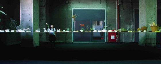
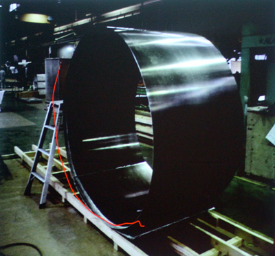
It's an aluminum table with a self-weight of 700 kg; the straightness was achieved, he's explaining, by pre-bending the table (by over 360 degrees, so it actually curved around on itself), but "when this table is put on the floor, gravity makes it flat." (I'm so glad he's explaining the technical background here! This is one thing that Sou Fujimoto didn't do.)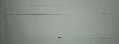
"This is the elevation of the table."
He's showing a video of the table: "it's soft like a paper." The table is undulating under it's own weight...it is extremely flexible.
6:23 pm: Japanese pavilion, Venice Biennale 2008
"I wanted the plants and the building to have an equal presence. So the plant and the column of the building are the same diameter: 1.5 cm." 
The landscape inside and outside the greenhouse is continuous; there are plantings on both sides and you hardly notice the separation of the glass (although it calls attention to itself materially in other ways, like when raindrops fall on its surfaces).
6:27 pm: lake project
The form of the lake changes depending on the water level; when the water level is high, there are islands; when the level drops a bit, there start to be connections to the shore; and when it drops further, "a complex topography appears."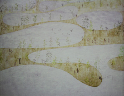

6:31 pm: building in existing building
They proposed connecting rooms in a skyscraper vertically from the 1st to the 22nd floor, making a 500 square meter house that is 70m high. "In Japan, any hill over 60m is a mountain."
"This is a study of how to create a vertical relationship in the existing building."
"On each floor, the shape and place of the opening is different, and the stair is different." 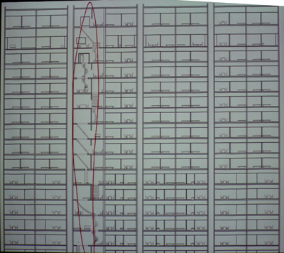
"Sometimes, like in mountain climbing, it takes more than a day to climb up to another floor. ...I hope in this way, a new lifestyle will appear."
6:36 pm: KAIT workshop
"This is the plan. These are the columns." 

Every column has a different profile (I don't think he said this was based on the loads; this seems to have to do with making the space nonstandard even though it's repetitive, as in a forest). "And there are different trails, like animal tracks. ...With this ambiguity we are trying to create a new flexibility of architecture."
"This space is like a landscape."
"This movie is taken by the security camera. This column (pointing to two close together) is like a wall, so nobody goes through. But sometimes they do." (Laughter was we watch people wind their way through the columns in different, often playful ways; but there are also patterns--like one column that many people stop to touch or lean on.)
"Furniture is not decided in this place, so it is always changing." 
6:47 pm: cafeteria for university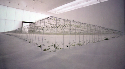
"This is for a cafeteria, napping place and party area." No columns for a 120m span; one big room. The roof is 8mm steel plate; it's like the table. "Average ceiling height is 2.3m, same as a private house, so it's an intimate space, but one that extends like a giant grassland scenery."
"Now let's think of the space of the earth. We are living in the interesting space between clouds and land. We call this scenery."
"The floor and the ceiling have a subtle curvature, making something like a horizon; the ceiling is like the sky and the floor like the ground. It is a new scenery as architecture. This building will be completed in September of next year."
6:55 pm: Venice biennale 2010 Arsenale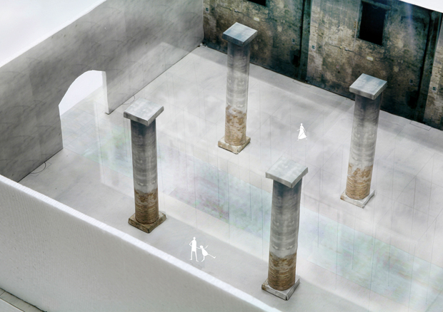
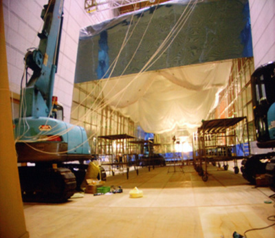
"The quest of transparency is a fundamental part of architecture. This is usually created by material, but in this project I was thinking not of transparency of material, but transparency of the architectural structure itself."
The beams are 1mm thick, the columns are 0.9mm, and wires are 0.02 mm. "The components of the model are the same scale as components in nature." He's zooming in on a photograph where they're making the columns in a workshop; given their thinness, they're almost impossible to see!
"By [twisting] the carbon fiber by hand, a column is made." "This project was a limit to test the limit of architectural construction."
7:03 pm: Yohji Yamamoto NYC store
In NYC meatpacking district.
"Like cutting a piece of cake, I cut the building. We cut it minimally; just here."
I think he's saying that they used the bricks from the walls they took down to create the new wall.
Lian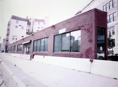
[Before and after]
"I made a free-standing building in NYC. You can go all the way around it and see everything inside." "From this angle the building is so thin, you can hardly believe it is brick."
7:10pm: square balloon
"Our space was large with a ceiling height of 20m. So I wanted to make something like a scenery instead of an object that you put in the space." 
This blog was most active from 2009-2013. Writing about my experiences and life at Harvard GSD started out as a way for me to process my experiences as an M.Arch.I student, and evolved into a record of the intellectual and cultural life of the Cambridge architecture (and to a lesser extent, design/technology) community, through live-blogs. These days, I work as a data storyteller (and blogger at Littldata.com) in San Francisco, and still post here once in a while.


6 Comments
a wonderful architect! his interviews in japanese are also charming.
thanks for the coverage! I wish I was there!
News flash: in the KAIT workshop, most of the 'columns' are actually thin, flat tension members pulling down on the roof (which would have been pre-tensioned to balance these forces) and acting as shear walls. The tension makes these thin elements more resistant to shear, and their cumulation (with over 300 columns in the building) adds up to the equivalent of a shear wall in earthquake-prone Japan.
That tiny/huge contact form on Ishigami's website is the coolest contact form I've ever come across.
Thanks for the coverage, Lian!
alex, like wow...
That's amazing !
Block this user
Are you sure you want to block this user and hide all related comments throughout the site?
Archinect
This is your first comment on Archinect. Your comment will be visible once approved.