
Sep '06 - Dec '09
I am both scared and fascinated by Orlando and its famous neighbor, Disney World. The fear rises from a city that seems to sprawl endlessly, encouraging growing and continuous mass-indulgence. However, by now the model has spread like a virus throughout the country and it does not seem to be slowing down. As the sprawl spreads it is Orlando and Disney's shameless acceptance of what it is (an economy built by sprawl), that allows them to also serve as laboratories to experiment with suburban typologies.
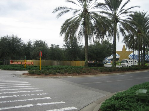
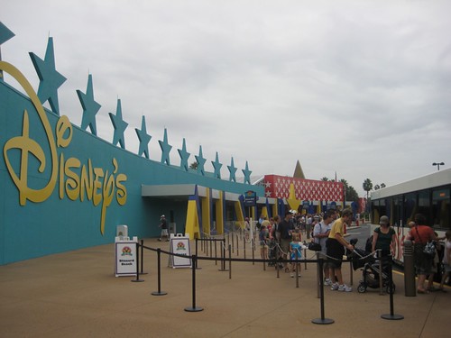
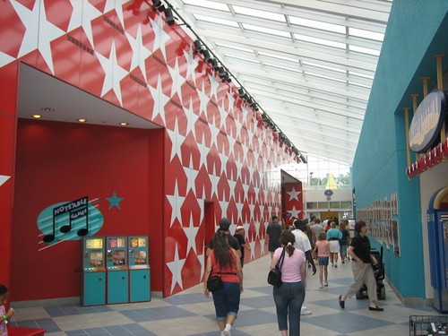
Let's take the All-Star Resorts as an example. The complex, designed by Arquitectonica, re-works the typical strip mall motel and allows it to have a larger presence and interaction with the 'public' street (which in this case Disney also owns). The volume that would regularly be a simple box is then divided to create a large public space and given as much day-lighting as possible. The main building houses the front desk, information, stores, a food court, and even a bar. After you pass the main building you go into a world populated by monumentally-sized icons that make it seem as though the place is populated by giants or, perhaps, the demigods of capitalism, begging the question; are they art?. This icons really give the place an other-worldly nature and to tell you the truth I do not think they are that far from being art. The spaces seem to encourage people to go outside and hangout around the public spaces better then in most other motels I have seen.
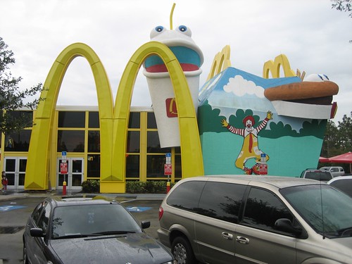
The MickeyD's down the road from the All-Star resort is not too bad either (I cannot find how designed it but would love to know). Why? because unlike the thousands you and I have probably seen that pretend to be a little hut somewhere in the alps, this one accepts simply what it is: a place for plastic food next to a highway. The entrance is marked by a gigantic 'golden arches' next to large cartoon icons of the food inside. On the side facing the Disney-owned highway the MickeyD's simply has a huge sign. Now I am not saying I love these places, but at least there is a strange sense of honesty to them. We see motels and McDonald's everyday, here they at least have some ambition and at least do not create an entirely homogeneous built environment. Let's call it a small step, but a step nonetheless.

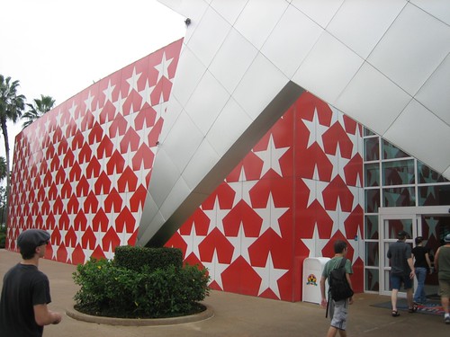
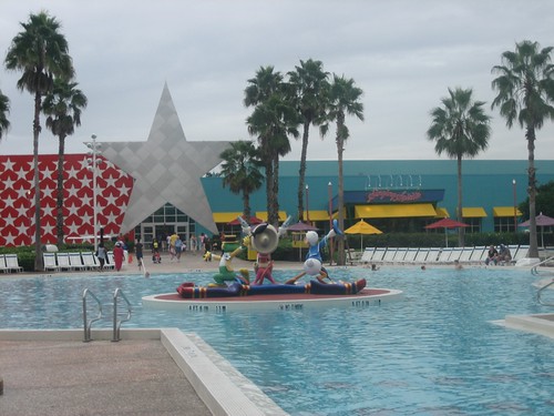
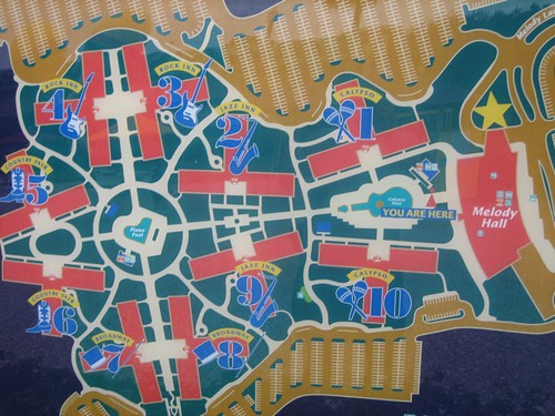
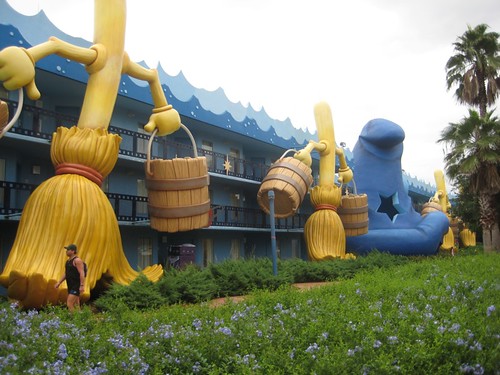
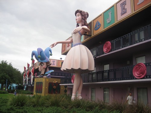
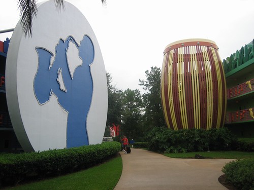
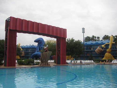
More images of the resort here
BONUS:
Images from Celebration, FL
Graves = Post Office
Philip Johnson = City Hall
Cesar Pelli = Movie Theater
Venturi - Scott Brown = Bank
As you may imagine, Celebration is a weird place. It's architecture is eclectic but its goal is to have a culturally homogenized community of 'happy' people. Somehow, though, Celebration feels faker than the All-Star resort. I feel that in all reality the model that the All-Star proposes is more likely to a new type of urbanism than the conservative compromise that Celebration spouses. 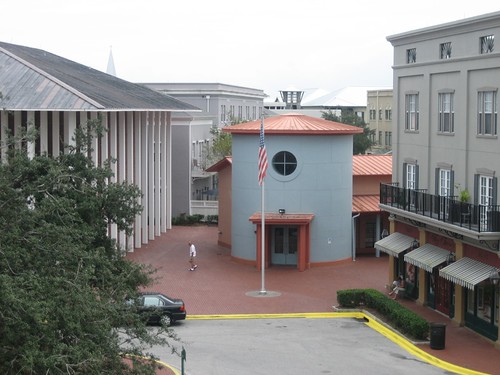
City Hall (left), Post Office (right)


5 Comments
i've stayed it that resort.
It blew, the only good thing about it was the arcade, but the rooms were tiny and uncomfortable.
The McDonald's is by Venturi, Scott Brown & Associates, 1996.
hotel, thanks, that is what I thought and was telling people but was not 100% sure.
Apurimac, my room was comfortable enough, but could uncomfortable rooms be a good thing to create thriving public spaces? Isn't that what happens often in NY where your room is so small and uncomfortable and is only worth it because the city is your livingroom. In the Disney case it may be that they want you out of the room and spending money, but still....
True that Q, although street life in my 'hood ain't what it should be. I get envious of other peoples 'hoods.
disney + mcdonalds - two of the worst urban inventions
Block this user
Are you sure you want to block this user and hide all related comments throughout the site?
Archinect
This is your first comment on Archinect. Your comment will be visible once approved.