
Sep '06 - Dec '09
CHECK OUT THE UPDATED AND EXPANDED PORTFOLIO, also includes larger images...
A last review of the design work that I included in my application portfolio before my new design studio series begins:
NY1: Manhattan Youth Community Center
Main idea: I used the imaginary circulation patterns of a UN diplomat and hot dog vendor to design a surrealist structure (with t-shirt). This process helped me create a building in which three circulation systems for three different programmatic pieces intertwine to create constant movement, chance encounters, and constant interaction.
Program: The building has housing, educational, and entertainment programs.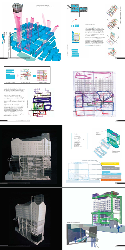
NY2: Harlem Center for African American Culture
(NOMAS competition with a large team, I led the team and focused on the design to see the names of all that participated see the flickr image)
Main idea: We used the grid of NY, its circulation system, and complex facades including the emergency exits to design an open system of programmatic pods and system of circulation inside the existing Hotel Theresa in Harlem. To give the community as much space as possible in the "public" functions of the building we put galleries on top of the building thus opening the interior of the shell as much as possible.
Program: Public functions on the lower levels and in top of the building, educational spaces sprinkled throughout, big band shell in the middle.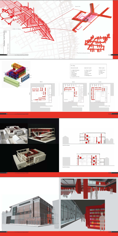
CHA: Charleston Public Library
Main idea: Create on large continuous wall of books (red), thus giving as much space as possible to public functions of the library.
Program: Library, offices.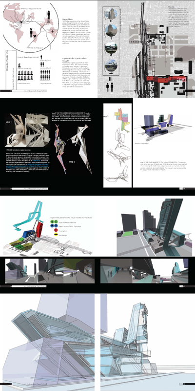
ORL: Re-thinking Orlando's Downtown (yes, there is one)
Main idea: by a series of exercises with "trusses", I designed a large truss that could soak up all the programs to either complement or supplement the existing surrounding programs. The idea is that through the use of this truss-building areas of Orlando can become more dense.
Program: Anything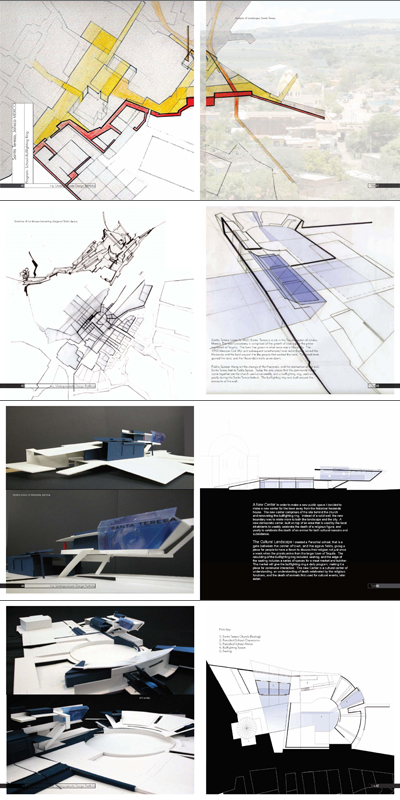
MEX: Parochial school/Bullfighting ring
Main idea: the project was to create a center for a growing town in Jalisco, Mexico. I used two programs that are intrinsically intertwined in the town's psyche to create an "event space" to worship and meditate on life, with all its bloody consequences (Jesus, bull...), both human and animal.
Program: same as title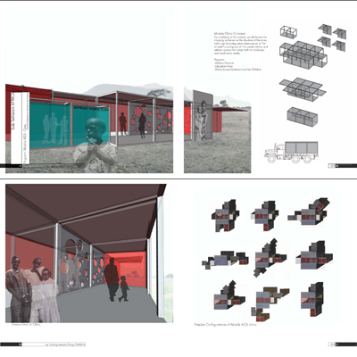
AFR: Mobile Aids Clinic (AFH Competition with buddy who is now in Berkeley)
Main idea: A kit of parts to create a mobile AIDS clinic that is very flexible and easy to construct.
Program: same as title
In Collaboration with William (Bo) Ogle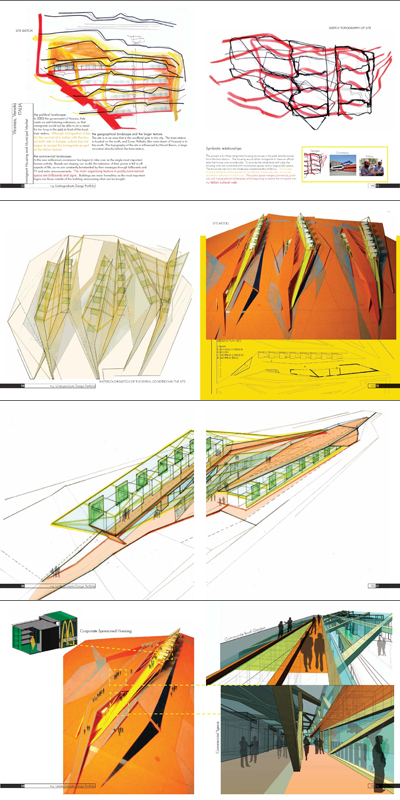
VIC: Vicenza's Landscapes of Change
By looking at the landscape in Vicenza, Italy create a space for the new Italian: the immigrant. This project is about corporate sponsored housing, inside of large commercial shells to help out newly arrived immigrants get jobs and housing.
Program: Housing/Commercial


17 Comments
very nice +q. I wish you had PDF though... the size of the images of this posting doesn't do justice to some of the images.
Very nice work... I just sent you an email.
great work...show off!
just kidding. love the vicenza project.
dot, not showing off, just revisitng my past work for one last time before embarking in a new design semester in a new school. Plus i think that some people starting to go through the applicaiton process might be interested.
DEVicox, if you want an image I could send it to you, the PDF of the whole thing is something like 20MB or more...
And just to make it clear, this is all work done while at the University of Florida, where I got a Bachelor of Design from, and used to seek acceptance into the GSD MArch I AP program.
very nice stuff q, altho i share DEVicox's lament of not being able to see the images/text in a larger format. I'll assume, however, that Harvard thought it was acceptable work... ;-)
The very first project at the top is quite beautiful. The physical model set into the context looks amazing.
"...it's decent." in the voice of the infamous A. P.-M.
You got very nice work, Really cool stuff.......
Quilian,
Zach Rose here [UF]. Haven't heard about or seen you in a while...glad to see that you are doing well.
Drop me a line sometime. zrose@zr3d.com
~Zach
very dope work!
Impressive, no wonder you got into Harvard.
Hello Quilian...
I am a new user and had just come across your blog. I was admiring your portfolio and I have a question regarding the transparent image of your Orlando model (the first one above the project description). How did you do that? Is it using 3D Max and Photoshop? I am currently working on a project where I would like to show the transparency of the spaces. I'd be grateful if you'd respond when you get a chance. Thank you :)
is this really all pre-harvard? the quality is what I'd expect from someone already in the program. nice work.
Very nice. This is for MArch II right?
MArch I AP
Do you happen to know where I can find any examples of portfolios that got accepted to non-AP March I at GSD? razorzor@gmail.com I'd really appreciate it.
Thank you for sharing. I am starting undergrad in architecture next semester. This is truly inspirational and informative.
Block this user
Are you sure you want to block this user and hide all related comments throughout the site?
Archinect
This is your first comment on Archinect. Your comment will be visible once approved.