Hong Kong, HK | Singapore, SG | Beijing, CN | Shanghai, CN | Chengdu, CN | Shenzhen, CN | Macau, MO | London, GB | Dubai, AE | Abu Dhabi, AE | Seattle, WA | New Delhi, IN
Standing on the summit of Victoria Peak since 1992, the Peak Galleria welcomes millions of travelers each year who come to catch a glimpse of the spectacular view of Hong Kong. The landmark shopping arcade with panoramic views to both the Victoria harbor and the Pokfulam Reservoir, offers a multi-sensory shopping, dining and entertainment experience attractive to international tourists and local families. Due to its long history, the premise had become obsolescent and worn out in the past decades and was in urgent need of a makeover.
Aedas was commissioned by the Client to renovated and modernize the property for a brand new outlook. Undergone a more than 2.5 year redesign and construction, Peak Galleria re-opened in 2019 with a modern image of a rising bright gem stone sitting on the peak. "The Victoria Peak is of great significance to the history of Hong Kong and the local citizens. To bring back the glory and glamour of the arcade, it needs not only a fit-out in modern architectural language, but also a re-positioning of the development. We are making it an inseparable part of urban life in Hong Kong, a leisure destination for the citizens, a playful memory for children, and a Hong Kong image for tourists", said Ed Lam, Executive Director of Aedas.
To achieve this goal, three key strategies have been applied for rejuvenation of the arcade:
1. To create a gem-like, eye-catching entrance that resonates the city’s lively spirit and symbolic image of “Pearl of the Orient”.
2. To improve circulatory and visual experience to interior space by re-organizing retail layout and circulation flow.
3. To promote interaction with nature and add commercial value to outdoor terraces by creating new alfresco dining area and improve design and accessibility to viewing platforms.
An eye-catching gemstone for “Pearl of the Orient”
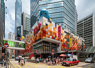
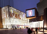
The journey begins as one arrive at the century-old Peak Tram Station. Removing obstructive built works on the plaza, a dazzling gemstone immediately draws attention from visitors while the two wings extends to form a welcoming hug around the plaza. Sharp angles of the thick red granite were replaced by tender curves of the glass and steel structure, reflecting a lighter and younger image of the shopping arcade with a style.
The design draws inspiration from the "glowing gem", combining two inconspicuous entrances into one grand iconic entrance. Triangular glass panels are applied to realize the curtain wall’s diamond-cut pattern, sparkling to create an eye of the peak. Bright and glittering in the sun, it reflects the surrounding natural landscapes and changes of the sky from different angles, stimulating an intuitive interaction between architecture, nature and people passing by. As night falls, LED lights on the grid shell structure put on a light show like a meteor shower, brightening up the Peak to offer a different kind of fascination from daytime.
To realize the 3D structure of the gemstone, a CNC machine method is adopted to produce the star-joints in accurate and extraordinary touch of finish. The components of the structure are prefabricated to ensure accuracy during composition, while reducing transportation cost and construction time.
To return space to the city, ample communal spaces are created for people to share and interact. The public plaza has always been a place for gathering and transit. Transforming an existing fountain into a lawn, it endows the plaza a broader view and an inviting vibe.
Improve Atrium and Spatial Quality
Lights penetrating through the curtain wall, the open and permeable entrance introduces a pleasant sense of arrival as visitors step in. It blurs the boundary of indoors and outdoors by inviting natural lights and extending stone patterns and materials of the exterior wall and plaza into the interior space.
With optimized layout and rich colours applied, the design changes the dim and cramped visual impression of the arcade. The main atrium is strategically widened from 4 m to 8 m in a comfort and proper proportion to enhance spatial quality and allow events and gathering. The arcade is re-arranged into a singular loop to improve wayfinding for visitors and commercial value for retail shops. Coherent with changes on the building facade, the sharp corners and straight angles in the interior space are also modified into curvy round aisles to generate a softened affinity to visitors.
Existing skylight structure is retained and upgraded by adding a thermal insulation film to filter out heat and sun glare. With sunlight shedding in, the new lighting system and the overall light tone of the arcade creates a bright and amicable atmosphere that people almost feel that they are walking in the sun.
An installation art of glass panels is set on top floor along the passageway. The “Rainbow Corridor” features glasses in different forms and colors - creating gradients of the color spectrum - and reflect the changing sunlight into playful shadows within the atrium. The rhythmic light and colors eliminating the sense of confinement in an enclosed space and creates a special “check-in” place for the mall.
Human-nature interaction with blurred boundaries
Accessible terraces are set on each floor to maximize view for visitors and generate additional value for the commercial space. Existing solid parapet walls are demolished and replaced by clear glass balustrade. All restaurants in the development are placed with alfresco dining area enjoying different angles of the view. Collaborated with local artists on design of the children playground on 2/F terrace, an inspiring culture and art space is created to enhance engagement and liveliness to the arcade.
Strolling up to the observation deck on top, the gem-like curtain wall of the main entrance extends upwards to as railings. The glazed panels are visually lighter and physically thinner, reducing distance to the natural scenery. Viewing the cityscape afar, high-rise buildings blocks below showcase prosperity of a bustling Hong Kong; while natural forests and ocean on the other side speaks for an everlasting tranquility of the land. Taking photo from any of the triangular frame is like a silent dialogue between man and nature, architecture and the environment.
The designer’s effort is well paid off: "More and more citizens are choosing Peak Galleria as their weekend destination for family gathering. You can see children playing, friends hanging out on the terrace and tourists acclaiming for the views on the observation deck. The best refurbishment is to bring the building into life, returning space to the city, and inviting people to visit and celebrates its new life."
Status: Built
Location: Hong Kong, HK
Firm Role: Design & Project Architect


