anchor
A Fresh Start


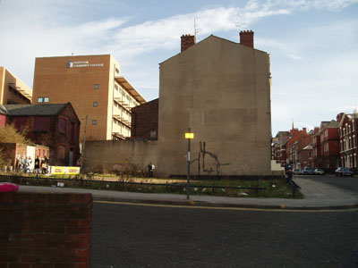
Here is the approach to the site of our next project - a welcoming police station. At the top of this hill is the Metropolitan Cathedral, and at the bottom is the beginning of the shopping centre. All around are Georgian buildings, light industrial works, monstorous 60s car parks and various bits of 'new build'.
Design a neighbourhood police station on the site on Mount Pleasant which includes the accommodation below.
You should bring to the project an opinion of the role of police in society and how your architectural solution can address some of the problems that they are now encountering.
Reception with counter
Display area
Public meeting room for 20-30 people
Private meeting room for 2-4 people
Duty officers room
Charge desk
Custody suite
Locker room incl. showers and toilets
Offices for 5 staff
Individual offices for 2 staff
Rest room
Seperate staff entrance
Secure parking for 2 cars + 1 standard Transit size van
You should look at a wide range of similar building types, both in this country and abroad to see how others have tackled the problems. As a starting point look at the Koban police stations in Japan.
The site is approximately rectangular, with sides of 25 and 20 metres, and is situated on a corner at the end of a terrace.
I'm looking forward to this project. Not because of any particular interest in the police, which I'll have to read up on, but because it's a structured brief and a fresh start. My last design for a project was unfeasible - floating on the surface of a river, without much of an idea about what materials to use - so my goal with this one is to create something practical and buildable.
For Thursday we need to present a site analysis. Its physical characteristics and our emotional response. I'm unsure of how to present as much information as I'd like to in a condensed way. Perhaps it would take the form of a model.
Hopefully over the weekend I'll be able to show the brief to some police officers, to see what they'd recommend, and visit a few police stations.
Oh, and another thing which needs sorting... After a traumatic holiday of portfolio compilation, I've decided on two constraints which will make things easier next time. Firstly, everything will be done in black and white so that I can focus on the important things, and print everything cheaply. Secondly, I'll try to stick to a layout grid which I'll establish at the beginning of the year, so that everything looks visually coherrent by the end.
Unrelated link:
Urban Art Official - for the best curation in street art today! Watch this space for news of future involvements...


4 Comments
Hi drs,
Nice pics; I'm just starting to realize the potential for these blogs to serve as a place to almost subliminally test studio design ideas (since I don't think we'll be giving each other critiques). Anyway it's great to see the actual studio brief... I would have put some of mine in the blog but it's about 12 pages so no go.
I love the Machester Cube site: it's great when a gallery actually shows shots of the exhibition.
Cheers man. Hope they communicated a bit of the approach. Had to take a few more to sketch over the top of today, which I'm prouder of, so I'll post one of those up.
I do think it's good to post up progress to obtain feedback. Put things out in the open, allowing others to see how the school works, then maybe get something back in terms of criticism.
The brief was abbreviated, but certainly not twelve pages - that's a bit deep, isn't it?
I agree with you on the feasability and buildable comments. So far in my Studio everything has been kind of fantastic and imaginary and dream-like. It's kind of interesting to design without realistic constraints, but it also seems a bit impractical.
Good luck with your projects.
Cheers.
Yup. It sometimes unsettles me to think that we're just producing pretty pictures! Marrying 'buildability' and the fantastic is the real goal. Traditionally we would've started out on the former end of the spectrum but now it's probably more trendy to start at the latter and work through. Our school seems fairly well balanced but it's easy to sway towards the unbuildable - often through laziness!
Block this user
Are you sure you want to block this user and hide all related comments throughout the site?
Archinect
This is your first comment on Archinect. Your comment will be visible once approved.