Archinect
KMA Architecture

KMA Architecture

San Diego, CA

anchor
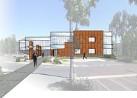
This retail renovation was designed to unify 2 separated levels of retail that shared a sloped parking lot.
5 more images  ↓

Scripps

KMA Architecture designed a new overall look for this existing two-level retail center which was built in the mid-1970 (see existing photo, below left).  KMA’s first priority was to add value wherever possible. The existing shopping center, while at a very busy intersection off of a main section of freeway was visually insignificant within its surrounding environs. Our design team was able to reinvent the building in a way that increased the property's visibility and minimized costs to the Owner by not altering the existing building structure. These design aspect made this renovation a smart investment for the client and was an opportunity to increase property value.

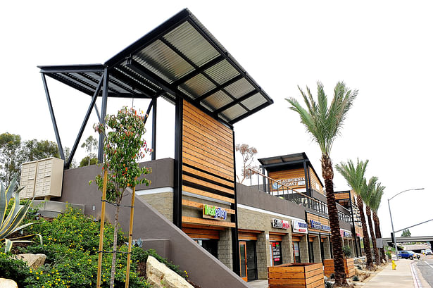
KMA addressed the deficiencies of the existing center by creating more noticeable design features and elements that improved the visibility of the project and finally provided convenient access between the first and second levels. The design added strong structural facades to the corners that would grab attention and add emphasis to the center by implying height without making any integral changes to the original building. KMA is very familiar with the renovation of existing commercial and retail centers; we are well versed on ways to minimize the costs of improving your property to make it an optimum balance of expense and return.

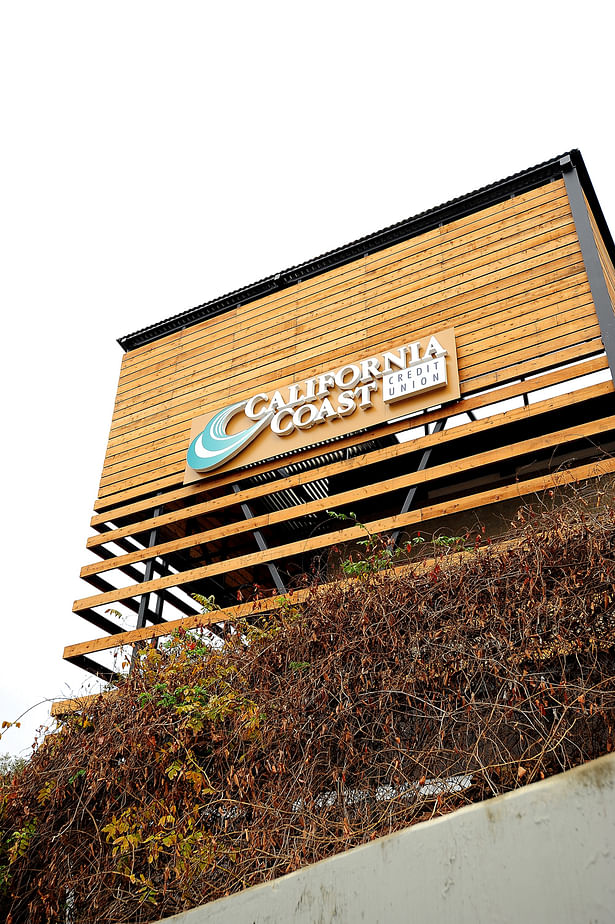
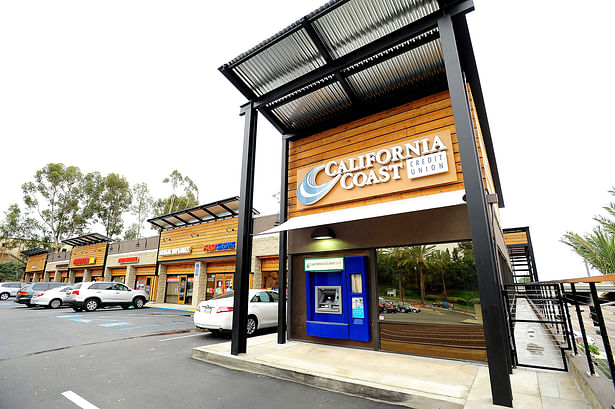
  • Working closely with the client, the KMA design team reinvented the facade with a contemporary look inspired by industrial building elements such as wood planking, corrugated metal roofing and painted steel framing.
  • KMA also delivered value by exploring alternative materials, considering their cost and longevity, and by keeping the scope of the building improvements under a threshold that would not trigger a costly structural upgrade or any additional site improvements.
 
Read more

Status: Built
Location: San Diego, CA, US
Firm Role: Project Architect
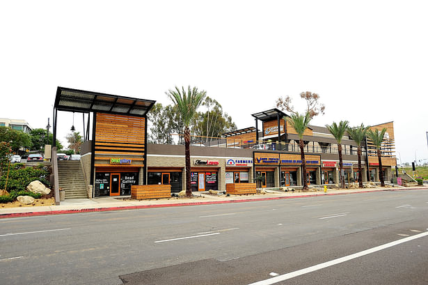
 
The varying heights and consistent use of materials makes the building read as a group of interesting elements from a pedestrian or passing vehicle.
The corner volume at a highly visible corner allows for implied height without altering the existing building.
The minimal use of materials helped keep the tenant signage standardized but still unique to each business.
The beauty of this design is that the renovated portion of the center is ENTIRELY independent from the existing structure and therefore minimized the costs by not triggering site and building upgrades.
The client desired the renovation to imply a commercial-industrial look so the materials selected were minimal and exposed.