Aug '08 - Jul '09
So, I'm going to blog a few "epilogues"....this is because, technically, I'm not a student anymore since I graduated a few weeks ago, but I feel compelled to keep writing to you until I know what I'm doing with my life. And I still don't. Thus, the epilogues.
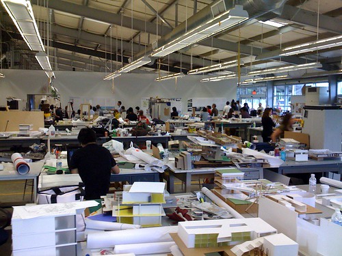
Yesterday I had the privilege of participating in the final reviews of the 3rd year students at Cal Poly Pomona. One of their instructors is Archinect Senior Editor Orhan Ayyüce, who asked me to join the juries (which included Cris Anaya, former school blogger, and Archinect's "Voice" Marlin Watson), and I happily agreed. I've only done juries a few times but I really enjoy the opportunity to interact with younger students and get them thinking about issues that may have never crossed their mind during the course of their project. I am adamant in thinking that a final review should be a learning experience - just like a good final exam is one that you can learn from - so I tend to be gentle to the students, as I don't think learning experiences need to be traumatic to be impactful.
In any case, the students were great and very gracious, and it was a long and tiring but rewarding day. Something that struck me was how far along these 3rd years were compared to where I was in my 3rd year. They all had 3D models plus physical models, and in most cases, they had clean and clear presentations. Holy crap, I just remembered I was a 3rd year 10 years ago! Time flies when you're having fun, I guess :-|
17 Comments
Awesome! I love being on juries, LOVE it. Emily I know for sure that you would make a great teacher, by the way. Something to consider in your wide-open future, maybe... we need more female representation at the heads of studios.
(yes, I know I'm going to get slammed for saying that...)
Good for you, Emily... being a good juror/critic is hard and important work. And driving out to Pomona? Well, that's above and beyond the call of duty!
Shouldn't the proper term "Epi-Blog?"
Manta do you think a wise women would be a more empathetic supreme cour... er i mean studio head?
ah ha ha! ...remember when I said I didn't 100% agree with her? hmm.
I really hope a photo pops up with Emily looking all jury-ish
emily, you are a great critic. if i had the powers, i'd hire you as a faculty immediately. your comments were so thoughtful, constructive and helped students a great deal. i sincerely look forward to work with you again.

cris anaya commenting, and on far left, emily kemper with her green camera phone
Thanks Orhan :o) I really did enjoy it! Also the reason I was holding my iPhone was because I was using it as a timer to keep the students on track and not let them talk for too long ;-D
Interestingly, in going through all the stuff in my apartment before I move, today I unearthed the drawings from my 3rd year project and they are - are you ready for this? - ink on vellum! I was in school when the big shift started to happen from paper drawings to CAD and so, while my 3rd year drawings were by hand, my 4th year comprehensive studio drawings were done in the computer. And for that reason, I kept the meticulously crafted 3rd year hand drawings while I threw out the rest. I just couldn't bring myself to trash those pieces of vellum that I remember spending so much time on, even though I can safely say the project was my "fun with a compass" design. Ah, school....
I too have noticed how much better student work looks today as compared to the decade + since I was matriculating. Then again when I was an undergrad we were making models from basswood and chipboard by x-acto knives. Today they have lazer cutters. We had big plotters available, but only in special labs as a pay per use option. Today they have HP plotters right in the studio. We did have computers/laptops way back then but FormZ was a brand spanking new software and only the $5000+ laptops could handle a decent rendering. Today a $1000 or less laptop can crank out 3D graphics we would only have dreamed of. Bottom line, technology has made students present much better, but I think the overall quality of graduates has remained about par over the years.
the digital shift has taken over a decade. As an undergrad in the early 90s, we started experimenting with first generation formZ and other modeling programs. in grad school in the early aughts, they changed the first year curriculum from being focused on constructing intensive hand drawings to all digital the year after I started. Not sure if I agree that the projects look better - student often get caught up with superficial rendering issues that prevent deeper architectural exploration and development. but I won't complain about retiring my electric eraser and triangles.
i tend to partially agree with barry and aqua.


there is also the allure of particular building form favored by the students and often you see the same fluid building form regardless the building type rendered from every possible angle leaving little for imagination. this has start to have reverse sympathy impact already. most faculty are sort of tired of seeing this and people are down grading them more than before.
personally, i evaulate each project by its own merit. but word out there is; "renderings are dime a dozen".
i usually warn my students to do one but do it well. they usually saturate the board with the same drawings over and over. it gives them instant gratification as advanced designers but if you keep your eyes on the drawing long enough they, if they are not done well enough, start to fall apart pretty fast. they don't spend enough time on the structure of things.
one thing i know gets zaha hadid very excited is talking and considering structural engineering. most people don't know that...
just my observation from the other side of the camera if you will.
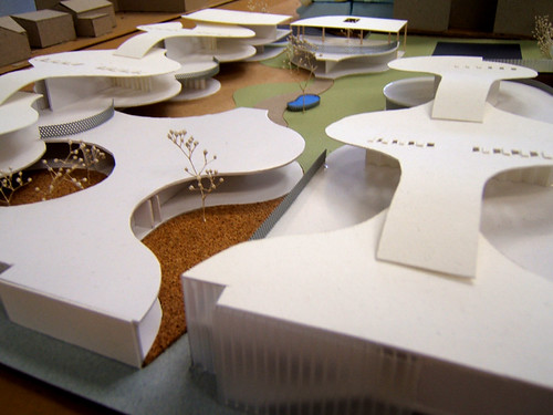
here are couple of elementary schools came from my studio.
I definitely feel that for me, personally, the availability of graphics programs like Illustrator and InDesign have enhanced my work to where I can actually convey the ideas that I'm trying to get across. I just wasn't fast enough with hand drawings. I'm glad I learned them, but I don't think I need to go back to them any time soon.
i really don't see any reason to be 'nostalgic' about hand blown drawings either.;.)
my critique is the same either way;
"what is behind or under all these renderings, models and shoes you are wearing?"
then we get to talk about the project.
I was in a critique last winter when the topic of rendering time came up. The critic (I don't remember who, there were about 6 of us) said that a student had too many interior views, none of them very well-composed. His (the critic's) theory was that when a rendering took 15 minutes or more to "render", you had to choose which views you wanted very carefully. Even moreso, of course, when one was constructing a perspective. The availability of literally hundreds of views ready to pin up as fast as a printer can spit them out means one doesn't have to carefully consider which views actually "sell" the project best.
Similar to my own theory of digital picture taking, I guess: I'm lousy at composing photos, so I snap 50 and hope a couple of them look good!
Obviously students, and practitioners, should use the tools available to us - I don't especially want to hand construct perspectives, either. But selecting and editing your images carefully based on the context is still critical: if you're presenting a project to other architects, you'd pick four specific views; if presenting to the neighborhood association, three different ones; the contractor gets the views that explain the massing; the bank sees the money shot, etc.
Anyway, thanks for posting the additional pic, Orhan! What a cool studio space, too.
Much of the digital 'design' process foisted on ignorant students over the last decade is how to edit and select the best looking image/shape from dozens of iterations - that isn't design. Design is a deliberate process of creating a solution. Digital cameras don't make folks better photographers any more then digital design tools make better architects - they just allow amateurs and the talent-lacking masses to generate lots of crap.
Learning how to look, compose, and anticipate the transient phenomina that make a great photo and great architecture takes lots of deliberate practice. 50 snap shots are not going to improve your picture taking skillz - but 50 carefully frames and shot images can. Yes, digital files are cheap, very cheap compared to film - so there is no longer the pressure to edit in the view finder before taking the picture. Design students need to be taught that discipline again, too.
I think the battle between hand drawn vs computer renders is global; however what I find most relevant no matter when it is brought into the process are models. Yeah for the models!!
handbuilt


handbuilt
handbuilt
digital + handbuilt
digital + handbuilt
no need for either/or
i'll agree that emily is a good/fun/helpful critic. she was for us at governor's school. maybe that rv tour should make a pass through lexington ky?
Thanks Steven. We'll see...if I decide to do it, I'll let you know :o)
I just want to say that regardless of digital or hand drawn presentations, there is something inescapable about hand-built models. I just think that if you can't build a model yourself, how do you expect to convey that idea to another person, the builder included? I'm just saying...
Block this user
Are you sure you want to block this user and hide all related comments throughout the site?
Archinect
This is your first comment on Archinect. Your comment will be visible once approved.