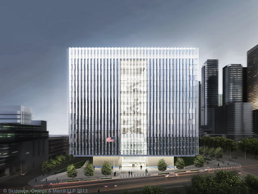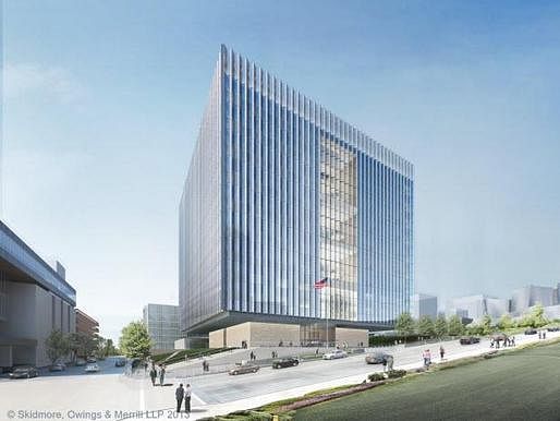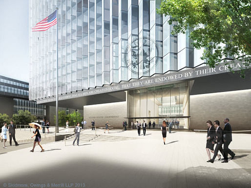

Since we first announced that Skidmore, Owings & Merrill was chosen to design the new federal courthouse in Downtown LA, construction for the new cubic courthouse at the corner of First Street and Broadway began on August 8.
The approx. 600,000 square-foot building was proposed back in 2001 and approved by Congress for $400 million, but the project came to a halt in 2006 when the Government Accountability Office found that costs had tripled due to delays and design changes. The new $319 million courthouse -- designed by SOM in partnership with Clark Construction -- will be an addition to the revived Civic Center area, as reported by the LA Times.
Aiming for LEED Platinum, the serrated façade of the "Cube" is designed to achieve a north/south orientation to maximize views while reducing solar heat gain by 47%. The building has water and electricity conservation strategies and a 400 kW roof-mounted photovoltaic array. Part of the courthouse's design is to appear floating over its stone base which also makes it safe from earthquakes and bomb threats. The cubic form of the building is described as an updated, abstracted version of archetypal Federal architecture.
The courthouse will accommodate 24 courtrooms, 32 judicial chambers, house the U.S. District Court and the Central District of California, and provide related services and facilities for the U.S. Marshals Service, the U.S. Attorneys’ Office, Federal Public Defender, and the General Services Administration.
Completion of the project is expected by 2016.
Live webcam coverage at the construction site can be seen on SOM's website here.
All photos courtesy of SOM.
6 Comments
This is great, we are back to the late 70s.
nostalgia rears it's ugly head...again!
I like it and I don't.
I like that it's simple and contextual with so many existing buildings in DTLA, almost too much so. I wouldn't have wanted another Gehry piece in the general area.
I don't like that the vocabulary and massing is somewhat trite, relying on a closer inspection of the surface articulation to make it look current, something which most non-design types wouldn't do in the first place.
But it's better than some more recent courthouses in the West, such as this one, in Sacramento, for which I only like the podium. The back side of the building is far worse, IMO:
http://www.nlarch.com/portfolio/images/full_usfedch1.jpg
And this one in Portland, OR, not ME:
http://upload.wikimedia.org/wikipedia/commons/thumb/6/69/Hatfieldcourthouse.jpg/220px-Hatfieldcourthouse.jpg
I guess it's all the needed spaces for incarceration / detainment and secured functions that make for so many solid spaces on their exteriors, and make them kind of foreboding.
I think it's all the post 911 homeland secutiry stuff also, but agreed, it could be handled better.
Not a fan from the looks of this. Could be better.
Interesting to see a (neo-) brutalist form justified using contemporary sustainability rhetoric. I think that I like it just because it follows one specific formal/design direction such that it knows what it is, whereas a lot of corporate architecture seems to follow no specific agenda at all.
Block this user
Are you sure you want to block this user and hide all related comments throughout the site?
Archinect
This is your first comment on Archinect. Your comment will be visible once approved.