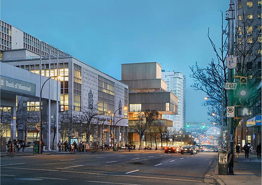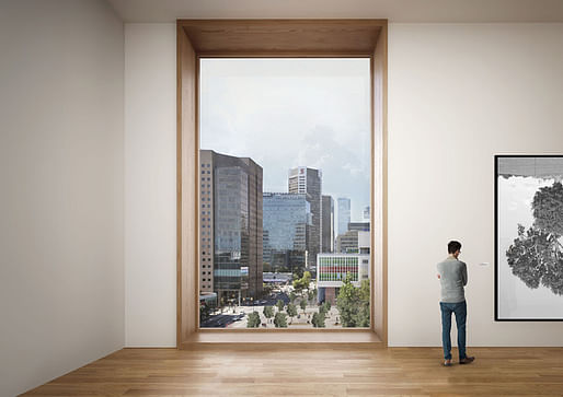
After beating out KPMB Architects, SANAA, Tod Williams Billie Tsien and DS+R to win the project back in April of 2014, Herzog & de Meuron have now released the first look at their design for the new Vancouver Art Gallery, a significant update on the Gallery's old neoclassical building and the firm's first in Canada.

The new Gallery will not only double the amount of exhibition space to over 85,000 square feet, but also relocate the institution a few blocks into a quickly-developing sector of Vancouver's downtown. The formal update is pretty extreme – the prior Gallery's columns, front steps and flanking lions bestowed a formal, traditional vibe, while Herzog & de Meuron's stack of wooden and transparent volumes is top-loaded so that "the modest, almost domestic scale will enhance the character of openness and visibility for everyone," according to Jaques Herzog in a statement.


For more information on the Gallery's redesign, check out our interview with museum director Kathleen S. Bartels.
7 Comments
Reminiscent of their proposal for the Kolkata Museum of Modern Art
I hope the Queen Elizabeth Theatre is on board for the dramatic changes to their plaza -- which I hope they are, but the A LOT of how this works urbanistically depends on significant changes they are showing on a neighboring property (RIP Media Club).
The other question that stands out is -- why so vertical? Pushing it up against Georgia feels like the right move, and fronting onto a shared plaza with the Queen Elizabeth is cool, but they are using quite a small portion of the site. I think at one point I heard rumors of using condo development to bolster the budget... maybe the rest of the site is being reserved for something more to be revealed at a later date...?
I think the proportions are awkward and am left wondering what they are doing about the considerable grade on the site. Looks to me like they are planting the building on a podium and doing the standard underground parking garage with street level entrance along the SE side...the same crap Vancouver has been doing since the 80s. I was looking forward to this building given how bleak the architecture in the downtown core is and have to say I am quite let down. Maybe the release of floor plans and section drawings will show some interesting things happening. The only thing going for this building that I can see is that it isn`t another glass block. Congrats on that I suppose...
From the images and descriptions I've been able to glean off the interwebs, I have to say that I'm really, really disappointed.
the next architect that does the stacked boxes thing should be permanently banned...
And these guys need to change that pic asap! I keep thinking it's Simon and Garfunkel.
The Pritzker is highly overrated, and the superstar quality it bestows - especially on this pair of bookends - is equivalent to Milli Vanilli winning a Grammy.
Block this user
Are you sure you want to block this user and hide all related comments throughout the site?
Archinect
This is your first comment on Archinect. Your comment will be visible once approved.