
Oct '11 - May '13
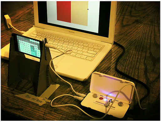
My piece for 2D crit is entitled Frank Lloyd Wrong.
Like my explanation in the end of the crit (other departments utilize the ‘cold crit’ system—meaning the artist cannot say anything during most of the crit, letting the work defends itself in front of a supposed-to-be critical audience), this is a small joke that turns out big just because I take it really seriously. My premise is simple: “how could design plan be translated into sounds?”
A review was written by Brian Kavanaugh (a Painting student who is a 2D elective as well). Here's what he wrote:
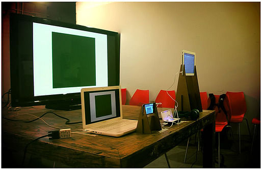
When first walking into the crit space in the Architecture building I found myself attracted to the electronics laid out before me due in part to the similarity to a retail display. Instead of being overwhelmed by four separate screens, I was surprisingly at ease with the familiarity.
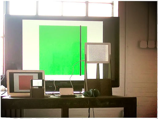
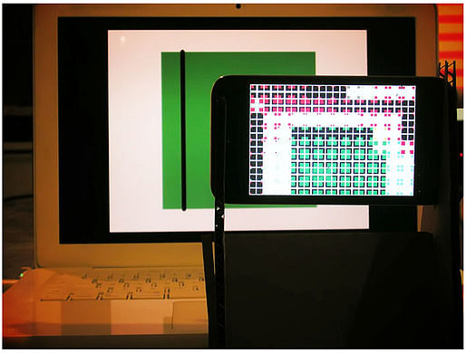
Relationships of two are quickly identified, one pair of screens showing single large squares of varying patterns and colors, another pair exhibits much more convoluted imagery that appears to be related to the larger squares because of basic similarities in shapes and colors. And each small screen is matched with a larger one when viewed straight on. After perusing the four screens and their tangle of cords I did what came natural, I touched stuff. Double tapping the iPad screen changed the pattern before me, from crossed over squares and rectangles to lines, sometimes abbreviated, stretching north to south then to a third iteration of squares within squares within squares, etc. This was the same for the iPod Touch. Along with each visual change came a subtle change in the audible effects. There are specific properties in the sound output that are matched to each type of patterning happening on the touch screens. Using the slider in between these devices one could easily go from the audio of one device to the other or split the difference. It also became clear that the images on the hand held devices were completely reliant on what was presented on the larger screens, captured through the cameras of the iPod and iPad. The images closest to me when sitting down were being orchestrated by the simple squares farthest from me. It came as a relief that I wasn’t in the company of a seemingly random happening of shapes and sounds but a considered system in which one piece was reliant on another. I couldn’t immediately decipher how the relationship was formed but I knew I at least had some amount of selection in the experience of it.
The computer application or “app” used in Farids work to create such designs is entitled Field, created by Austrian video artist and media designer, Rainer Kohlberger. Because it is so succinctly described on the artists website I figured Ill use his own words to describe his work;
Field is an abstract audiovisual work that generates itself through real-time camera input. Brightness saturation and color are interpreted, and translated into a constructed grid. The image plays the sound.
RULES, STICK TO ‘EM
Unfamiliar with the history of generative art, I saw an opportunity to get a lesson, ultimately helping me understand what I had come in contact with. It was time to do some old fashioned research. On his website, Rainer Kohlsberger credits the painter Theo van Doesburg and his idea of “concrete art” as main inspirations for Field. Doesburg helped with the formation of De Stijl, also known as Neoplasticism, with many artists including Piet Mondrian. (Left, Theo Van Doesburg, Composition XXII, 1922) There are six tenents of Neoplasticism that dictate the overall aesthetics, ranging from colors to be used to the absence of symmetry but adherence to balance. Doesburg became involved in Concrete Art in the 1930s. From its outset Concrete artists didn’t think of themselves as making “abstract” works, to them that term meant some adherence to nature. Concrete artists understood themselves as operating parallel to nature, creating work from basic forms, planes, colors and materials. They conceived of the compositions in their minds then went about constructing them perfectly on canvas. They claimed these were “the concretion of the creative spirit.” In the 1960s artists built on the principles of mathematics found in Concrete Art by incorporating computer programming. Often referred to as generative art, the creation of the artist is an algorithm that is then executed by a computer to compose or construct the work. Georg Nees and Frider Nake created some of the earliest examples of this work. (Above, Frider Nake, Walk-Through-Raster, Series 2, 1-4, 1966) Aesthetically akin to some Op-Art of the time, there was a similar idea of democracy in both experience and execution. When the algorithm is published, anyone is able to create the work themselves.
As technology evolved, this was an art form that would grow along side it, a mutually reliant partnership in pushing forward. Eventually artists wished to create an environment in which human interaction could play an immediate role of manipulation in an environment created by such algorithms. Such artists include Golan Levin and Zachary Lieberman, interested in interactive experiences between people and computers. With the ability to carry the technological vehicle of this work with us, Rainer Kohlberger creates three part collaboration between us, the environment and the device that acts as the intermediary.
The work presented by Farid took the role of an instructional tool for me in its presentation. A interesting one but still an event out of which a finite amount of information could be found. I’m not referring to research, all history stops at the present, but since I know the capabilities of the technology set in front of me I had the urge to manipulate it more myself. After I exhausted the small amount of input I could have on the work I was left staring at a mechanism with functions I had used up, experiencing a work with boundaries I just discovered. Instead of inclusion I ultimately felt alienated by a systemically based work that was already configured. It was as if my presence was something the program had to suffer, leaving me just enough to tinker with.
I haven’t before seen any of Farids work and with this I feel I have a great idea of his influences and areas of inspiration. Leaving, I had the picture in my head of Farid meticulously drawing the notes of his favorite song on the best possible staff paper with the finest ink. While containing aspects of Neoplasticism, “rule” art, generative art as well as interactive art I came to understand this work as homage to Farids artistic lineage but found it difficult to identify a space within it to call his.
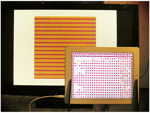
The crit itself went great for me. I achieved what I wanted to, basically a quarrel between the students, Bill, & Elliott Earls, the 2D Design Artist in Residence, about authorship, the meaning of design, education pedagogical methodology, and history, as well as meaning of art. It was a full house, maybe with 50-65 attendees (with people from other departments surprisingly showed up as well). For a couple of second, I felt loved. I had never experienced that kind of feeling before, I still don't know what to do if such feeling come again. Sad but true, for all the people who were present yesterday, I thank you.
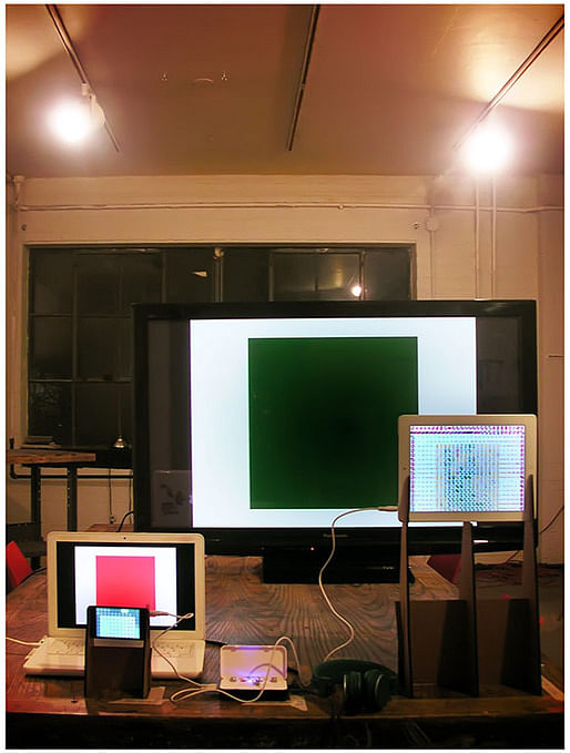
I'm going to leave you all with a video, taken by Doug Skidmore, of me while setting up & playing around looking for my favorite arrangement of the piece.
I hope this is not the last time you'll hear about Frank Lloyd Wrong… To be continued?
A school blog on Arch Dept, Cranbrook Academy of Art. By farid rakun, admitted Fall 2011.
No Comments
Block this user
Are you sure you want to block this user and hide all related comments throughout the site?
Archinect
This is your first comment on Archinect. Your comment will be visible once approved.