anchor
resurfacing - an architect spy among art students
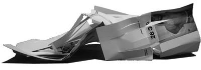
last entry i mentioned a venture into the world of 'communication design'... or graphic design to most people. being the idiot (and possible sadomasochist) that i am, i re-entered the undergraduate arena, the BFA in communication design at the University of North Texas. it started out cool. i felt like a spy - the rogue architecture grad subversively observing art students who are just discovering the design discipline.
i laughed when the professors told us the program would kill us. "you won't sleep. you'll have no friends, blah blah." i remembered the long nights, the basswood, stabbing myself with piano wire, cutting off part of a finger with an xacto-blade, etc. i thought to myself "you kids are in for a real treat." i feel like wearing a badge that says 'get real - i survived architecture school'.
what's been really nice is having to take drawing again. i felt disconnected from drawing as i became more and more reliant on the computer as architecture school wore on. i hadn't done a manual perspective or rendering in years. so using my hands again - that has been quite enjoyable.

this semester i'm taking design II, which for most art students is the first foray into the third dimension. i wouldn't have taken it were it not absolutely required. and let me tell you... some of them are really scared of that dimension. our first assignment - to dismantle an extension cord into its vital components and use the wiring to delineate an abstract form. pretty cool. when i get the models back i'll post pics.
our next assignment is to construct a series of spatial variations using three intersecting planes. pretty simple. i nearly threw up in class after the instructor suggested the work of 'that architect frank gehry'. needless to say i'm not a fan of his.
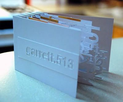
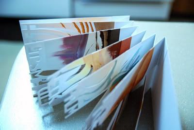
a project that came about last semester - the 'body book'. we had to make a book using an accordion structure (which i applied to the spine rather than having the pages fold out like an accordion, like everyone else was doing). i cut the pages in half and had them cross over each other. as to the 'body' reference.. we were instructed to take photographs of our skin in various lighting conditions and use them as swatches to be color-matched and reproduced with acrylic paint. my classmates smothered their books. every surface was covered. i guess i like clean white pages. i also drew diagrammatically over top of the painting.... somewhat of a reference to skin manipulations like grafting and cosmetic surgery.
anyway i hope to keep updating as things unfold.
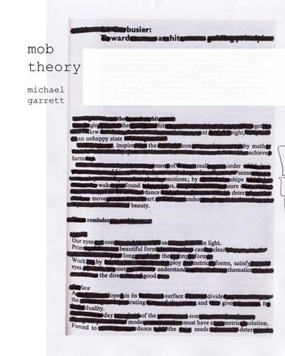


1 Comment
i see helvetica...
Block this user
Are you sure you want to block this user and hide all related comments throughout the site?
Archinect
This is your first comment on Archinect. Your comment will be visible once approved.