
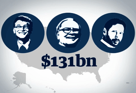
It has been the rallying cry of the Occupy movement for the past two months - but is the US really split 99% v 1%? As poverty and inequality reach record levels, how much richer have the rich got? This animation explains what the key data says about the state of America today — The Guardian
It has been the rallying cry of the Occupy movement for the past two months - but is the US really split 99% v 1%? As poverty and inequality reach record levels, how much richer have the rich got? This animation explains what the key data says about the state of America today


2 Comments
another thing telling us what we all should already know by now. i appreciate the large 99.99% stick figure at the end.
Why are the rich people stick figures fat and the poor thin in the video? Should be the reverse: the poor have to eat McD's every day between their second and third job while the rich can be choosy about their lean, grass-fed artisan burgers...
Block this user
Are you sure you want to block this user and hide all related comments throughout the site?
Archinect
This is your first comment on Archinect. Your comment will be visible once approved.