
Follow this tag to curate your own personalized Activity Stream and email alerts.
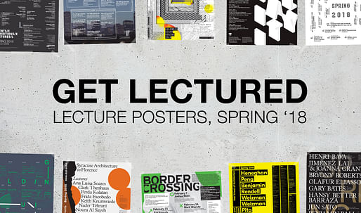
It's that time again to vote for your favorite architecture school lecture posters for the Spring '18 term! If you've been following Archinect's ongoing Get Lectured series, you'll notice that these posters are as diverse as the institutions they represent. The lecture posters serve as an... View full entry
")
Preliminary Research Office, headed by Yaohua Wang, Dingliang Yang and Chloe Natanél Brunner, has shared their proposal for the YeouiNaru Ferry Terminal. The proposed Ferry Terminal is situated upon Seoul’s Han River and is surrounded by both natural and urban landscapes. The project uses... View full entry

Pritzker Prize winning Norman Foster is the latest starchitect to work on a storied wine estate and his client is honoring him in a very special way. Château Margaux, one of Bordeaux’s oldest and most highly-regarded wineries, broke tradition and released a sleek, new bottle design featuring the British architect’s modern building etched in silver. The redesign for the 2015 Grand Vin is the first in Château Margaux’s 500-year history [...]. — Quartzy
If you happen to be a wine-loving fan of Lord Foster's œuvre and are considering to add a bottle of Château Margaux 2015 to your collection, be prepared to (currently) shell out around $1,400 a pop. Château Margaux's modern 2015 addition by Foster + Partners. Photo: Nigel Young.Photo: Nigel... View full entry
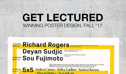
Archinectors got to be the judge in voting for their favorite architecture lecture series posters from the Fall 2017 term, as previously featured in our ongoing series Get Lectured. The results are now in! The IE School of Architecture and Design won by a landslide with 255 votes. Coming... View full entry
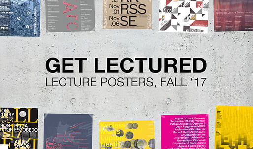
As the end of the year quickly approaches, many architecture schools from coast to coast are wrapping up their Fall 2017 lecture events. As you may have seen from Archinect's ongoing Get Lectured series, the graphic design of these posters are as diverse as the institutions they represent. The... View full entry

Amy Starecheski, oral historian, former squatter, and author of the recent book, Ours to Lose: When Squatters Become Homeowners in New York City, gathered a group who have been documenting the squatting movement from multiple perspectives, from firsthand experience to generational remove. Below, Amy guides us through some of the documents they have gathered and created: a graphic novel, a sketchbook with instructions for DIY electrical wiring, interviews, and installations... — Urban Omnibus
Thanks to Amy Starecheski, the documentation of the gritty romance of squatting in city-abandoned NYC buildings in the 1980s and 1990s can now be perused, graphic-novel style: View full entry

Not content to be merely groundbreaking, Bureau Spectacular's imaginative work is increasingly becoming prestigious. The SFMOMA will display "insideoutsidebetweenbeyond," a large-scale installation the museum specifically invited Bureau Spectacular to design, from February 11th through August... View full entry

Although Los Angeles has had its battles over supergraphics—those painted on advertisements that often stretch multiple stories on a building's facade—the billboard as a concept has received substantially less attention, unless the provocative imagery on it causes fender benders. However, Tom... View full entry

Tokyo 2020 Olympics organizers on Monday chose logo A — a stark indigo-and-white checkered circle — as the games’ replacement emblem after the original design was scrapped last year amid claims of plagiarism.
The Tokyo 2020 Logo Selection Committee chose the logo from a shortlist of four following a competition open to any resident of Japan aged over 18. Almost 15,000 entries were submitted.
The winning logo was designed by Asao Tokolo, a 46-year-old artist [...].
— japantimes.co.jp
"The design comprises 45 interconnecting pieces forming a checkered pattern known as ichimatsu moyou. Use of the color indigo is intended “to express a refined elegance and sophistication that exemplifies Japan.”"Previously: 2020 Tokyo Olympics panel launches nationwide call for new logo... View full entry

'Every day people follow the sun to our city in pursuit of their dreams,' bid committee chairman Casey Wasserman said in a statement, adding: 'We're inviting the world to follow the sun to California in 2024.'
The Olympic movement takes such things seriously. In the past, millions of dollars have been spent on the design of emblems and the often-ridiculed mascots.
— Los Angeles Times
You can read LA 2024's full press statement about the logo's unveiling here, and watch the promotional video below.More on Archinect:L.A. seeks to accelerate infrastructure projects in advance of potential Olympics2020 Tokyo Olympics panel launches nationwide call for new logo designZaha Hadid... View full entry
")
Spiffing up materials the city puts out to promote safe driving “is definitely not what this is about,” Reynolds said. “It's going much deeper into the way we think about designing the streets. Art has the power to get people to sit up and pay attention and jolt them out of their normal ways of thinking. We can infuse unexpected elements into the design of the streets and the way of moving through the streets.” — The Los Angeles Times
For more on the (changing) art of street navigation: • What Do Pedestrian Traffic Icons Say About Your Culture?• Los Angeles has Created the Perfect Parking Sign• Seeking identity through city fonts• From California to Texas, car culture is losing its monopoly View full entry

Infographics make everything more fun, right? "Archi-Graphic: An Infographic Look at Architecture" is a new book that explores the world of architecture in a way that wouldn't be the same with words and images alone.Authored by Frank Jacobus, an assistant professor at the University of Arkansas'... View full entry

Pop Chart Lab — the studio that gained renown for their infographics on culturally relevant topics like beer, cats, comic-book villains, famous TV characters, and so on — recently came out with "The Architecture of American Houses: A Structured Survey from 1600 to the Present", an enticing... View full entry

In Archinect's latest book giveaway, readers had a chance to win the new Graphic Design: The New Basics, 2nd Edition by Ellen Lupton and Jennifer Cole Phillips. Expanding on the successful original edition, the second edition features 64 new pages including explanations on key concepts on visual... View full entry

Type Nite will be coming to New York City for the first time next Thursday, July 16 at Strand Bookstore. Established in Baltimore 11 years ago, Type Nite is a festive evening of typographic entertainment where visitors can engage face-to-face with some of today's leading graphic and typeface... View full entry