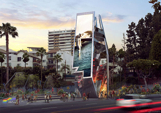
Although Los Angeles has had its battles over supergraphics—those painted on advertisements that often stretch multiple stories on a building's facade—the billboard as a concept has received substantially less attention, unless the provocative imagery on it causes fender benders. However, Tom Wiscombe's proposal for digital, vertically aligned, two-sided billboards that allow people to walk inside of them injects new life into an otherwise sleepy structure, making them less car-centric and more about public space.


The proposed billboards, which were chosen via a West Hollywood RFP over designs submitted by Zaha Hadid, Gensler, and the MAK Center, will be placed in public plazas along West Hollywood's section of Sunset Boulevard.

For more on Tom Wiscombe:
10 Comments
The idea around the public space is good and I'd like to see a few of these designs, but, what's wrong with billboards? They are part of our culture. Oh, it must be the "Clorox clean lines" (Ccl) visual mentality advocated by architects.
Arrrrrgh! I JUST this week gave a talk to our local Sign Ordinance Revision Taskforce talking about how rather than just divide into rabidly pro- and anti-billboard factions we can look for examples of GOOD design - both visual and functional - of billboards happening elsewhere. I wish I had seen this proposal so i could have included it!
I did show Lorcan O'herlihy's Sunset Strip billboard (it's shaped like a wishbone) and Zaha's proposal for this same location. I also showed Peru's UTEC billboards that are also air- and water-filtering systems.
Nothing against using billboards to define urban space but, as designed won't this be dangerous at night? Maybe raise it up on columns or something........
Once again, and avante garde architect manages to take something bad and make it a hundred times worse.
that shit is wack - monument to the 3rd international funded by mc donalds.
What is the reason for this form? Where do those aggressive little serrations on the side of it come from? What is the point? Is there a point, other than to seem bewildering, obscure, like the artifact from an alien culture?
If there is a place for elegant minimalism, designing new billboards for LA is it.
Much more successful design from 1982.
Quondam, you are correct all adds will be in Augmented Reality as you walk down the street and some hapless homeless guy who spent a night at above bus stop jacks your real wallet (assuming you still have one).
EKE - you ask about the form. I looked at this and knew it was Tom Wiscombe immediately. Just browsed his website, http://www.tomwiscombe.com/
nearly all design moves are slim trapezoids morphing off or splitting off a surface.
http://archinect.com/news/article/149823829/a-liberal-education-tom-wiscombe-on-archinect-sessions-one-to-one-14
vaguely remember his NASA background and fathers job...so I immediately thought of this based on EKE's question above
but not sure that was really NASA, so then I thought about NASA objects, like the shuttle, you can actually see the trapezoid as well...
but does it apply here?
I have no idea why a billboard on Sunset Blvd. should look like space vehicle or a radar-evading weapon, but, hey....whatever.
Block this user
Are you sure you want to block this user and hide all related comments throughout the site?
Archinect
This is your first comment on Archinect. Your comment will be visible once approved.