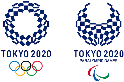

Tokyo 2020 Olympics organizers on Monday chose logo A — a stark indigo-and-white checkered circle — as the games’ replacement emblem after the original design was scrapped last year amid claims of plagiarism.
The Tokyo 2020 Logo Selection Committee chose the logo from a shortlist of four following a competition open to any resident of Japan aged over 18. Almost 15,000 entries were submitted.
The winning logo was designed by Asao Tokolo, a 46-year-old artist [...].
— japantimes.co.jp
"The design comprises 45 interconnecting pieces forming a checkered pattern known as ichimatsu moyou. Use of the color indigo is intended “to express a refined elegance and sophistication that exemplifies Japan.”"
Previously: 2020 Tokyo Olympics panel launches nationwide call for new logo design
More stories about the 2020 Tokyo Olympics in the Archinect news:
1 Comment
The Tokyo Olympic committee is an abortion in and of itself, and exposes the the Olympics for what they are today. Nothing but a circle-jerk money-grab by the the richest of the rich in their respective countries. The system stinks...
Block this user
Are you sure you want to block this user and hide all related comments throughout the site?
Archinect
This is your first comment on Archinect. Your comment will be visible once approved.