anchor
Spanish Building Facade Designer

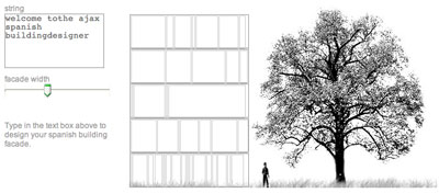
We just finished a competition at the office yesterday afternoon, and after seeing the elevation drawings that were produced, I was inspired to create the first ever javascript css Spanish building facade designer.
It's still in the works, but it works well enough for now to
try it out. *edit - my old website is down, so for now i changed the address over to good old zippyzest.com...
Why does every elevation drawing of a "Spanish building" have to look the same? It's a box, with floor height divisions, and then a bunch of windows, of all different widths, that seem to have some kind of meaning. Well I asked in the office yesterday who drew them on this competition and why, and the only answer i got was, "b/c it's cool to draw buildings like that." Surely there is a reason. Or was it just that one cool Spanish architect drew a building that way 10 years ago, and it became trendy.
Someone please explain it to me. I just don't get it.


12 Comments
very funny, dm, and sorta true. but before you completely disparage the spanish work, you gotta check out these guys: rcr aranda pigem vilalta architects. really beautiful stuff.
i still drool whenver i look at this book.
This is so silly that I love it.
I don't want to completely disparage Spanish architecture, I just want an explanation, some kind of reasoning. I mean it would be nice to think they were using L-system equations to develop repetivite elements in a facade, or musical chords, or something natural, but I know for a fact this is not the case with my boss. He knows nothing about math, I can't even explain how resolution relates to image dimensions in photoshop to him without at least ten unique blank stares. As far as I can tell they draw buildings that way b/c it's "spanish".

And I guess the American equivalent at this time is that elliptical roof curve that infects wachovia branch banks everywhere.
hmmm something broke on the site for a minute, but it's back working with the scale tree and Mr. Spock silhouette. yes, Mr. Spock. He is the first noteworthy google image result for the term "scale figure". And he's awesome.
This is awesome! I love the colors. Ah, hahaha. Too rad. I think Adjaye has a bit of SBFE--Spanish Building Facade Envy.
American B.F.D. would definitely produce some kind of random elliptical roof plane--that Wachovia pic is a great example b/c it shows the "long, extended walkway roofplane" that always foils the hovering ellipsoid roof. Snicker snicker snicker.
have you used your own post as the string? it results in a very nice spanish skyscraper.
wow. i wish i had snagit on my mac so i could grab that as an image without stitching it together manually, and then I could add it to the "under construction" gallery here on archinect... excellent.
clever.
i hate those damn wachovias. they're everywhere.
do you mean do a screenshot? there's a clever easy way to do that on a mac, if that's the case. i don't know what snagit is though.
oh, snagit will take a screenshot by scrolling the webpage, no matter how long it is... and make one image, or copy the text with links, etc... it's pretty interesting: http://www.techsmith.com/snagit.asp
you should try a robert frost poem or a led zepplin song
Here's a preview of my next project:
Google Earth and Timestamping Polygons.
Don't steal it yet. I want to actually do something with it first. And as you can see by the number of replies to that post, lots of people are interested in the idea. patent pending...
Block this user
Are you sure you want to block this user and hide all related comments throughout the site?
Archinect
This is your first comment on Archinect. Your comment will be visible once approved.