
Hi Archinect!
By now, you've probably seen Google's April 1 release of its 8-bit map for NES. 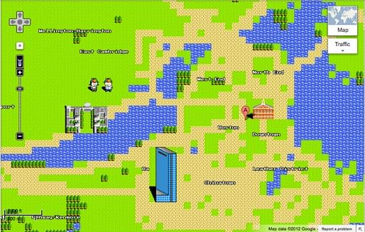
But have you seen this real-time animated map of wind in the United States?
And this Metro Distortion Map that shows the travel time to stations in Washington DC?
 And Mapnificent, which shows what places you can reach by public transit within a given travel?
 And of course, there are Eric Fischer's maps of ethnicity, Twitter Geotags, Locals and Tourists, and his Geotagger's World Atlas.
 If there are other map projects you know and love, please post links in the comments!
thanks for reading!
Lian


This blog was most active from 2009-2013. Writing about my experiences and life at Harvard GSD started out as a way for me to process my experiences as an M.Arch.I student, and evolved into a record of the intellectual and cultural life of the Cambridge architecture (and to a lesser extent, design/technology) community, through live-blogs. These days, I work as a data storyteller (and blogger at Littldata.com) in San Francisco, and still post here once in a while.


4 Comments
Awesome stuff, Lian!
This may be more in the realm of infographics, but visualcomplexity.com has plenty of sexy maps.
here's some more excellent maps.
Nice! Thanks!
Very cool! There are two other visualizations that are worth showing side-by-side with the Wind Flow - David Hicks Water Flow and Perpetual Ocean...
Block this user
Are you sure you want to block this user and hide all related comments throughout the site?
Archinect
This is your first comment on Archinect. Your comment will be visible once approved.