
Hello Archinect,
I wiggled my way up to the University of San Francisco for the first talk of the season in their Data Visualization Speaker Series, given by Cole Nussbaumer. [Update: a video of the talk is here.]
7:05pm: Until two years ago, CN worked in Google's People Operations team, where she told stories using data to help people make decisions. She left Google to work full time on teaching people about storytelling with data.
In school, we learn about stories and language on the one hand, and about numbers and math on the other--but these disciplines rarely mix.
Graphs normally don't look so good and aren't that clear.

Overview of tonight's talk:
Here we go! Section 1: Before you visualize the data, understand the context. Once you explore the data and find what you want to say, you move into an explanatory space, where we will focus tonight.
First, who is your audience? What motivates them? Is it making money, beating the competition, or something else? The more specific you can be, the better your communication will be. Then, what do you want your audience to do? Change, implement, empower, understand, support, create... Finally, how can data help you make your point?
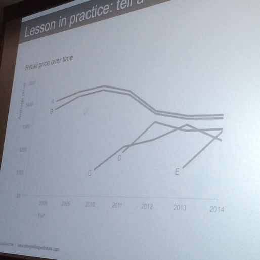
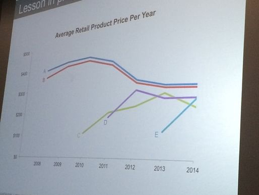
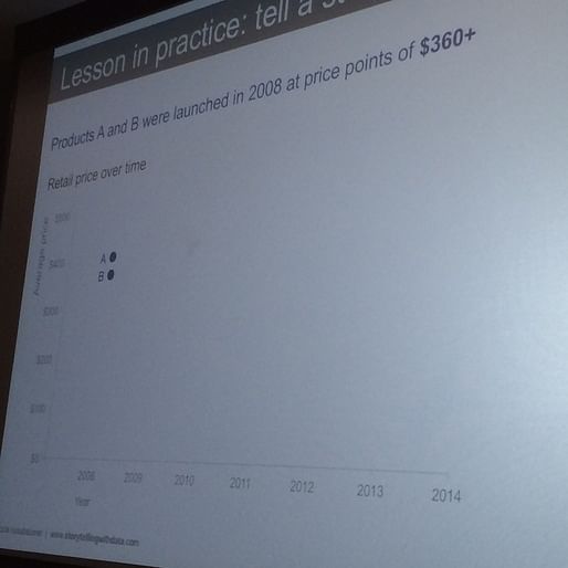
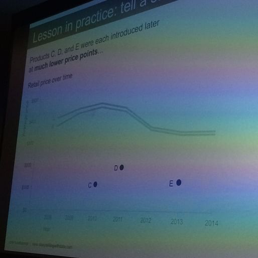
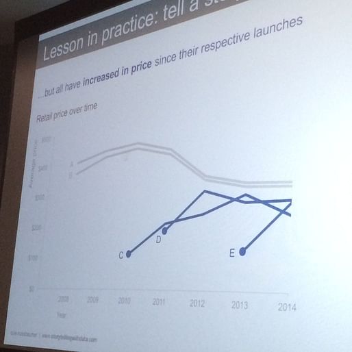
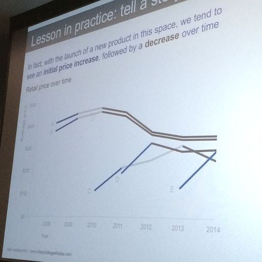
Here's an example that we'll return to throughout the talk:
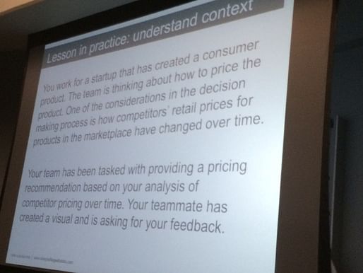
Assume your audience is the VP of product. What we want them to do is understand how competitors' pricing has changed over time, and accept our recommended price range. We can use data to make our point by showing the average retail price over time for Products A, B, C, D, and E.
2. Choose an appropriate visual: CN categorized all the kinds of data visualizations she had made over the past few years, and came up with more than 100 examples. At first she thought the 'long tail' would be relevant, but when she looked closer, most of the work fell into twelve groups.
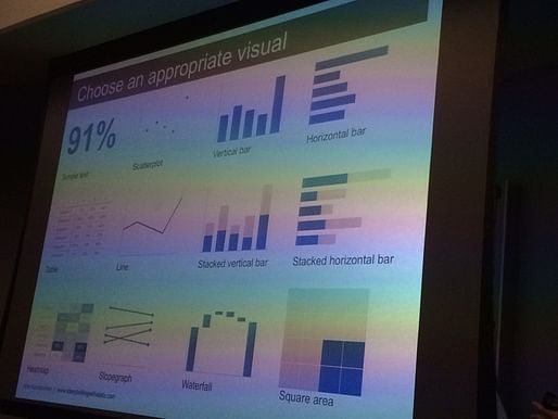
For just one number, text is the way to go, for example: 91% of data visualization experts agree.
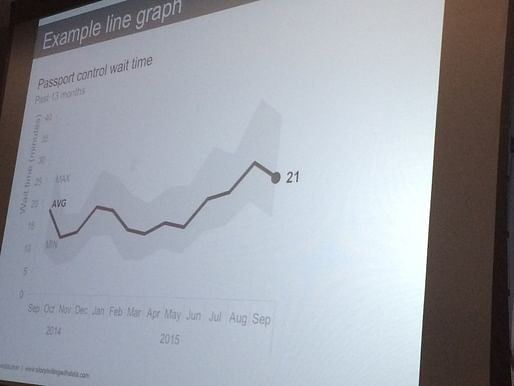
Graphs are more visual than tables. Scatterplots can let us group instances. Line graphs are good for time, when the data is continuous. Here, a line graph shows the average as a summary statistic, as well as the max and min, which can give an idea about variance.
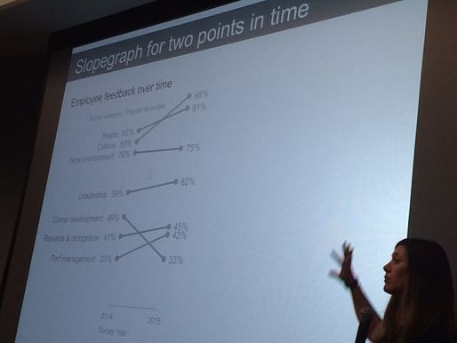
Slopegraphs are less common, and can pack in a lot of data, because the slope visually tells us about the rate of change. Depending on your actual data, a slopegraph might be great or confusing (if there are too many crossing lines, for example).

Bar charts are great for categorial data (different categories)! Vertical, horizontal, stacked vertical, and stacked horizontal. They're common because they're really effective--our eyes can easily compare the lengths of bars. Stacked bars let you give information about the sub-components about pieces--but one weakness is that it doesn't provide a consistent baseline to compare each subcomponent.
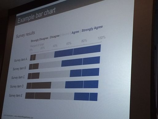
Stacked bars as a percent of whole somewhat alleviate this problem, because there are two datums to compare to--these are great for survey data.
Rule: bar charts must have a zero baseline, because we're comparing the difference in bar lengths against their overall length.
There is one graph type that CN didn't include: the pie graph. Why? If you have to estimate the size of each component here, it's really hard to tell.

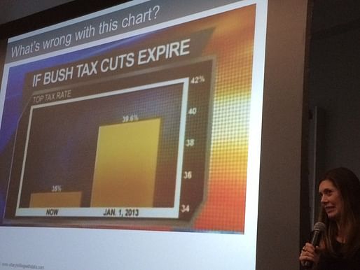
Another rule is that we should never put charts in 3D, because it distorts sizes and doesn't add any information. So you can put your pie chart in 2D and label the segments with percents--but really, CN says, consider a horizontal bar chart. They're very easy to read.
"If you find yourself reaching for a pie chart, pause and ask yourself why." If you have a good reason, fine--but if not, consider using another chart type.
Let's work on this chart. First, get rid of the color to focus on the trend over time.
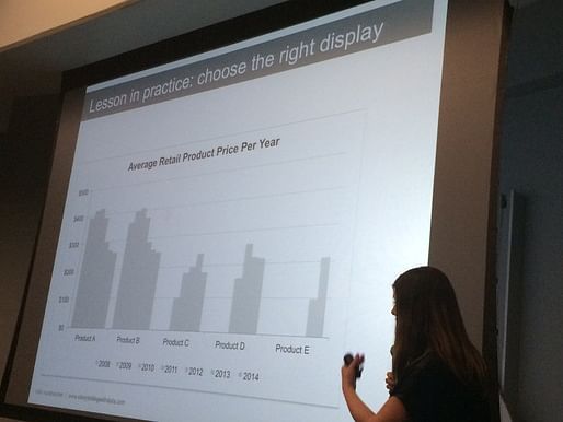
Then highlight 2010 to the present, to see if there's a trend. There is, and the data is over time, so let's make it a line graph and stack the lines along the same axis.
3. Identify and eliminate clutter. Strip anything away that isn't adding enough value to justify its presence. Gestalt theory from the early 20th century informs how we visually perceive information.
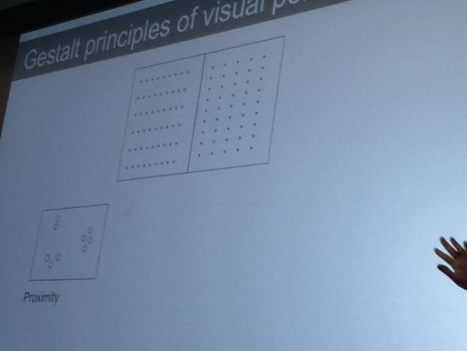 a) proximity - we see horizontal and vertical rows here, simply based on the distance between dots.

b) similarity - allows us to avoid dividing lines in the table, just by using two colors.
c) enclosure - we tend to see enclosures, so if we get rid of heavy borders, our data stands out more.
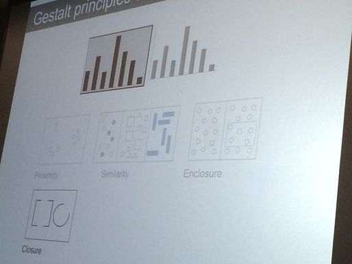
d) closure - this has something to do with how we tend to mentally complete partial shapes. Basically, remove pointless outlines.

e) continuity - I'm not sure what this is about, but maybe you can glean it from the above diagram.
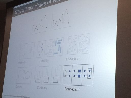
f) connection - for example, connecting dots in a line graph can be helpful
Gridlines are OK if you think your audience will really want to check the exact values, but make them light (line weights!)
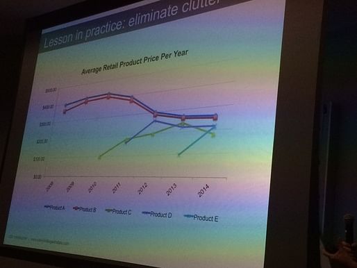
CN gets rid of the strangely shaped dots, zeroes after the decimal, and gridlines. She makes the x-axis labels horizontal so that they can be more easily read. Then she puts the labels near (proximity principle) their respective lines and colors them (similarity principle) according to each line.
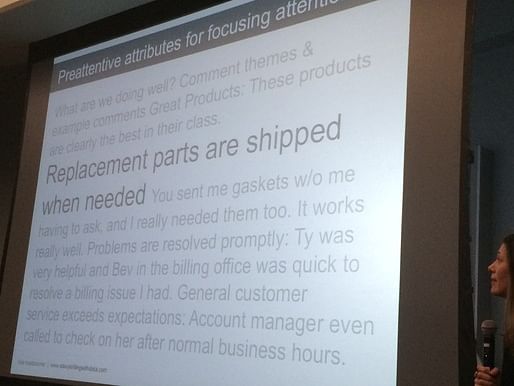
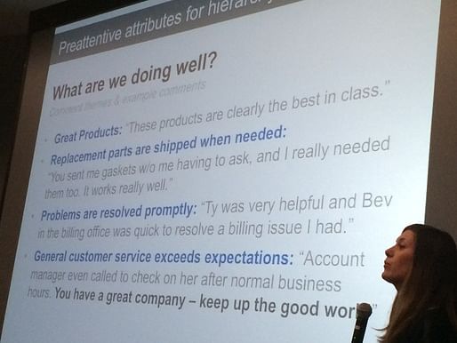
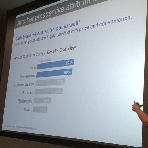
4. Focus attention where you want it
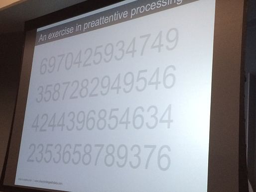
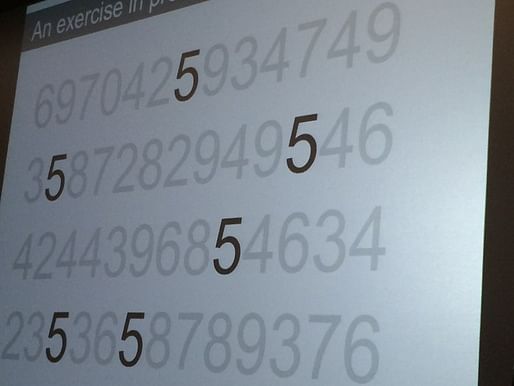
Iconic memory is shorter than short-term memory--it is momentary, and tuned to pre-attentive attributes. This allows us, for example, to count the number of "fives" on this slide much more quickly, when they are colored differently.
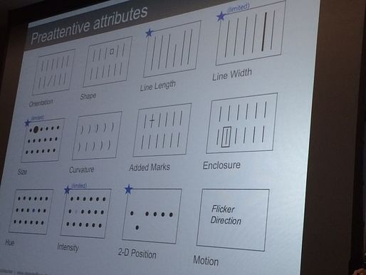
There are a variety of pre-attentive attributes. We tend to assume some are quantitative (length) and some are categorical (or qualitative) (such as color). We can combine them to format a text, to make it scannable within a few seconds. For example, we can go from this, which just calls out one statement...
...to this, which is fully formatted:
In a presentation, you can show an un-highlighted chart to talk about the data in general, then focus people's attention using color or other pre-attentive attributes, as below.
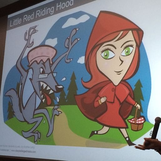
5. Tell a story. "And here, I mean a full-on children's story." For example, Little Red Riding Hood. CN gets someone in the audience to recap the plot. The story has a few lessons for us:

Words are very helpful in data visualization. Some are mandatory, like axes and labels. Annotations are also helpful to make sure people can come away with your key takeaway.
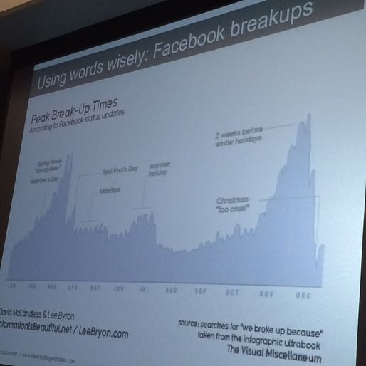 Here's a good example of how annotations make this data on peak break-up times come alive.
If there isn't anything interesting about the data, then don't show the data. It sounds basic, but it happens all the time. You risk losing your audience for when you do have something important to say.
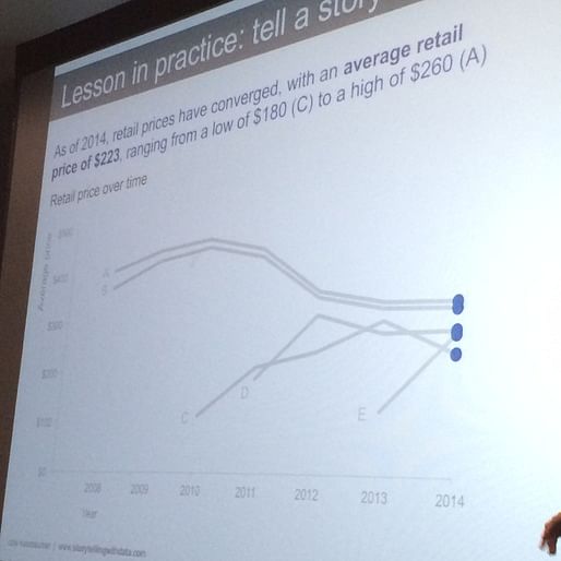
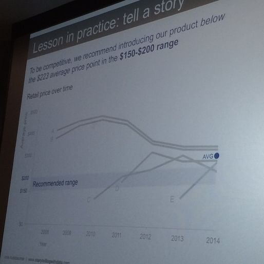
Back to our example: CN runs through a series of slides that she might run through in a few minutes in a presentation, to show the data in our example. Instead of talking through a static graphic, she builds the data over a series of slides and calls out different trends and parts of the data using colors, as she builds her argument.

End, applause.
Question: What if you want people to figure out the data on their own, without telling a dominant story? CN: Good question. When you use pre-attentive attributes to highlight one part of data, you're de-emphasizing others, so that people are less likely to see other stories.
Question: What about infographics? CN: Some are fluffy pictures that have little data. Others are actually informative--for example, the New York Times, National Geographic, or Wall Street Journal. These allow you to sit with the information and see insights for yourself.
Question: You mentioned that bar charts should always show zero. What about line charts? CN: You can get away with zooming in for line charts, because the main comparison is between points over time. But the risk is over-zooming, which will make small differences seem more significant than they are.
Question: Can you explain waterfall graphics, which was one of your types? CN: They're good when you have a beginning point, then additions or subtractions, and an end point. For example, in People Operations (i.e. HR), your team starts at a certain size, then grows or shrinks over time as you add or lose people.
Question: Is there research comparing the takeaways that people get between pie charts or bar charts? CN: I think you're probably right that this is more anecdotal than proven--but maybe someone knows a specific study. Someone else in the audience: There are studies on this, and usually bar charts win in terms of people remembering the numbers. But it's really hard to research the gestalt feeling of a "percent of the whole," where pie charts are actually effective. So is the story about the specific numbers, or the relative amounts, as a percent of the whole? If it's the latter, then pie charts can work.
Question: What if you have a ton of data and want to allow your audience to explore it? CN: I find that we often want to do that, when really what we should do is take our analysis a step further. There are different use cases, but it's often dangerous to not present an analysis.
Question: As a personal project, I've recorded all my activities in Google Calendar for a year and a half, and I put it in a pie chart, but what would you recommend? CN: I would not choose a pie chart, myself, but it depends on what you want to get out of the data. It's often about playing with the data, to see what works. And put your graphics in front of someone and watch their facial muscles--see how painful it is for them. Ask them to describe their thought process. I also use the optometrists' approach, A/B testing minor changes in the graphic, to iterate through small changes.
Question: What about animation or interaction? CN: There is definitely a place for interactivity on exploratory data. Not everyone will be willing to dig through the data, though, so can you start an interactive graph with an explanatory view that already says something? That is really helpful.
Audience comment: In defense of pie charts--if you have two categories and want to show a percent of the whole in a relative sense, a pie chart is great! CN: But to play devils' advocate, if you just have two categories, you can also just show the number.
Question: What about platforms like Tableau that have a specific approach towards graphics? CN: Tableau is fantastic for exploratory analysis, because it has stripped the crap away. They've recently added a "storypoints" feature, because they've recognized that they want to do better at storytelling. For me it's not about the tool--these principles work with any tool.
Cole ends by plugging her website, Storytelling with Data, where she's got lots of great content, including material from her talks.
Thanks for reading!
Lian


This blog was most active from 2009-2013. Writing about my experiences and life at Harvard GSD started out as a way for me to process my experiences as an M.Arch.I student, and evolved into a record of the intellectual and cultural life of the Cambridge architecture (and to a lesser extent, design/technology) community, through live-blogs. These days, I work as a data storyteller (and blogger at Littldata.com) in San Francisco, and still post here once in a while.


No Comments
Block this user
Are you sure you want to block this user and hide all related comments throughout the site?
Archinect
This is your first comment on Archinect. Your comment will be visible once approved.