
Hi Archinect!
Back for the second day of this great event. From the OpenVis Conf website:
The purpose of data visualization is to illuminate data. To show patterns and relationships that are otherwise hidden in an impenetrable mass of numbers.
In many datasets, color is one of the most effective means of accurately conveying quantity, and certainly the most widespread. Careful use of color enhances clarity, aids storytelling, and draws a viewer into your dataset. Poor use of color can obscure data, or even mislead.
In this talk Robert will illustrate the principles behind choosing colors based on human perception through historical examples and contemporary NASA visualizations, and share the many web-based tools he uses to craft perceptually-based color palettes.
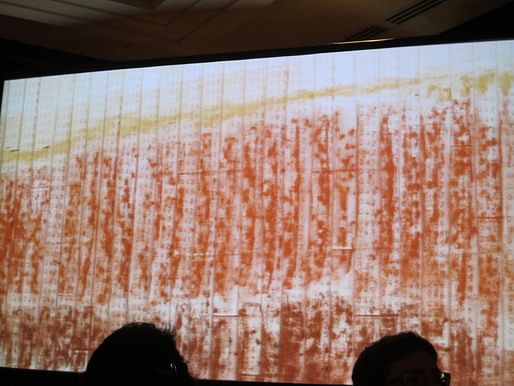 Simmons opens with the above image, which was done (decades ago) by NASA (engineers?) while they were waiting for their computer to render the image. They printed strips of paper with numbers representing the image, and used pastels to "paint by number," to visualize what the computer was taking a long time to show them. This is data visualization!
The way our minds process color, different hues tend to have different perceived brightness. So we use brightness (or lightness), hue, and saturation (or chroma).
 Color space is lumpy: there's no such thing for us as "dark yellow."
How can we use color in visualization? For sequential, divergent, and qualitative maps.
 Cartographers have been using colors in maps for a long time. Here's an example from 1823.
The two most common gradients are grayscale and rainbow.

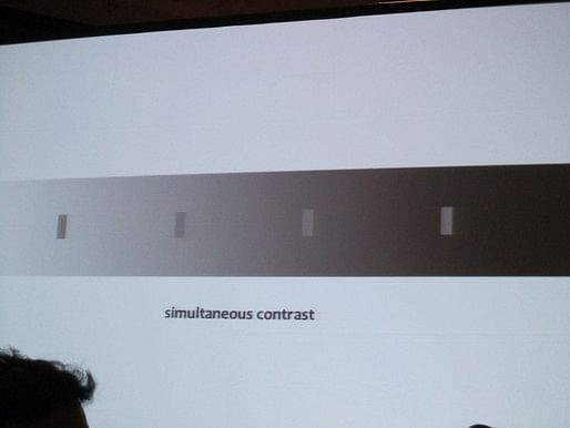 The grayscale palette is problematic because we interpret tones in relation to its adjacencies; for example, here, each of the four gray rectangles is 50% gray, but it is impossible for us to perceive this.
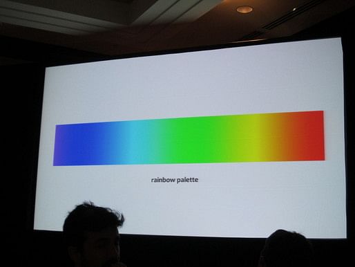
For the rainbow palette (if you take the mathematically produced spectrum), the gradient isn't even in terms of where the color perceptibly changes.
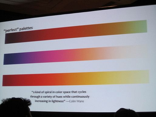
Colin Ware describes three "perfect" palettes, which cycle through hues while continuously increasing in lightness, like a spiral through the color wheels. These palettes are color-blind accessible.
 We should work in LCH space, rather than HSB, because it shows a cleaner gradation.
 For divergent palettes, the light/white is usually placed in the middle as it's easier for us to distinguish the extremes in relation to white, which are what we generally want to emphasize.
About 8% of males or 5% of the overall population is red-green color blind. For example, the bottom palette here can be read by the color blind. (Eric Fischer is in the audience and confirms that this one works for him.) 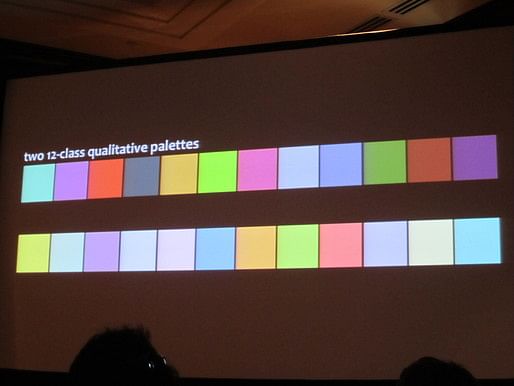
 We can generally distinguish 5-9 categories, more than that is problematic. If you have to have more than this, you can group the colors, so that you can understand the overview of the map (the reds are all urban; the wetlands are both shades of blue), while also being able to distinguish the fine differences. (Eric Fischer says he can read this one, but Simmon points out that this map can be problematic for certain color blind people.)

Simmon really doesn't like the rainbow spectrum, both because of the uneveness in the color's gradations that can be misleading, and because the colors should be semantically resonant. "Semantically resonant" means that the colors should be meaningful relative to the content they're representing (as above, on the right vs. on the left). 
For example, John Nelson ran Google searches on a range of affective terms in English, and determined the archetypal colors based on this.
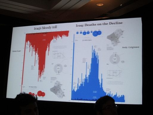 Andy Cotgreave re-did the much-maligned graph of Iraq deaths, by flipping it to make the Y-axis normal in its orientation (more is up), and by changing the color from red to blue.
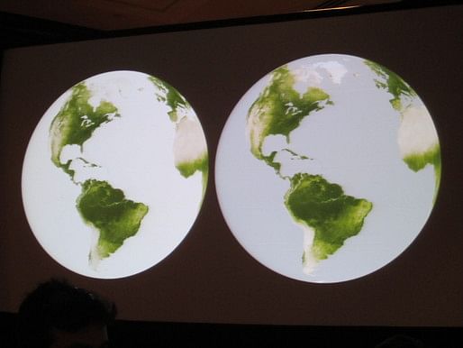
 Here's a map where dark means more productive, in both ocean and land, though ocean is blue and land is green.

 The above map uses a sharp break in the temperature, because hurricanes can form exactly when the water temperature is 82 degrees or more. So here, water at this temperature or above is red. For color-blind people, the color gradient still works, as shown in the grayscale version.
 Here's an example showing a more effective way to show "no data": the gray on the right is better, because it avoids ambiguity.
In this map, Simmon wanted to use a yellow to red scale to show temperatures, because the map is about maximum temperatures--every temperature mapped here is hot for the location. And it looks good at the global sale, but when zoomed in, the way in which our eyes perceive juxtaposed colors is misleading. If you see the areas around the dunes, these places look like the reddest parts of the map, even though they're not. So Simmons reverted to a more traditional yellow to purple scale.

Layering information to show different scales of information, that you can dig into by spending more time looking at the visualization.
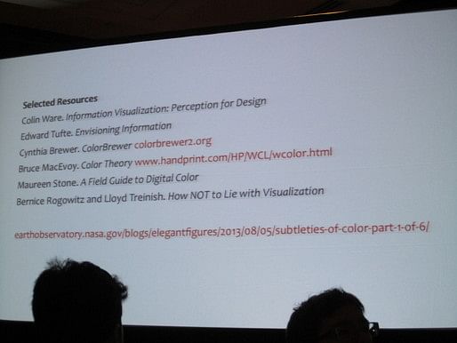
Three great online tools: Color Brewer (very easy), Nasa Color Tool (harder to use, but more control), and Chroma.js, a JavaScript library.
Thanks for reading!
Lian


This blog was most active from 2009-2013. Writing about my experiences and life at Harvard GSD started out as a way for me to process my experiences as an M.Arch.I student, and evolved into a record of the intellectual and cultural life of the Cambridge architecture (and to a lesser extent, design/technology) community, through live-blogs. These days, I work as a data storyteller (and blogger at Littldata.com) in San Francisco, and still post here once in a while.


No Comments
Block this user
Are you sure you want to block this user and hide all related comments throughout the site?
Archinect
This is your first comment on Archinect. Your comment will be visible once approved.