
Hi Archinect!
This one is for the lols. The GSD's Scott Cohen and Nader Tehrani, Head of the Department of Architecture at MIT, are having a friendly lunchtime debate--as illustrated by the hot air rising from each house in the poster.

12:10: Scott opens things, describing his close and collegial relationship with Nader, in which each one critiques the other's work openly and vigorously. Scott admits that Nader's house is "more beautiful" but still believes that his is much better. Nader thinks that Scott's house went "from bad to worse." Scott says that "It's time to lay open some of our disputes...they're small differences you could say--we have parallel educations and have been teaching together for years."
[Note that the higher-quality images are pulled off of PSC and NADAAA's websites, and aren't always exactly the ones they're using.]
12:14: Nader Tehrani: "Somehow, you're absolutely right: I thought the house was so ugly that I didn't even consider it at something to address. But I'm more interested in talking about its typological problems. We're going to present each others' work."
 PSC's house is constrained by the road and the slope, as well a zoning consideration that was almost identical to the condition at NT's house.
In these images, the landscape is objectified and made iconographic; it's like the model of Scott's Torus House for MoMA.

"In discussion with Scott I came to understand the importance of the geometry of this house--not only the roof and plan but the geometry of the landscape." The retaining wall, and the roof. The roof is a hip roof, but triangulated, and has a relation to PSC's canopy for the Goldman Sachs headquarters.


One of the most paradigmatic moments in the house is at the entry, with the stair and view down to the playroom. It recalls other tropes in contemporary and modern architecture where the ground is not taken for granted but is objectified as an artifice. Elsewhere this reveals a typological rift and establishes a relationship with the landscape. In Scott's case, this does not establish a relationship with the landscape but rather is an incident. [i.e. mild disapproval from NT]
There's a selection of materials and iconography that establishes a connection to Frank Lloyd Wright.
Why is the house entirely organized around this view, yet then recessed from it? That's not clear. And how is such a careful design reconciled with such a casual arrangement in the windows?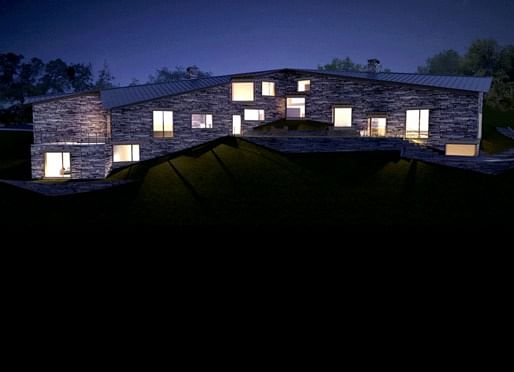
"We had, over ten years ago, a conversation with SHoP." They had a concept of the figure, of a voluptuous female body for the Museum of Sex, and then they showed the geometry triangulated. And you went bezerk on them, Scott...you don't remember? Well, you did.
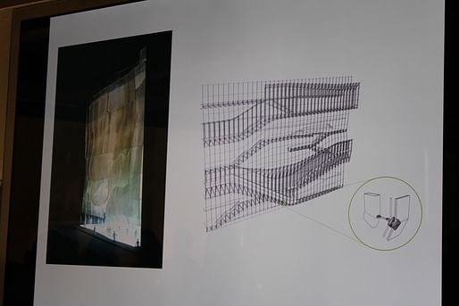
 In the Tel Aviv Museum, issues of constructability, which PSC never admitted to be interested in, in his focus on the agency of geometry, came to the fore.


Just one question for this one [a conventional looking sun diagram for PSC's house]: greenwash or substance?
And this: In case I get pummeled today, I just want one really ugly image up there to return to:

12:27: Now it's Scott's turn to present Nader Tehrani's house. PSC: If mine is distorting in plan and section, NT's is also, in a different way.

Scott is talking us through an animation diagramming the formal development of the house on the site. Now a walk through the plans. "This should be a dashed line [an overhang], but Nader represents it like this..." [laughter]


Nader is far more thorough in his representation than I am--he complained to me that I didn't have the sections he needed for today.
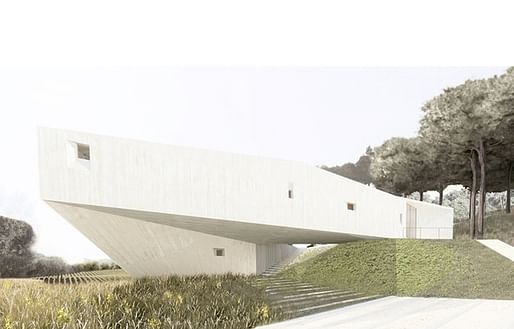
Nader has been very committed to merging representation and performance, or function. And there is a refined development at all scales--it is far more artful than mine, frankly. It is designed through and through. Even the status of concrete here becomes a means to establish a gradient between this material and another--rock. He does not adopt the banal elements and leave them as they are, as I do.

For example: it didn't bother me that he did this with a window, leaving the tar torn, but it bothered me that he would impose this on his client--that their window would be blocked. I would never be allowed and would never ask a client to do this. Does the artistic will of the architect get sublimated into a friction between the client and wider (cultural, etc.) needs? Nader is much more interested in expressing the will of the artist over everything; the artistic will of this, to me, is too hubristic in private houses. I think we have a different obligation in public buildings.

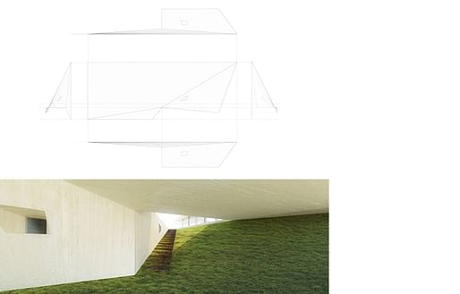
12:37: NT: I'm unhappy with the landscape. [image below] Why do you create this huge terrace, while the main rhetorical move of the landscape is blocking it? And where there should be large openings, these are reduced. So I think either this isn't giving enough to the client--
PSC: You're using my argument on me!
NT: Or it should be more Scott. It could be more radical but this is middle of the road.
PSC: Because the whole building is on this topography, it's true...I minimalized the leveling there. So yes, the terrace isn't more wonderful than anywhere else, it doesn't have the spectacular view that you have. This triangle, which appears to be nothing more than more earth, it is actually the lifting up of the house that allows this view.
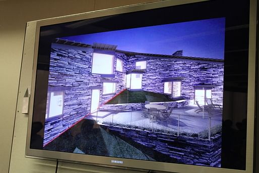
NT: But it is a detail that you might have seen at a local store in Medford.
PSC: But how many houses have you seen where you see the whole housing being lifted up, where that apex is below--a space inside the house? The space is layered obliquely; what interests me about it is that this remarkable condition of the parallelogram and the fact that we don't recognize it so readily as strange. That's what's interesting to me.
NT: But it's more like an abdication to convention. I'm not necessarily critical--it's very banal, but you may stake the grounds in the banal, or--
PSC: But I would like something that seems so banal and so negligible, this landscaping around the house, to turn out to be something so remarkable in the interior architectural expression.
...
12:45: PSC: Architecture is in a state where nobody pays attention to it. And architecture doesn't need attention: we live in it and experience it in a state of distraction. This is fine for me. You don't have to bear so heavily on everyone with a hand that makes architecture always remarkable.

NT: Your entire argument rests on the distinction between private and public architecture. ...Take the exterior of the Taiyuan Museum of Art: if you had an opportunity to do a house like that, would you take it? Or would you push it away, and say, "let Nader do it."
PSC: I would push it away: I don't think a house should be so artful.
NT: Are you moving away from this? Do you think that Torus House and Wu House are as invested in the banality of certain conventions?
PSC: No, they're more like your latest house. [laughter] You have arrived. But I think it's a mistaken understanding of domesticity in architecture. I take pleasure in these stones that are like any other, but which seem strangely not horizontal when they are imposed upon into the geometry of a parallelogram.

NT: But does it bother you that this line [at the ceiling, in the above image] is not continuous?
PSC: Yes.
NT: And would you want to make this continuous in a house as well as in a public project, knowing all the structural gymnastics you'd have to do?
PSC: Yes.
NT: You're guilty of a lot of architecture here. The question is, is it in bad taste?
PSC: But you're the taste-meister. I don't really have taste. [laughter] It's true! What I like is thinking about the tension in the change. Why do you have to have everything changed? Why do you have to design your doorknobs? Why are your windows custom designed?
NT: No they're not, they're off the shelf. I use systems.
PSC: OK, let's look at this slide that Nader showed in his lecture. I would do the left slide, but I think you're invested in the middle slide. You want to go back to the ontological roots of the material and expose them; why do you need to do that?
NT: First of all, I don't think I'm at the middle slide.
PSC: Are you on the right? [laughter]
NT: No. In the middle slide, you're not only in the symbol of the hair but the performance of it; you need to (slick it down) otherwise it goes flying off. Some of it is technical, about the science of building, and some of it is in perception and how it engages society.
PSC: I guess in my case it is more modest: just experiencing the interior of the domicile in a slightly different way, with an uncanniness that might even go unnoticed. You would like to change the image of architecture, you are more physiognomic.
NT: Why is it that you pay so much attention to the lintel when you know it's not needed?
PSC: Because it's a conventional sign; the conventional sign makes it go away.
NT: No, it doesn't make it go away. It's "architecture." It could be a steel angle with the concrete and then the stone. This way it's like having an eyebrow over every window.
[...]
NT: ...When your client wants more real estate, you have to...
PSC: I did maximize the FAR. But I reduce the design to one architectural conceit and everything else is normal, whereas you invent everywhere. That's the difference between us.
OK, now they're opening up to questions from the floor.
Question from a student for Scott: Why doesn't the sunken playroom have windows? PSC: We were at the maximum habitable volume for that cellar space and could not have done that.

Question from Ingeborg Rocker for Scott: How do you feel about the eyelashes, not the eyebrows? [The vernacular has gone astray; they're clunky.] [IR is referring to the exposed structure (rafters?) on the underside of the overhanging roof, as in the above image.]
PSC: Do you think they should be more abstract or more vernacular? IR: It is an odd in-between, between the vernacular and the architectural. PSC: The roof comes to a perfect apex here, so it has to bend down; it becomes flat so it's the one place where there's a violation of the parallelogram--because of the overhang. It's a sense of codes violated by the geometry. I don't care if it's ugly or not, it's when (the system) reaches crisis that it interests me.
...
NT: Architects have a marginal presence in the world.
PSC: So you think we have to take over the tasks of designing from other disciplines?
NT: Absolutely. If we're only talking in places like this [gesturing to the room]... We have to take on other forums.
PSC: But what do you mean by engineering?
NT: When you see what engineers do, it's often arbitrary too. So we can operate there and adjust some parameters of our own.
...
PSC: You don't think that anybody in the world of industrial design can create a better doorknob? That architects can always do it better?
NT: No there is great work in all these fields, but in some cases an architect can do it better.
...
Question from student about what the end goal is?
NT: The production of new forms of knowledge.
PSC: I just want to extend the forms and types that I've inherited...extend them a little bit, and do it within architecture. I don't want to design a new doorknob, but want to work with other disciplines from within architecture. I want that to be the domain of innovation.
NT: When you do that, you can influence something this tiny [holding his fingers together], and sometimes nothing at all.
Question from a student about why the residential is not for PSC a terrain for this kind of innovation?
PSC: First, they're less complex. You can up the ante and live in a house that is so refined and elaborated, but I prefer the house to be a more casual space. Philip Johnson once described architecture as "the art of wasting space." You can absorb this in public buildings, but in a private house, how often can you give up so much space to a fillet? I don't think Nader wastes space inside houses either, by the way.
Thanks for reading!
Lian
This blog was most active from 2009-2013. Writing about my experiences and life at Harvard GSD started out as a way for me to process my experiences as an M.Arch.I student, and evolved into a record of the intellectual and cultural life of the Cambridge architecture (and to a lesser extent, design/technology) community, through live-blogs. These days, I work as a data storyteller (and blogger at Littldata.com) in San Francisco, and still post here once in a while.


1 Comment
What is the main idea for PSC's house? is it the view the people could see from his house?
Block this user
Are you sure you want to block this user and hide all related comments throughout the site?
Archinect
This is your first comment on Archinect. Your comment will be visible once approved.