
Hi Archinect!
Eric Fischer is up next at Bocoup's OpenVis Conf.
From the conference website:
Eric Fischer is a data artist and software developer at Mapbox. He was previously an artist in residence at the Exploratorium in San Francisco and before that was on the Android team at Google. His work has been shown at the Museum of Modern Art and has appeared in many web and print publications including Wired, Popular Science, and Best American Infographics. He is particularly interested in using geographic data to understand and improve the pedestrian and transit experience in cities.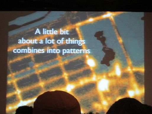
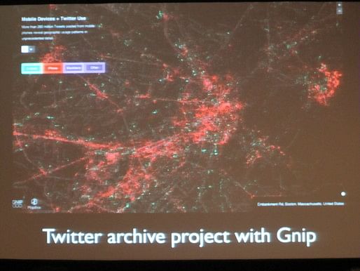
When he started working, his process was very manual, which made it slow and hard to iterate through options. He eventually learned to "do it right" for a project for the Twitter archive with Gnip, and is currently using Datamaps and Github to organize his work.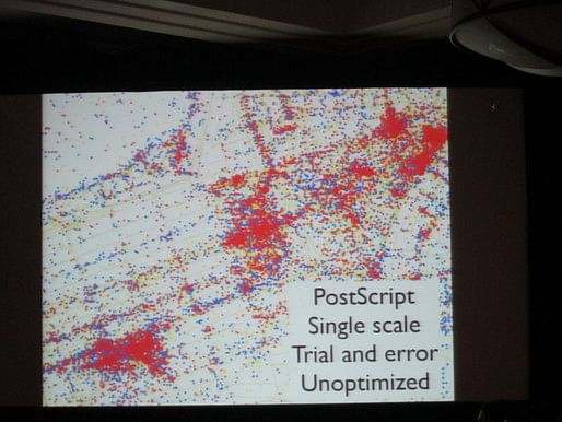
 When you're working on a project that can be zoomed in to a single block, or zoomed out to the whole world, there's a lot of scales to think about. What is a "human scale"? "I think where web maps are concerned, 50 ft/pixel is about right, as ridiculous as that sounds," because a pixel becomes a building or a street.
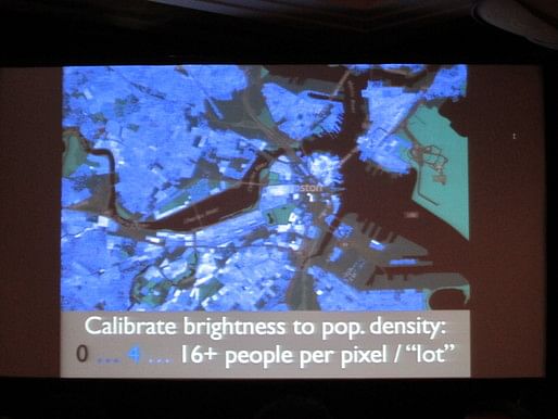 Fischer then calibrates the brightness in his maps, so that brighter areas indicate greater population density. He uses a square root, 0-4-16 scale, to avoid having most of the map dark. On the other hand, he's seen research that shows how human vision sees brightness on a cubed scale, so maybe his calibration could be even more extreme.
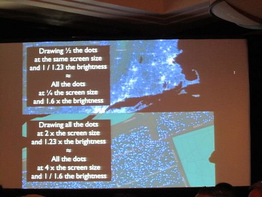
Instead of using a lot of dots that overlap, as you zoom in, his dots get bigger but not that bigger, so that you can still see them individually. Conversely, as you zoom out, the brightness is bumped up to avoid everything looking dimmer. He pumps up the brightness by "1.6x," which is a value he determined just by seeing what looked right.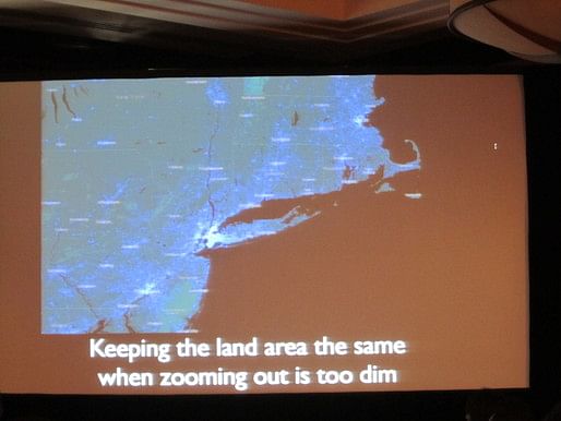
Fischer also doesn't render all the dots for the zoomed out maps, because "billions of dots takes a long time."
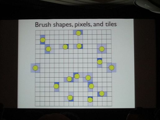 Making a map for the web is not like making a printed map, because you have to think about how the pixels render out dots. We can't actually draw round dots so it's important how the dots get visualized based on their location relative to the grid of pixels. This problem is most time consuming at the tile edges, because you have to make sure that the each tile has the correct information relative to its neighbor.
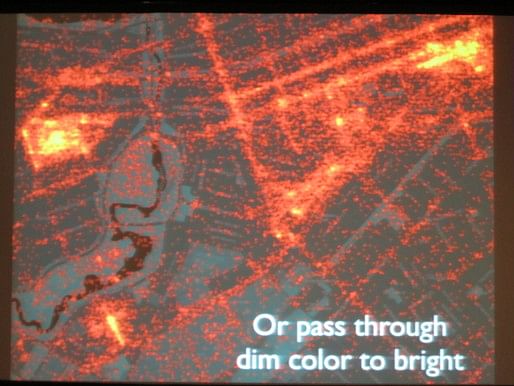
Colors look good when the go all the way from black to white, with a color in between. So you should either fully saturate from black to white, OR you can also use a very bright color (yellow, in this case) instead of white as the top value.
In Fischer's census map, which looks at race and ethnicity, and in his map looks at photos taken by tourists and locals, he uses colors to show different categories. He lets conflicting colors even out to gray, rather than compete.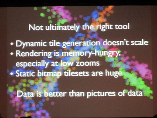
While Fischer has been explaining what he's learned, he also shares what he's unsatisfied with. Datamaps is ultimately still too slow, and the static bitmaps are huge files. "Data is better than pictures of data." What is closer to the original data, in order to keep the metadata, and keep it scalable, and so on, so that you're not exporting a single image. Mapbox, where Fischer works, has been working on these problems.
In the question period, Fischer reveals that he's red/green color-blind. He's also incredibly humble and gracious in fielding questions, admitting what he doesn't know and what he'd like to do better, as well as inviting the audience to give suggestions if people have better ideas for how to solve particular problems (like showing change over time, which Fischer says he's never figured out satisfactorily). I have to say this is a different attitude than what I've seen in over ten years of architecture lectures.
Thanks for reading!
Lian


This blog was most active from 2009-2013. Writing about my experiences and life at Harvard GSD started out as a way for me to process my experiences as an M.Arch.I student, and evolved into a record of the intellectual and cultural life of the Cambridge architecture (and to a lesser extent, design/technology) community, through live-blogs. These days, I work as a data storyteller (and blogger at Littldata.com) in San Francisco, and still post here once in a while.


No Comments
Block this user
Are you sure you want to block this user and hide all related comments throughout the site?
Archinect
This is your first comment on Archinect. Your comment will be visible once approved.