Can it get any colder here? Where's the snow? Honestly, it's very strange being here in the Northeast, especially when it is freakishly cold and when the lack of precipitation makes the dead, dormant grass look like tundra. I kinda wish I was back in Texas. Kinda.
The semester is chugging along, and much has happened since the last couple of installments. I should begin by telling you about my schedule this semester. Most of my schedule is occupied by independent study credits (thank you, thesis). But I do get to take one class, and this semester, I am taking Dietrich Neumann's
Film Architecture course. I absolutely adore the class, not only because of the subject matter (which is somewhat related to my thesis), but because the class occupies that odd middle ground between survey and seminar. I have been taking too many seminars of late, and I am excited to hear some good old-fashioned lectures. The class has everything you expect, and more. We've viewed some excellent films by Le Corbusier/Pierre Chenal as well as by Man Ray and Robert Mallet-Stevens. And it's interesting, because those movies that, on a cursory investigation, may not have architectural significance, actually are more relevant than you would believe. Take, for instance, F.W. Murnau's
Sunrise (1927). There is a very famous tracking shot towards the end of the film, and (as our instructor was saying), if you look through the windows of the tram, you will see elements of Weimar-era modernism (i.e.
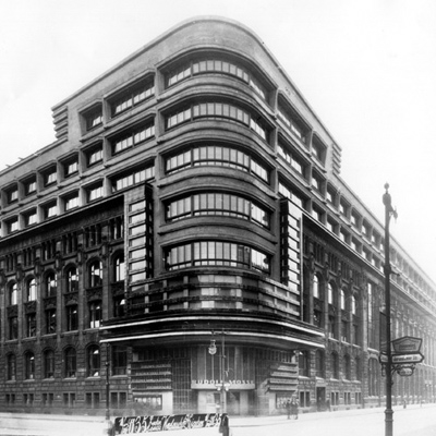
Siedlungen), and, in a very European city square, there is a building that looks exactly like Erich Mendelsohn's and Richard Neutra's
Verlagshaus Rudolf Mosse/Berliner Tageblatt (the Rudolf Mosse Publishers Building), from 1921-1922 (see
above). The thing is, these constructed sets make their appearance in American theaters before the 1932 Modern Architecture (International Style) exhibition at MoMA. The idea here is that film is a polemicizing vehicle for modern architecture.
Our colloquium is chugging along as well. To refresh your memories, we've already had Neumann and DJ Spooky speak. Last week, we had Reinhold Martin, who is familiar to architecture audiences everywhere. Although Martin did not present on a specific type of representational format (i.e. films, novels.
et cetera), he delivered a sustained an passionate invective, straight up from his
Harvard Design Magazine,
Log, and
Grey Room writings. He did not lapse into a "critical versus post-critical" talk, but did present all his thinking within a larger, operative context. He talked about Buckminster Fuller's
World Game and the Vietnam War (from an upcoming article in
New German Critique), and how their respective representational strategies were literally that -- strategies. In other words, from Fuller's zero-sum Von Neumann-esque World Game, to the deployment of mechanized vision machines as weapons in Vietnam, risk became the ultimate form of visual representation. Great stuff, and we were all too happy to host him. Tomorrow, we have Karen Nakamura, an anthropologist who will lecture on anime, manga, and their relevance to urban subjects. More on that later.
And one last thing. Forgive the shameless plug. But this Saturday, February 10, I will be delivering a paper at the Annual Student Symposium of the New England Chapter of the Society of Architectural Historians (
NESAH). The event is at the Harvard GSD, in the Stubbins Room, and things start at 9:30am sharp.


8 Comments
Rheinhold Martin has got to be one of my favorite lecturers. He always kind of starts off slow but by midway he's got himself worked up to a full-scale paranoid rant. By the time he's done everybody in the room is ready to believe that the United Architects are a stalking horse for the one-world-government, black helicopter apocalypse. Brilliant.
The best lecturers that I've seen all have their own signature style, all different, but effective. The more I think about it and watch for the style and technique, the more interested I get in the role played by those aspects of academic rhetoric.
Best of luck with your Saturday NESAH event. If I were on the east coast I would definitely attend. Unfortunately, I am stuck on the West coast for now…
good luck with the presentation, enrique.
sounds interesting. since i live in tokyo the work on raymond is particularly interesting. what an unbelievable life trajectory he took...
Always watched Sunrise as just a wonderful movie - I didn't notice the architecturally "progressive" views & vistas. Anyway - can't be called outright propaganda for modern architecture - the opposition between the countryside and the city is not favorable to the latter. [Eventhough the seductress from the city meets the farmer not in a natural hideout (and in my opinion one of the wonderfully "spatial" and layered settings shown in the movie - another favourite being the traffic-filled street with superimposed motion all over)]
True, Helsinki. But consider a couple of things: first of all, the film was released the same year as the Weissenhof Exhibition in Stuttgart. Not related to Murnau's film, sure, but definitely worth noting. Also, if you look at set designer Rochus Gliese's sketches for the film sets, they have a distinct Weimar temperment. Also, note the use of glass in the café scene towards the end of the movie. The traffic street is definitely an analog to Alexanderplatz. The city depicted in the film is much more European than American.
Murnau's films have a distinct architectural flavor -- notice the use of cardboard International Style skyscrapers in Die Letze Mann, as well as the "tilted" houses in Nosferatu: Symphony of Horror (Spyros Papapetros has written about the architectural aspects of Nosferatu, with a surprise ending of sorts).
It's funny, because I am actually reading Raymond Williams' The Country and The City (1973) right now. The book is interesting, as it is a literary history of representations of urban and rural life. The book came about because of Williams' dissatisfaction with the depictions of rural life (he was a country boy, grew up in the marshes of East Anglia, only to study at Cambridge and live in London).
Yeah - got it. just commenting on the disconnect between the form and content of the movie, not really opposing the idea that there is an abundance of contemporary imagery transmitted, but the idea of that (this) film would be "a polemicizing vehicle for modern architecture". I'd be content by saing just "a vehicle for modern architecture". so there. got this hair split...
Anyway - it's one of my top 3 movies ever - I love it. Have to see it again along witha re-vieweing of other Murnau and catch the architecture this time around. thanks for the tip.
And yes, he has a very strong vision in the production design of his movies - including the architecture - without losing sight of the "flesh" so to speak. I'll watch Murnaus drunken piglet tottering around anyday rather than Antonioni's (arguably one of the MOST architecturally minded of directors) lost shadows in their existential wringings.
I think that's well put ... an evocation of European architecture in an early American film does not necessarily connote "polemicizing" ... indeed, I think I may have overspoke. Yet the presence of these elements are interesting, if anything, for their vision. So yes, excellent point.
You may be the first person (at least that I've heard) favor Murnau over Antonioni. It's funny, because although Antonioni is very architectural, I feel an architectural reading of some of his movies may be overdetermined. Again, just because Antonioni features tons of BBPR-esque work in the last 10 minutes of L'Eclisse does not necessarily mean that the movie is architectural.
And now, I do feel that Murnau is the more "architectural" director. Excellent point, Helsinki.
Yup -architecture as a strong metaphor in films never quite makes me feel like there would be something inherently "architectural" in a particular scene. But architecture as a weak metaphor does the trick for me so it's hard to pinpoint where the difference lies - maybe it's just about tastes... As in comparing Metropolis and Collateral, I'd say Collateral has the more architectural feel - as in architecture (or urbanism) being what it is (playing "itself") instead of being a stand-in for some other thing or concept.
Block this user
Are you sure you want to block this user and hide all related comments throughout the site?
Archinect
This is your first comment on Archinect. Your comment will be visible once approved.