I love the
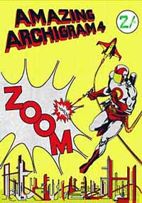
Yale Center for British Art ... today, for example, I got a really close-up peek at Archigram 4, known for its comic book-inspired cover and title, "Amazing Archigram." Upon entering the YCBA's rare book room, my colleague and I were required to register and to wash our hands -- so it felt like we were going into a clean room or like we were doctors going into a biohazardous laboratory. We were also given a series of page paperweights and a foam stand designed to minimize human contact with archival material. The room was kept preternaturally dry, and the only other guy in the space was taking photographs of some sketches with a camera mount that looked not unlike a guillotine.

One of the librarians came into the room with a cart containing a bunch of 50s and 60s-era British art catalogues (including materials from the ICA as well as the
original catalogue to the This Is Tomorrow exhibition, complete with pictures of Peter and Alison Smithson, as well as a poem by Reyner Banham). My colleague pulled a single embossed heavy paper folder, opened it up like a flower, and in there was Archigram 4.
To cut a long story short, I got to hold Archigram 4 in my hand. And the first thing I noticed was its relative tiny size. It was only slightly larger than a mass-market paperback. It was also silk-screened by Warren Chalk, so it was a relatively messy job. The bright yellows and reds bled outside the heavy, indigo outlines of spaceships and astronauts on the cover.
Inside, most of the commentary consisted of frames from science fiction comic book titles. They contained submarines, aircraft, rockets, missiles, space stations, flying cities. It even had images of
Chesley Bonestell's paintings (see the image at the top of this post). Some typewritten text was hastily pasted over some of their respective speech bubbles, and these were where Archigram's well-known technophilic polemic unfurled over the span of a handful of pages.
But, despite the fact that all these images could have easily been a distraction, one could never lose the sight of the fact that this was first and foremost an architecture publication. Thus, alongside an explanation of their Plug-In City concept, Cook and Chalk placed an axonometric drawing of a Jacques Cousteau submersible. There were also a couple of pages devoted to
Cedric Price's unrealized Fun Palace and his gaga London Aviary, as well as buildings by Hans Hollein and others.
By far my favorite part was the two-page pop-up city that rises from the middle of the publication. It consisted of a series of towers, also silk-screened in the almost-garish yellow/blue/red pallete that graced the cover. However, upon close examination, you could see that this pop-up was not only cut by hand, but was manually pasted into the spine of the publication. There is something nice about that, if you think of it. In this day of mass-produced boutique and academic presses, where a constellation of MIT, Princeton, Actar, Monacelli, Taschen, Phaidon and others' spines grace our bookshelves, it is indeed hard to remember that there once was a time when architectural discourse was tantamount to a guerilla operation. There is almost no difference (other than the subject matter, of course) between Archigram 4, an issue of
Maximum Rock and Roll or any other 'zine. Touching an issue of
Maximum Rock and Roll leaves newsprint on your finger -- but that's alright, because it is as urgent and quotidian as a daily newspaper. Touching Archigram 4, however, slowly turning each corner of the page with the tip of my fingernail, being careful not to get any skin oils on the publication ... was this like touching a dessicated, delicate skeleton, or was it like handling a vial of nitroglycerine? Here was something that required the discriminating eye of the architecture enthusiast, and the delicate touch of a neurosurgeon.


4 Comments
Good stuff. Love your writing. Keep it up.
I used to have an old collection of Chesley Bonestell's stuff that I think ended up in the custody of an ex-girlfriend.
i think i saw a similar show of this at moca in chicago. i am not a fan of spacey architecture. long live the right angle!
I have one early-ish Amazing Spider-Man comic (a battle vs. Doctor Octopus) that I would gladly trade for an original Archigram publication. I was more into baseball cards as a kid anyway...this particular comic is from before my time.
...nitroglycerin? perhaps 30-40 years ago. today it's a skeleton in many senses. archeology is truly fascinating.
Block this user
Are you sure you want to block this user and hide all related comments throughout the site?
Archinect
This is your first comment on Archinect. Your comment will be visible once approved.