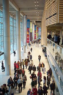
I cannot remember being inside a library as thrilling as the one I am currently in. The Grande Bilbiothéque du Québec, by Patkau / Croft Pelletier / Menkés Shooner Dagenais Architectes Associés, is an extraordinary space.

From the Berri-UQAM subway stop, you enter a series of revolving doors, go up narrow escalator, and enter the main hall of the library. On the right, metal bars grace a curtain wall frosted with alternating bands of diaphanous glass (the image above is taken from the opposite end of the hall). In between its vertical supports are some x-shaped braces -- a move not unlike the giant "x" motif along the side of James Stirling's Community Center at Newton Aycliffe, his 1950 thesis project from the University of Liverpool School of Architecture ...
And slightly to the right of the curtain wall, are a series of giant ferroconcrete pillars that seem to stretch endlessly into the ceiling. And as your eyes travel down the pillar, and trace imaginary lines of site along the pristine whitened floors (indeed ... a
clean, well-lighted place), you see on the left, bordering the main hall, a system of maple blinds that grace the individual floors of the library. It is almost impossible to discern the individual floors within the building, but the blinds complement the banded glass on the opposite side of the hall. When light enters, the two act as a series of coordinating brises-soleil that amplify, yet mute the light that enters the hall.
I walk through the security entrance into the reference area, and there, you can see the figural viscera of the space. Here, it is a bit darker, but you can see the series of stairs that criss-cross up and down, amplifying the "X" bracings on the far side of the
grande salon. There is also an elevator, with all its tracks, pulleys and levers exposed to the world. Bear with me for a second, but consider the ironclad logic of the Jorge Luis Borges'
The Library of Babel ... a series of connected, orthogonal shapes that extend upwards, outwards into an immeasurable infinity. Here, the
logic of the Grande Bilbiothéque du Québec is literally circumscribed by its boxy envelope or dangerously obvious
partÃ. The collection and circulation spaces, seem to suggest an interlocking series of boxes, each new square formed by the junction creating a different space in itself.

But, back in the
Grande Salon, if you pretend you are rewinding, walking backwards in time and space through the double filtered space, in a volume where a diffuse light creates something approximating Paul Scheerbart's manic alpine visions, and say, for a second, that you are headed back underground, towards the labyrinthine ducts and tunnels of the Berri-UQAM .. there, on your right, looking through the maple louvers ...a sculpture towers, reaching into the air. This is
Espace Fractal by Jean-Pierre Morin -- a extruded rhomboid shape that meets in a series of polished aluminum pipes that sprawl like the impossible tangle of a Gorgon's head.


12 Comments
very nice...thanks for sharing
it really is beautiful...
Thank you for the inspired account. just happened to marvel the library or were you doing some reference-hunting for the Stockholm Public Library competition? ;-) During the last few months I've noticed the tendency to carefully survey every inch of library spaces I've happened to visit (because of the aforementioned reason). The declared "truth" that libraries are endengered seems to have given them a rush of adrenaline and a succesful new rise. exciting.
Helsinki -- I was actually at the Centre Canadien d'Architecture doing research for my thesis ... I visited the BNQ just to eat lunch and use their free wireless. It is truly a great building ... it is a civic building in the truest sense of the word (the place is buzzing like a tiny city). I'll let you do all the groundwork and take all the credit once you win the Stockholm competition :)
beautiful project, thanks for sharing.
smokety, my brother [who is not an architect] moved to montreal last year and the library was a godsend to him. he used the internet, got reading material, etc but most importantly used their job finding services [there's a special section with lots of information]. he told me how the library felt like his home [his first landing apt being so bad]. he still frequents it a lot [he got a good job, btw!]. i visited him a few months ago and it was one of the places he took me to. truly a civic space, as you said.
why does it have so many right angles and straight lines? where the swoops and curves and blobs at? be careful not to get tazed!
did you use the archives or were you just being a tourist?
TED -- just a tourist .... I spent most of my time on the Metro, the CCA, and my bed in Longuiel.
It looks great. I went to Koolhas' Seattle Library recently. It's mindblowing. I could send you or Helsinki some pics if you like.
something that is also pretty mindblowing are the proposals for the extension of the Asplund building - they can be seen on the swedish arrchitects website arkitekt.se - the server was down a while but should be up & running soon. incredible crud. but there are some jewels in the approx.1200 submitted entries...
i particularly enjoyed the little fence around the building protecting folk from falling frit.
Block this user
Are you sure you want to block this user and hide all related comments throughout the site?
Archinect
This is your first comment on Archinect. Your comment will be visible once approved.