The votes are in for your favorite Fall '22 and Spring '23 architecture school lecture posters featured in Archinect's Get Lectured series. Which five posters racked up the top votes?
The University of Texas at Austin School of Architecture took the top prizes for their Fall '22 and Spring '23 lecture poster designs. The team behind their Fall poster shared that they utilized Midjourney to help create the visual theme, which can be seen in both posters. Third place went to the University of Illinois Chicago School of Architecture's Spring '23 poster, followed by a fourth-place tie from the University of Milwaukee School of Architecture & Urban Planning and their Fall '22 and Spring '23 lecture posters.
Also among the top ten poster designs in the online popularity contest were Thomas Jefferson University, UCLA, University of Colorado at Denver, Washington University in St. Louis, East Los Angeles College, and Syracuse University.
Paul Petrunia: Syracuse University’s School of Architecture's Fall '22 & Spring '23 posters
Common Name's design for Syracuse Architecture's last academic year's lecture series is on brand for the school. It applies a nice color palette with smart typographical choices. The design language offers an interesting bridge between the old-school high-design print posters of yesteryear and the new media digital aesthetic that today's students are more familiar with. — Paul Petrunia
Katherine Guimapang: The Ohio State University's Fall '22 poster
This year's Get Lectured voting included a variety of poster graphics. While some schools took a more direct approach in showcasing their lecture programming with clear graphic layouts, UT Austin's Fall '22 and Spring '23 posts provided a playfully generated set of imagery that stood out. However, a lecture poster that grabbed my attention and deserved recognition for its graphic choices is Ohio State's Fall '22 lecture poster. Promoting the Knowlton School of Architecture's Baumer Series, their selected typeface has pulled inspiration from pixel/bitmap fonts that added a somewhat nostalgic reference to typography used in older computer systems and classic video games. This was paired with background imagery that nods to their "future geographies" lecture theme. It can be seen more prominently on the backside of their lecture poster with map projections. It's evident that the nature of "lecture posters" has changed over the years. As we live in a screen-dominated age, schools are focusing on graphic designs that aren't necessarily intended for print but for digital viewing. That said, I appreciate Knowlton's overall design approach. Not to mention, their 2-sided lecture poster provided brief bios of each speaker, allowing for both sides to be useful. — Katherine Guimapang
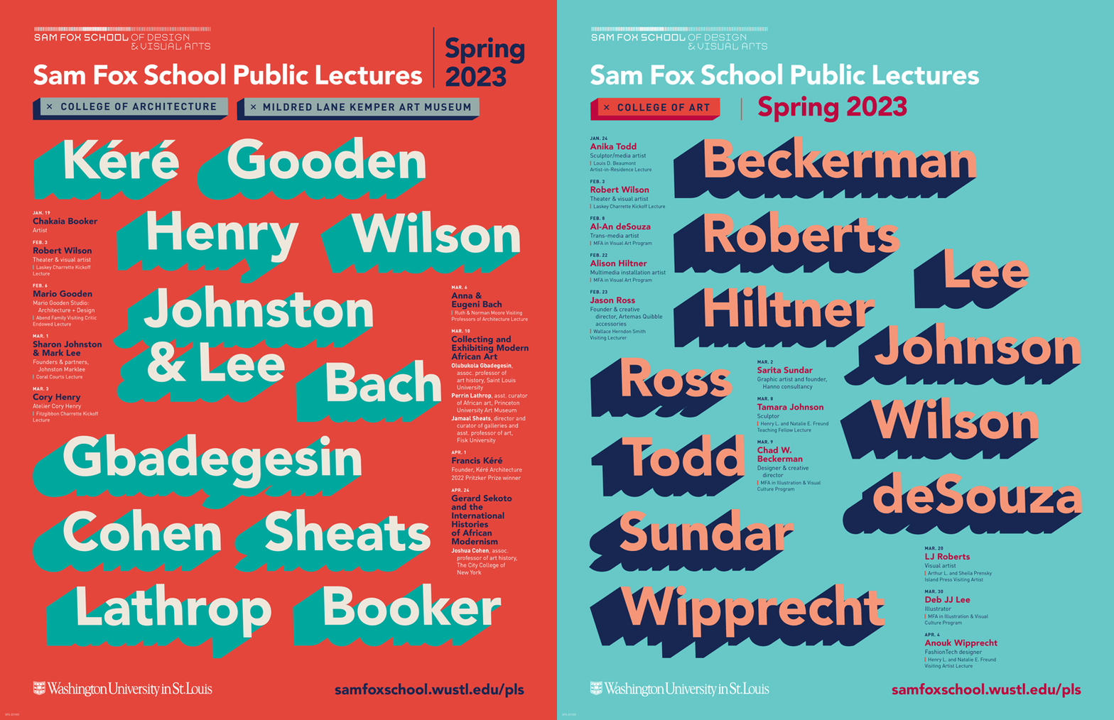
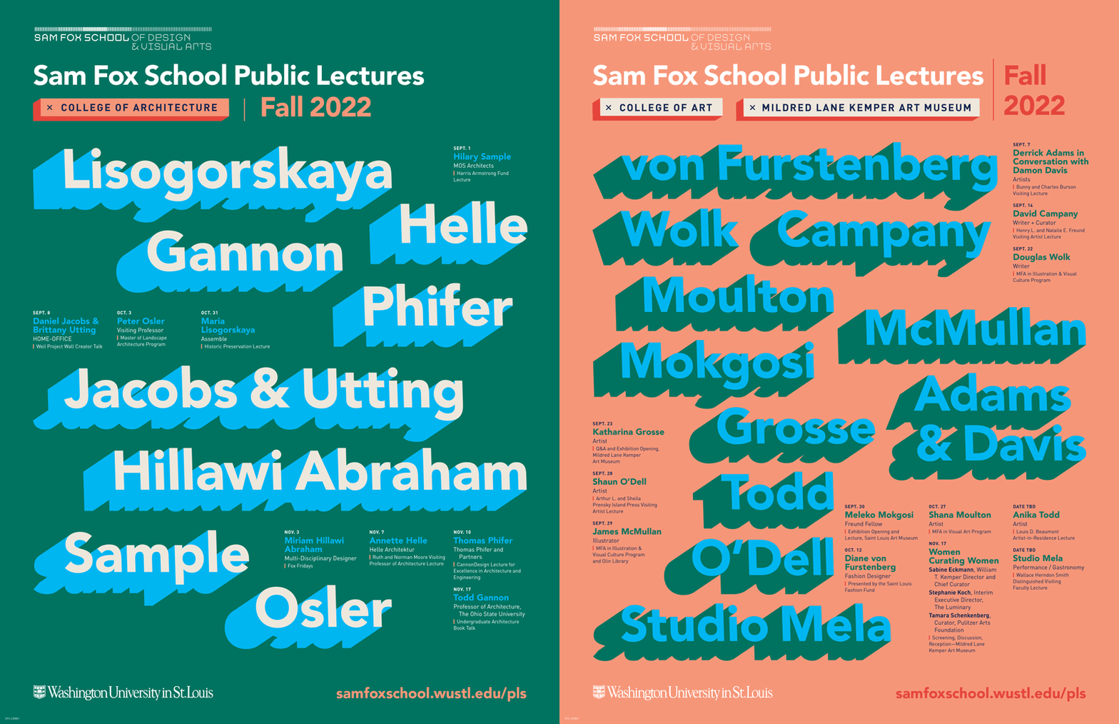
Alexander Walter: Washington University in St. Louis' Fall '22 & Spring '23 posters


Including not only one but two consecutive academic terms in our popularity vote allowed us to see how lecture poster designs from the same school correspond to each other from one term to another. UT Austin's winning posters and the top-scoring UW-Milwaukee designs played the instant recognition game to their advantage; Harvard GSD entered two concepts that, besides a few visual variations here and there, appeared nearly identical from a few steps back; Syracuse School of Architecture tweaked the color palette from Fall to Spring; but the real winner for me were the four back-to-back strong contributions from the Sam Fox School of Design & Visual Arts at Washington University in St. Louis: The designer, Audrey Westcott, delivered crisp, bold, and legible (what!) poster variations for each term promoting the going-ons at both the College of Architecture and the College of Art in conjunction with the Mildred Lane Kemper Art Museum. I look forward to seeing how their visual language evolves in this coming term. — Alexander Walter
To view the entire series and be notified about new entries, make sure to follow Archinect's Get Lectured tag.
Want to share your school's latest lecture series and be included in the current 2023 Fall series? Send your poster design and event details to connect@archinect.com.
Who should have won, in your opinion? Let us know in the comment section below.
No Comments
Block this user
Are you sure you want to block this user and hide all related comments throughout the site?
Archinect
This is your first comment on Archinect. Your comment will be visible once approved.