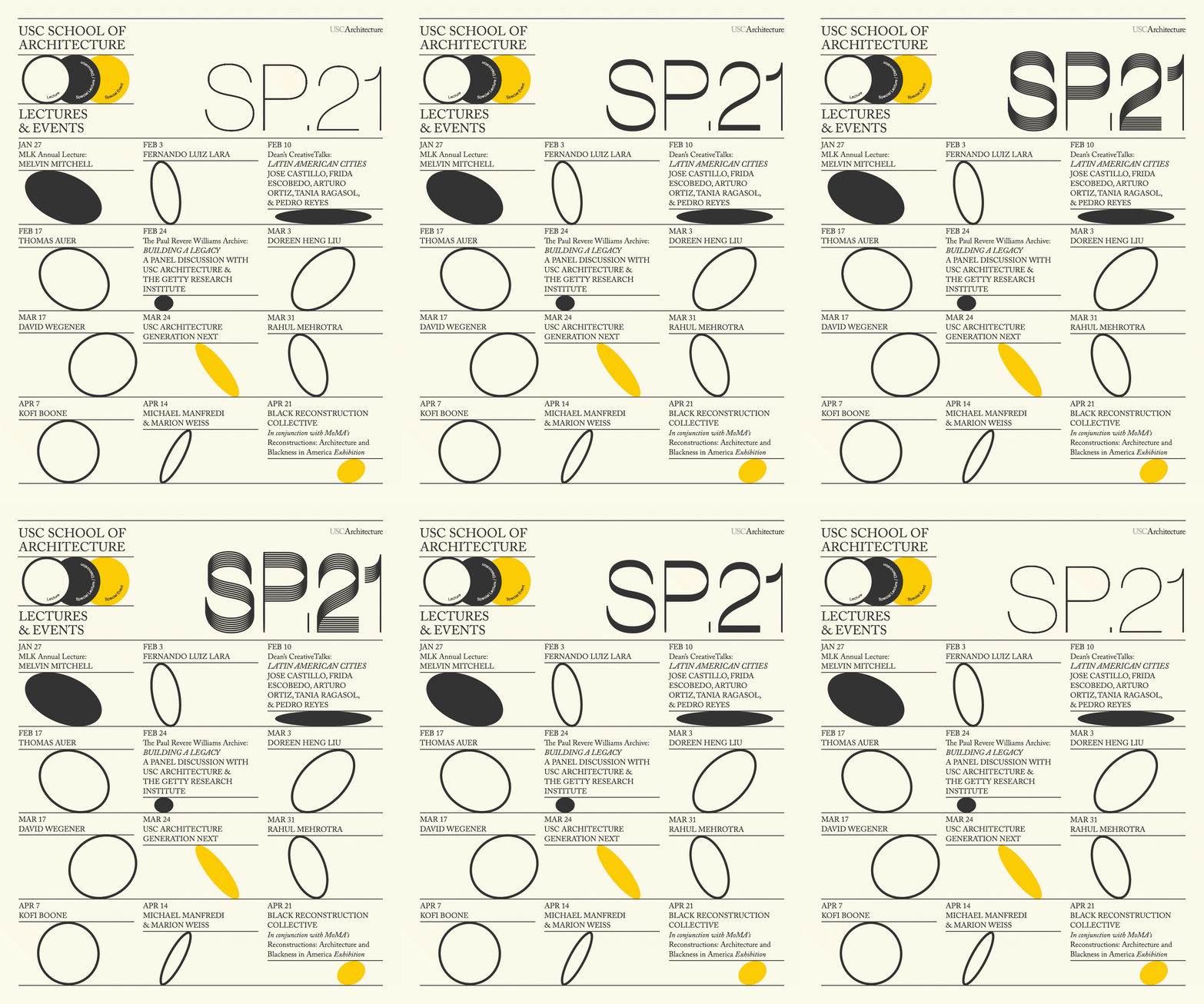
The votes are in for Archinect's latest contest of architecture school event posters featured in our ongoing Get Lectured series throughout the 2021 Spring and Fall terms.
The Boston community came out in full force to vote for their local team, the Boston Architectural College, taking first place in the people's choice popular vote. Following, with second place, is the Winter/Spring poster from the University of Toronto's John H. Daniels Faculty of Architecture, Landscape, and Design. Woodbury School of Architecture managed to claim third and fourth places with a creative offering of slick, animated poster banners.
Joining the winners were top ten poster designs from Harvard, Tulane, Carnegie Mellon (the 2020 poster contest winner), UT Austin, USC, Columbia, and Cal Poly Pomona.
Some of us here at Archinect want to share our own personal favorites.
Scroll down to the bottom of this post to see those, too...


Congratulations and thanks to everyone who participated in this year's vote!
Paul Petrunia: Harvard University's Fall '21 Poster

Seeing Harsh Patel's name tied to the Harvard GSD posters (see also his latest Spring '22 poster here) brought back some delicious nostalgia for the early days of the web. Back in the 90s, Harsh was a common name in web/graphic design circles. You don't see many of these names anymore because most of those rising stars have since taken on big roles at agencies, losing out on personal recognition for stability and collaborative work environments. Harsh's designs for the GSD posters have surely received a mix of reactions, as his graphic design work tends to predict trends, rather than respond to them. I don't doubt that there are just as many, perhaps more, people that find them hideous rather than beautiful. Put me squarely in the camp of admirers — Paul Petrunia
Katherine Guimapang: University of Toronto's Winter/Spring '21 Poster (see above in 2nd place)
While almost anyone can "put together" a visual graphic, there is a lot of thought and skill to understand foundational elements of typographic design, composition, form, balance, color, etc. My selection for this year's Get Lectured top poster was split between Carnegie Mellon's Spring '21 animated poster and the University of Toronto's Spring '21 poster. Don't get me wrong, Woodbury SoA's Spring '21 poster was another personal favorite due to the reprised work of graphic designer Robyn Baker. However, my deciding pick goes to the University of Toronto's poster designed by Chris Lee. When reviewing lecture posters, I often ask myself: "Would I want this in a printed version hanging on my wall?" While the poster's graphic language uses only two color elements and an edgy, serif typeface, the background shapes and forms make this a winner to me. Perhaps it's my preference for asymmetrical shapes arranged sporadically or that at first glance, the poster gave off hints of one of my favorite pieces by Henri Matisse, Nu Bleu IV. — Katherine Guimapang
Alexander Walter: University of Southern California's Spring '21 Poster

Standing out from the 2021 class of posters were proposals that embodied the rapidly changed landscape of lectures, and events in general, during the height of the pandemic and the continued need to shift from in-person to virtual gatherings. Likewise, designers increasingly questioned the mantra of the paper-on-a-wall format and explored concepts more suitable to the space where the promoted events were ultimately happening: the screen. Woodbury stunned with two back-to-back bangers (see above), Carnegie Mellon delivered another beautiful take on an animated video poster, but eventually, it was the Spring poster from the USC School of Architecture that won my heart with its well-balanced typography (a lecture poster that's easy to read? — the horror!), a calm, mid-century-inspired color palette, and just a hint of an animation that draws the viewer's gaze back to the poster over and over again. — Alexander Walter
If you would like to revisit all of 2021's Get Lectured posters, click here. To view the entire series and be notified about new entries, make sure to follow Archinect's Get Lectured tag.
Want to share your school's latest lecture series and be included in the 2022 series? Send your poster design and event details to connect@archinect.com.
Who should have won in your opinion? Let us know in the comment section below.
1 Comment
Boston College poster is definitely deserves the first place.
Block this user
Are you sure you want to block this user and hide all related comments throughout the site?
Archinect
This is your first comment on Archinect. Your comment will be visible once approved.