I seem to see joints -- but the way it's presented maximizes the effect of a plane of glass that's almost bigger than the building itself.
I have to say I worry about those overhead gabions in the previous structure; what could possible prevent them sagging out of plane ? They seem to be identical to the vertical ones . . .
SDR, that's a good point about the gabions, you can see some very slight bending in them in this picture:
the stone looks very flat and not too large, my guess is that they are using a heavier gauge wire mesh and the proportions of the panels are such that they are not carrying too much weight. one more construction picture, i like the pile of stones to the left:
i'm not sure if there are too many more hints i can give... let me know when it's time to move on.
phuyaka...that signage is such a let down...beautiful project nonetheless...the steel frame seems so thin to support that cantilever plus the weight of those rocks...
holz...if it is in south america, you can include the labor and it will still be comparatively inexpensive...
You've said that was a residential extension "of sorts" -- what's the nature of the project ? Are there other pics ? I like the way the shaped silhouette is so effective at "warping" the box. . .
you know, i've alway taken exception to the term "thinking outside the box"
holz.box...i really enjoy the simplicity of that little observation box...form, detailing, materials, function, the bench and the stairs...really enjoyable!
i want to take some good bread, some wine, and climb up there for lunch today...
i searched all sort of terms through google and my usually bag of tricks and came up w/ nothing...but then again, i've stopped really looking hard once i realized i was only posting modern brazilian buildings, and that gig was up...now, i just come up with ways of bumping the thread when needed, and researching all these firms i had not heard of before...
As much as I love it, I'm not buying that cantilevered table. We don't want to take our structural lessons from the likes of Mr Wright, after all. . .!
Name that Architect and Building!!!
some more images since we're on a new page:
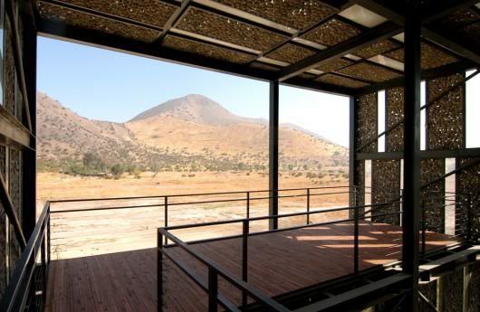
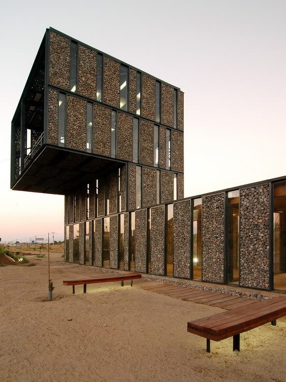
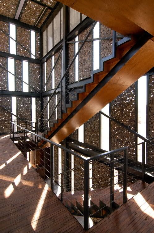
uh wow. very very nice... construction looks really simple as well, i'm guessing this wasn't too expensive (exclusive of labor)
oh, is this klotz?
good guess, but nope. firm is very young, run by 2 brothers and a classmate.
that cantilever rocks!
heyyyy-oooooooooo
?
nope nope.. like some of their projects tho...
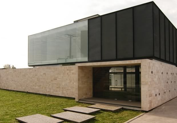
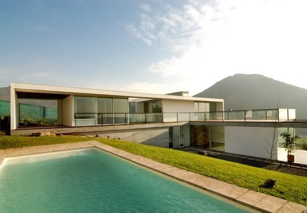
here's some other projects from the same firm:
all graduated from Universidad Central de Chile
Now THAT's a sheet of glass. . .
isn't that several panes buttglazed?
I seem to see joints -- but the way it's presented maximizes the effect of a plane of glass that's almost bigger than the building itself.
I have to say I worry about those overhead gabions in the previous structure; what could possible prevent them sagging out of plane ? They seem to be identical to the vertical ones . . .
Very nice!
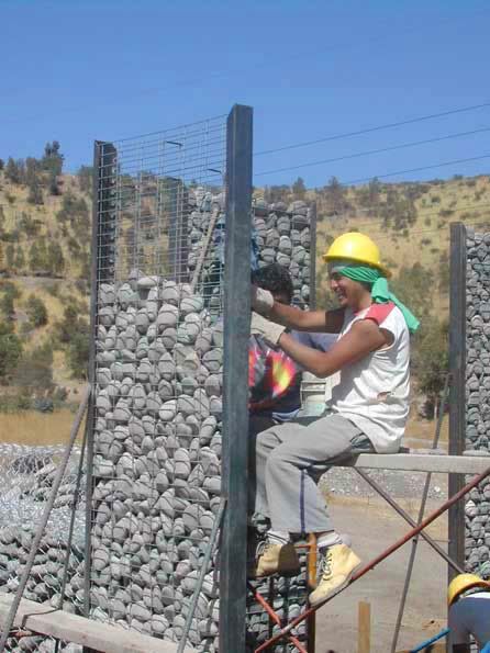
SDR, that's a good point about the gabions, you can see some very slight bending in them in this picture:
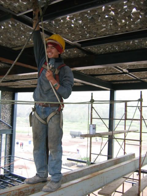
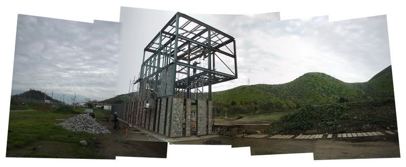
the stone looks very flat and not too large, my guess is that they are using a heavier gauge wire mesh and the proportions of the panels are such that they are not carrying too much weight. one more construction picture, i like the pile of stones to the left:
i'm not sure if there are too many more hints i can give... let me know when it's time to move on.
great work.
ok this hint should do it, was avoiding this view for the signage (which i also dislike):
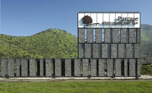
modernism just keeps on giving. . .
thanks for the extra images, phuyaka
Acceso Parque Metropolitano Sur
Polidura Talhouk Arquitectos
Pezo von Ellrichshausen v. bearth + deplazes!
phuyaka...that signage is such a let down...beautiful project nonetheless...the steel frame seems so thin to support that cantilever plus the weight of those rocks...
holz...if it is in south america, you can include the labor and it will still be comparatively inexpensive...
i meant regardless of labor, it seemed inexpensive. i am aware of the cheaper labor costs.
phuyaka, nice summary, but of course neither...
sorry, that should be to holz.box
i know. it's just what i envisioned as the aftermath of those two concrete boxes.
what's the country of origin? i'm thinking swiss... but i don't think i am right.
You've got a 50% chance of being either.
Right or wrong that is...
Its a residential extension of sorts....
regarding, phuyaka's post:
wow, that sign is for real!? i thought it was photoshopped in!
what were they thinking!?
diabase...portugal by any chance?!
yeah that sign is wretched. looks like the reception desk for a 1970's artistic tile manufacturer. just look at the other images instead.
diabase, i definitely thought it was PVE... interesting.
Maybe somebody can Photoshop in a better sign. . .?
I like the monomaterial(s) of this design; call it a (very) updated Greek temple ?
I was going to guess Austria for diabase's pic.
The architects are very well known for designing a market hall in a country well known for its watch making abilities.
miller maranta
villa garbald
Well done.
Does anyone know much about these guys?
You've said that was a residential extension "of sorts" -- what's the nature of the project ? Are there other pics ? I like the way the shaped silhouette is so effective at "warping" the box. . .
yeah, they're really good. the structural feat of the school in basel is pretty amazing (w/ juerg conzett)


also, they're hiring...
next stop
the villa garbald was originally a customs house in castegna designed by gottfried semper. now used as a conference center for the ETH.
and this is a sweet little holz.box
you know, i've alway taken exception to the term "thinking outside the box"
holz.box...i really enjoy the simplicity of that little observation box...form, detailing, materials, function, the bench and the stairs...really enjoyable!
i want to take some good bread, some wine, and climb up there for lunch today...
you should put that in the small buildings thread
i will just as soon as someone gets it....
oh, and for a hint: it's in south america...
ok, so it will be chilean or argentinan red wine up at the roof deck...
yeah, a nice miguel torres, cab perhaps.
Pinohuacho
Holz, is that you sitting on top?
haha, i wish!
ok, guys. this is a student project in chile...
i searched all sort of terms through google and my usually bag of tricks and came up w/ nothing...but then again, i've stopped really looking hard once i realized i was only posting modern brazilian buildings, and that gig was up...now, i just come up with ways of bumping the thread when needed, and researching all these firms i had not heard of before...
As much as I love it, I'm not buying that cantilevered table. We don't want to take our structural lessons from the likes of Mr Wright, after all. . .!
Block this user
Are you sure you want to block this user and hide all related comments throughout the site?
Archinect
This is your first comment on Archinect. Your comment will be visible once approved.