hey that's my work~ I wish. I find myself when I sketch to curve the tops of my roofs eliminating ridge plates. Planning departments arent usually sympathetic to them. That image is sexy though.
Its not the ***former employee of david chipperfield is it?
architechnophilia [hah - i cut and pasted it] that would be a good strategy for a high-moment continuous rafter structure, for spanning without base ties ? [pardon my layman's terminology]
I wonder if the cylindrical-section roof cap here is an off-the-shelf item ?
yes! it's AG Open Operating System. They don't have much built work, but that house has shown up in a few publications and books. the interiors are really nice but poorly documented on their site.
i agree SDR, they do seem to stand out. even though i like how minimal the fixtures are, i think it would have been more effective to provide some recessed up-lighting and wall-wash lights hidden from view, which would color the space with light rather then create spots of it.
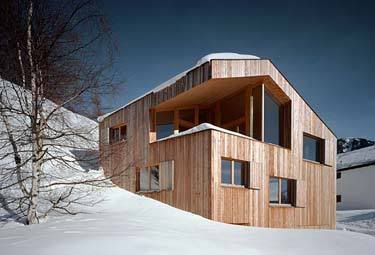
what first caught my eye with the project is how much it seems to change when viewed from multiple angles, when viewed from the west it looks stout and grounded, but from the east appears more slender and precarious on the site.
Name that Architect and Building!!!
toss up to get started again...


hmmm the curves of the roofline make me wish it fell more into the monolithic category, but it is still lovely.
any hints?
UK
- holly barn, the broads.
hey that's my work~ I wish. I find myself when I sketch to curve the tops of my roofs eliminating ridge plates. Planning departments arent usually sympathetic to them. That image is sexy though.
Its not the ***former employee of david chipperfield is it?
architechnophilia [hah - i cut and pasted it] that would be a good strategy for a high-moment continuous rafter structure, for spanning without base ties ? [pardon my layman's terminology]
I wonder if the cylindrical-section roof cap here is an off-the-shelf item ?
yeppers.
me too, atp. for the most part, anyway.
i didn't see any note about knox or bhavan working there.
both knox and bhavan came from Edward Cullinan Architects according to their bios.


next up:
Very nice!
ah frick i know this. is it AT or CH?
CH
do we peruse the same mags and websites?


 ooh, a real rainscreen! hot!
oh, more monolithic fodder
architekturbüro [lu:p]
there's a good chance. i usually nerd out every lunch break and bounce around a bunch of sites, bookmarking firms, saving images, etc.
ditto. hilarious.
Holz, I like that entry porch. Looks like someone cupping a hand to hear who is coming. I wonder to what room that horizontal window leads.
do you guys use del.icio.us?
it's a house and studio,
lower floor is studio, i would think. upper would be house.
and yeah, the entry is phenomenal.
i want to start a study of architect's signage...
i haven't signed up for delicious yet. maybe i should.
for another hint, the house above was built for a composer's family, in the alps
officially stumped
firm = in Zurich
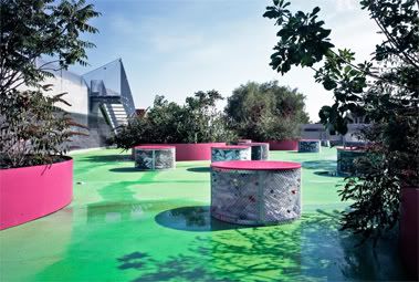
project = in Feldis
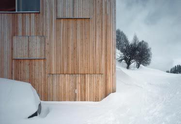
nicknamed the "wood crystal" because of the application of the same wood type on all of the surfaces of the project ('cept the glass, obv.)
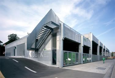
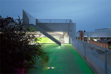
here's another project by the same firm; a recycling collection station in Winterthur:
Ferienhaus in den Alpen (Prefab)
oog ag
I think Haus Schudel is the official tilte of the project.
yes! it's AG Open Operating System. They don't have much built work, but that house has shown up in a few publications and books. the interiors are really nice but poorly documented on their site.
A good collection of photos here: Architekturbild
Next:
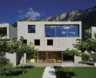
damn! good find on the photo-site. there's a lot of nice projects on there.
The only oddity in those lovely wooden interiors (love the rising "landscape" surrounding the open kitchen) is the lighting. . .
uh, patrick gartmann or a ripoff
phuyaka's alpen house, as shown in the architekturebild photos. . .
oh, wrong question. sorry.
Yes! Patrick Gartmann - House Gartmann.
i agree SDR, they do seem to stand out. even though i like how minimal the fixtures are, i think it would have been more effective to provide some recessed up-lighting and wall-wash lights hidden from view, which would color the space with light rather then create spots of it.
what first caught my eye with the project is how much it seems to change when viewed from multiple angles, when viewed from the west it looks stout and grounded, but from the east appears more slender and precarious on the site.
end critique.
the gartmann haus is very nice. and for under a million, a steal.


next:
I del.icio.us
ha ha, yeah, you're already in my network.
hint: it's a hauptschule
. . .with, like, EXTRUDED fenestration modules. How cool is that ?
yeah, a secondary school that looks better than 90% of US schools or office buildings. must be nice...
monolith redux:


peter kunz
so holz is this one at or ch? i'm thinking at.
AT. firm is pretty prolific
ah. dietrich-untertrifaller - Hauptschule Klaus-Weiler-Fraxern
si. all that wood is very nice.
i've really enjoyed the monolith tangent here...now, back to lurking this thread...
ok next up, a lot of pictures of this one because it's just that nice:
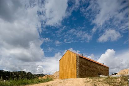
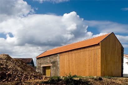
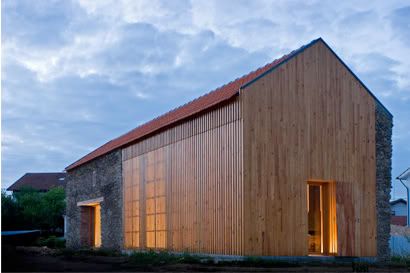

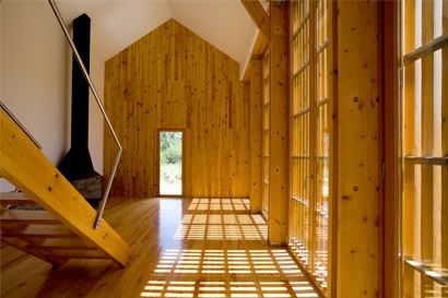
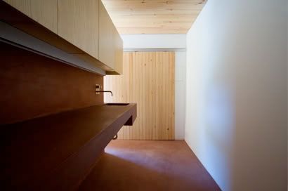
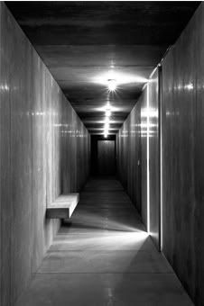
joão mendes ribeiro
and yeah, i wouldn't mind living there...
...and apparently that obvious.
yeah i think i need to move to another city.
want to switch?
post another? i've got to step out for a meeting
gladly. i'm over winter right now. i need to get out of the east.
anyone else want to choose a building?
Block this user
Are you sure you want to block this user and hide all related comments throughout the site?
Archinect
This is your first comment on Archinect. Your comment will be visible once approved.