A bench or table running along the wall, supported on a couple of 'included' brackets, wouldn't make me uncomfortable. But the leverage of that cantilever would easily begin to displace its two vertical 'counterweights' with a couple of guys sitting on the far end of it, seems to me -- or begin to push the two short blocks below it out of place at the bottom.
Maybe there are a couple of lengths of 1/2" allthread included in the vertical joints of the wall structure, with nuts and drilled plates at top and bottom. They could be tightened at any time in the future, keeping the table tightly squeezed in its 'mortice' . . .
Lovely thing, anyway. If intended to last, the roof could be given a membrane (?) and the ends glazed, some day, if desired. But it's nicer as a 'primitive hut' or cave-in-the-air, isn't it -- a meditation box penetrated by sun and breeze.
phuyaka...i am really interested in building with strong materiality and their aging process...i think is developing from my fetish for copper patina stains...regardless, looking at that building, i was very curious in how time (and in this case moisture) would affect the material (and structure) and how the architecture would adapt to it...hopefully they will keep the blog updated for 5 or 10 years...
i agree with the posts above...that the inherent simplicity of its design is served best by the simplicity of its function...
by the way, holz.box, phuyaka, ap, et al...your knowledge of contemporary architecture is very impressive...how are you all exposed to it?
I spent hours and hours in the library during school, just browsing and pulling things off the shelf.
Then I worked for abroad for a year which opened a lot of doors.
I traveled pretty extensively before, during and after.
Since, I’ve purchased a plethora of books and mags, and I peruse a lot of web blogs. I spend at least half of my lunch hour grabbing info on projects while eating.
holz... that's where i saw the above project first. after a year and a half at my current office, after hundreds of frivolous purchases and empty promises, we still haven't gotten a subscription to detail. if no one gets it after awhile fee free to call it.
$3,400? that's about how much i spent on all of my thesis test plots... i should've taken a different route...
yeah i like just about everything in this project.
ha and no worries apocalipstick, didn't refresh before i posted the other images so i didn't see your building.. interested to know what it's all about.
nope.. but good guess.. similar language through materials... it's tricky, no website that i can find for the architect... was in a few magazines tho.. around '95... arch record, detail, AV Monographs and a few others i believe.
phuyaka, whenever you want to head overseas for work, count me in.
i gotta head home as well. 9.30 on a friday. ugh, where did the day go? thank god for OT.
you can search the Detail magazine archives. it's a centre for music...
simples... the Eduardo de Miguel Arbonés project is in an older(ish) AV Monograph called "Spain Builds; 1975 - 1995" and has some amazing projects in it. I think you can still get older issues online. I haven't seen their most recent issue, but it's also a Spanish yearbook from the last year.
Name that Architect and Building!!!
sdr...i always saw it as a bench...which i guess makes it worse, right!?
maybe it's understood that it's there just for wine, bread, cheese and fruit...
still, a very ingenious but elegant box from students...
A bench or table running along the wall, supported on a couple of 'included' brackets, wouldn't make me uncomfortable. But the leverage of that cantilever would easily begin to displace its two vertical 'counterweights' with a couple of guys sitting on the far end of it, seems to me -- or begin to push the two short blocks below it out of place at the bottom.
Maybe there are a couple of lengths of 1/2" allthread included in the vertical joints of the wall structure, with nuts and drilled plates at top and bottom. They could be tightened at any time in the future, keeping the table tightly squeezed in its 'mortice' . . .
Lovely thing, anyway. If intended to last, the roof could be given a membrane (?) and the ends glazed, some day, if desired. But it's nicer as a 'primitive hut' or cave-in-the-air, isn't it -- a meditation box penetrated by sun and breeze.
I was going to guess it might be someone influenced by Jose Zanine Caladas, the Brazilian Architect. He is most commonly known as Zanine.
i'll repost this clue...
Pinohuacho
Off topic, but since I know you read this, holz, very nice. I now know why you want to work for them.


well that'll do it

Rodrigo Sheward (Escuela de Arquitectura Universidad de Talca) - Conversion of a devastated territory, i'm guessing his thesis project?
I love the winter pictures, it's aging amazingly:
and i don't speak spanish, but there are threaded rods...

if they ever glazed it, it would be awful. it is simply wonderful as is. being able to enjoy the vista in multiple positions is really nice...
here's more on it: blog
finally!
martin, there are about 15 firms in vorarlberg i'd love to work for.
I wonder how they get their commissions.
wettbewerbe
Here is also a flicker site: http://www.flickr.com/photos/rodrigosheward/show/
phuyaka...i am really interested in building with strong materiality and their aging process...i think is developing from my fetish for copper patina stains...regardless, looking at that building, i was very curious in how time (and in this case moisture) would affect the material (and structure) and how the architecture would adapt to it...hopefully they will keep the blog updated for 5 or 10 years...
i agree with the posts above...that the inherent simplicity of its design is served best by the simplicity of its function...
by the way, holz.box, phuyaka, ap, et al...your knowledge of contemporary architecture is very impressive...how are you all exposed to it?
I spent hours and hours in the library during school, just browsing and pulling things off the shelf.
Then I worked for abroad for a year which opened a lot of doors.
I traveled pretty extensively before, during and after.
Since, I’ve purchased a plethora of books and mags, and I peruse a lot of web blogs. I spend at least half of my lunch hour grabbing info on projects while eating.
yeah that basically sums it up, except i studied abroad, never had the chance to work there. hopefully soon.
Next, i think this one was widely published; rightfully so:
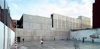
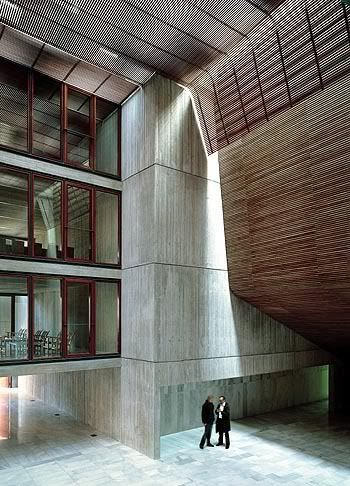
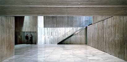
i've got that detail...
it's also got one of the more interesting schools in it...

oh, the blog shows the rodrigo pavilion in chile was constructed for US$3,400.
holz... that's where i saw the above project first. after a year and a half at my current office, after hundreds of frivolous purchases and empty promises, we still haven't gotten a subscription to detail. if no one gets it after awhile fee free to call it.
$3,400? that's about how much i spent on all of my thesis test plots... i should've taken a different route...
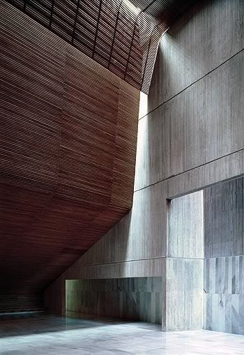
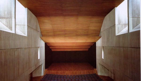
couple more images of the one in play
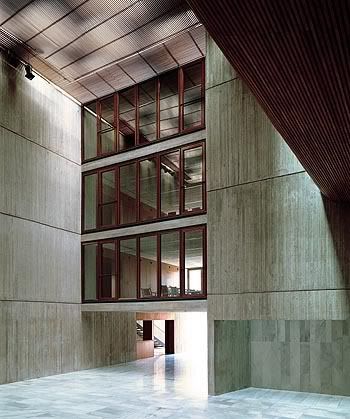
oh sorry on interfering :(
S'okay -- I can't wait to see what that turns out to be. . .
phuyaka's is pretty wild.
School in southwestern Europe (Portugal/Spain)?
it's in valencia.
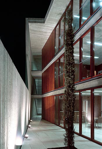
i really like the courtyard...
yeah i like just about everything in this project.
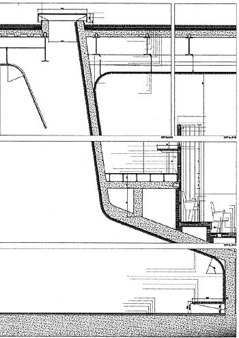
ha and no worries apocalipstick, didn't refresh before i posted the other images so i didn't see your building.. interested to know what it's all about.
and here's that detail holz was talking about:
Is it carmé piños?
nope
nope.. but good guess.. similar language through materials... it's tricky, no website that i can find for the architect... was in a few magazines tho.. around '95... arch record, detail, AV Monographs and a few others i believe.
ha! well it's 830 at the office on friday.. so holz if you want to take it i need to get out of here before i lose it.
I know I've seen the AV Monograph with it, but I can't make myself remember the architect!
phuyaka, whenever you want to head overseas for work, count me in.
i gotta head home as well. 9.30 on a friday. ugh, where did the day go? thank god for OT.
you can search the Detail magazine archives. it's a centre for music...
beautiful project:


Cultural centre in Valencia; Eduardo de Miguel Arbonés
next:
hg merz architekten
gedenkstätte sachsenhausen
zero energy, 4 story prefab timber...


wow...i was gone for the weekend, and missed some beautiful stuff!
The cultural centre in Valencia is gorgeous...there is so much fantastic work coming out of spain nowadays...beautiful warm simple architecture...
hint #1 - this project is in CH
simples... the Eduardo de Miguel Arbonés project is in an older(ish) AV Monograph called "Spain Builds; 1975 - 1995" and has some amazing projects in it. I think you can still get older issues online. I haven't seen their most recent issue, but it's also a Spanish yearbook from the last year.
holz - Passivhaus Sunny Woods - Beat Kämpfen
phuyaka...thanks for the heads up...i will put it on my list of books to get...this new wave of quiet spanish modernism is beautiful;
next up - modern addition to a very old house:
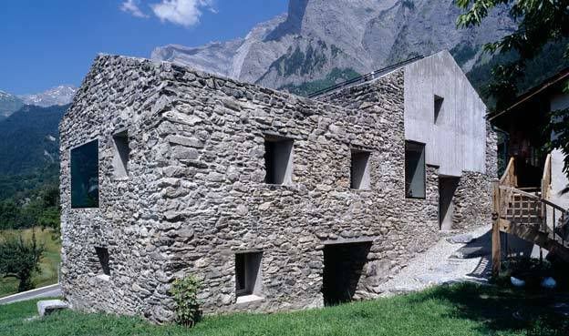
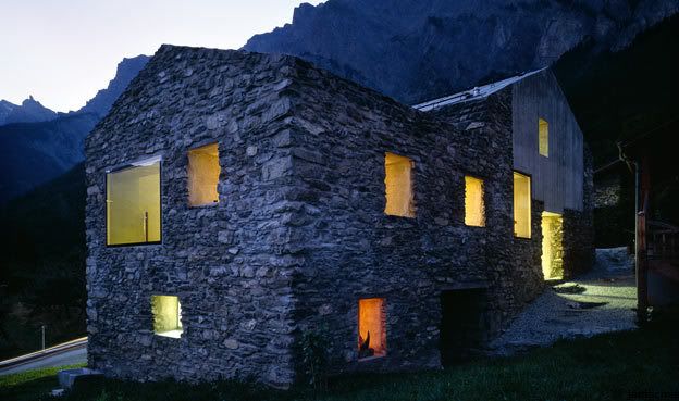
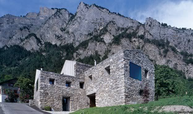
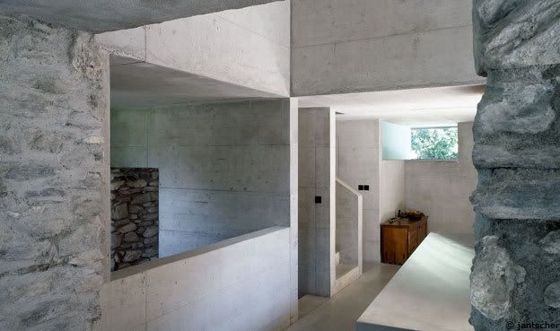
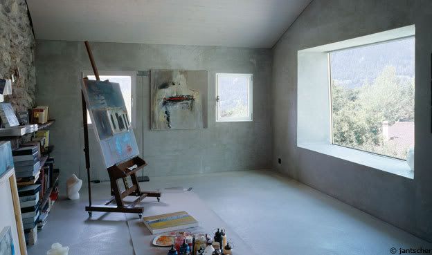
phu - i posted that project about 5 pages back...
damnit! i'm running out of stuff here. someone else feel free to take my spot
it kills me that i know i've seen this before...was it in arch review?
yeah Holz did post this a while back as part of all of the "monoliths"
its laurent savioz architecte - transformation of house in chamoson
someone else choose next.
it was in detail last year...the masonry issue. beautiful project.


i'll post a new one:
whoa!
sorry bout that. i won't post outside of my turn anymore!
new page, so here are two more of the project in play:


Block this user
Are you sure you want to block this user and hide all related comments throughout the site?
Archinect
This is your first comment on Archinect. Your comment will be visible once approved.