Welcome everyone! We hope you love the new site. It gets pretty deep, so it might take you a while to discover everything that is new. This is also just the first phase of the relaunch. We will be launching some exciting new sections, features and other fun stuff in the coming weeks/months.
I can see that we can't click on somebody's name and get their profile. I wonder if we have to enable something so we can make it public. Was nice seeing how many posts and threads someone had made like in the previous version.
Oh, but since I feel like I haven't said anything nice, I do like being able to track threads on the sidebar there. Anyway we can choose what threads are tracked?
I don't know if it's just not being used to the new version but I think that the side bar on the left is just taking up too much space. Maybe if we got rid of the whole black bard and just keep the tabs as they are. Would seem like there is a lot more screen space then.Or, move the tabs to the top and have them run horizontally.
I love how the site now is a lot more condensed and makes you focused.Everything was all over the place on the homepage before.
I kind of miss the red theme color that was spersed around here and there on the site. Grabbed more attention.
In the end, it could just be me. I can be picky :(
Biggest improvement appears to be the speed at which pages load.
The layout kinda breaks if you zoom into the page and scroll to the right.The discussions forum has lost its geeky quality, but oh well. At least there are no emoticons.
It looks good, though the main space for the forums messages is now bigger (515 px?, it was 415 or 410 in v.2) is still too small for my taste (I'm used to the usual vBulletin forums layouts); being an architecture forum it would have been nice to have at least the usual 640px wide space for images. I've tried the crtl+v... it paste text with its original format instead of plain simple text — that could be a mess (or maybe not, it will give the threads some colors and diversity...)
Posted this at TC 'cause I didn't notice this thread:
"One comment right off the bat, which is something that was also
peculiar in the previous version, is that a large thread such as TC does not show its most recent page first. Everything else on the
internet (blogs, archives, etc.) always have the most recent info first
and the other stuff is under "Older Posts", so that you click back in
time if you so want. Why make everyone go to the bottom of the page
and click to the recent page?"
Also, I guess if you don't have a hoity-toity "Professional Profile" invitation (or don't want one), it seems all incognito screen names are now frozen, since the Edit Settings has no screen name edit feature (unless I'm missing something).
I'm having some problems posting to my school blog. Well, one big problem, really - I can't see where to go to post a new entry. :/ Anyone found this already?
Thanks for the quick reply. One other thing (if it helps), I noticed the 'About The Blogs' text is still showing Loreum Ipsum text on the pop up (as opposed to the right-hand column).
I love all the depth the site seems to have. I almost feel like I'm discovering long lost crevasses of architectural goodness.
I too think the large screen names mess with the flow. Does anyone else have a vast amount of white space over yonder --->
It's kinda distracting.
All in all, It looks really great but it will indeed stake some time getting used to. Thanks again for all your hard work. Can't wait to see the rest as it unfolds.

Archinect 3.0
Just got on the new version! Really liking it.
Share your thoughts.
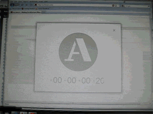
that 'a' reminds me of M*A*S*H
yahoo!
an edit feature!
Welcome everyone! We hope you love the new site. It gets pretty deep, so it might take you a while to discover everything that is new. This is also just the first phase of the relaunch. We will be launching some exciting new sections, features and other fun stuff in the coming weeks/months.
the A team!
cash money, ya'll.
Nice update ... it will take a while to grow as comfortable with this as we were with 2.0, but I like what I've seen so far.
I really like the new redesign, its a lot easier to navigate and visually see content on the page. Well done!
I gotta, say, though, the screen name bars make it harder to read the conversations as a flow - at least for me.
look at that. edit comment.
text - bold and italics are not working, no worries though..it'll get there.
congrats.
agree with sarah. the gray bar breaks up the flow of the discussion. it's too large and prominent on the page. will take some getting used to.
welcome to the new hotness
very cool :D
three cheers for the new Archinect!

italic
regular
that was a test in response to beta's comment. not sure if it matters, but i'm on PC firefox.
italics
regular
So cool. Great job! And I'm happy to see you all again.
Now I'm going to try bullets:
...It worked! And I can edit! Super awesome.
Great Work! Excited to discover the new features!
..and for constructive criticism-
1. Logo 'A' looks kinda lame & boring..any big $$$$ logo redesign competition announced soon ? ;)
2. Bold fonts are hard to read (Discussion/Job Headers) -needs more tracking/spacing.
Congrats!
I can see that we can't click on somebody's name and get their profile. I wonder if we have to enable something so we can make it public.
Was nice seeing how many posts and threads someone had made like in the previous version.
I agree with Sarah about the name bars for comments.
Diggin' it!
Well done, Archinect team.
Oh you're right, I hadn't even noticed that we all lost our post status. Dang! What's Vado going to say?
Oh, but since I feel like I haven't said anything nice, I do like being able to track threads on the sidebar there. Anyway we can choose what threads are tracked?
Loving this. Thanks for all the time and effort you've invested into making this site better.
Cheers!Great job gang! (Love the A logo too.)
I like the new A logo too.
I don't know if it's just not being used to the new version but I think that the side bar on the left is just taking up too much space. Maybe if we got rid of the whole black bard and just keep the tabs as they are. Would seem like there is a lot more screen space then.Or, move the tabs to the top and have them run horizontally.
I love how the site now is a lot more condensed and makes you focused.Everything was all over the place on the homepage before.
I kind of miss the red theme color that was spersed around here and there on the site. Grabbed more attention.
In the end, it could just be me. I can be picky :(
Looks good.
Biggest improvement appears to be the speed at which pages load.
The layout kinda breaks if you zoom into the page and scroll to the right.The discussions forum has lost its geeky quality, but oh well. At least there are no emoticons.
yeah!
Uh oh!
Emoticons...transform! :)
Hm,guess didn`t work for me. How did you do that.
i'm special

sweet!
Archinect 3.0!
It looks good, though the main space for the forums messages is now bigger (515 px?, it was 415 or 410 in v.2) is still too small for my taste (I'm used to the usual vBulletin forums layouts); being an architecture forum it would have been nice to have at least the usual 640px wide space for images.
I've tried the crtl+v... it paste text with its original format instead of plain simple text — that could be a mess (or maybe not, it will give the threads some colors and diversity...)
Test for an image larger than the forum's layout:
Nice, pics get automatically resized...
Rasa,
FRaC's secret
edit: italics button don't work...
Medit, I guess you went to ``View page source`` too then :). I had a feeling it was something else but thanks anyways!
in case you missed it:
and you can only edit your comments for a short period of time?
i miss that 'go to the bottom' button at the top of each thread
: ' (
Posted this at TC 'cause I didn't notice this thread:
"One comment right off the bat, which is something that was also peculiar in the previous version, is that a large thread such as TC does not show its most recent page first. Everything else on the internet (blogs, archives, etc.) always have the most recent info first and the other stuff is under "Older Posts", so that you click back in time if you so want. Why make everyone go to the bottom of the page and click to the recent page?"
Also, I guess if you don't have a hoity-toity "Professional Profile" invitation (or don't want one), it seems all incognito screen names are now frozen, since the Edit Settings has no screen name edit feature (unless I'm missing something).
Oh, FRaC thank you so much for that gif - I DID miss it and was so sad!
I'm having some problems posting to my school blog. Well, one big problem, really - I can't see where to go to post a new entry. :/ Anyone found this already?
Chris - indeed, this is a problem that we have totally overlooked. Paul will send an email, with instructions, to all the school bloggers shortly.
Thanks for the quick reply. One other thing (if it helps), I noticed the 'About The Blogs' text is still showing Loreum Ipsum text on the pop up (as opposed to the right-hand column).
looks great
I love all the depth the site seems to have. I almost feel like I'm discovering long lost crevasses of architectural goodness.
I too think the large screen names mess with the flow. Does anyone else have a vast amount of white space over yonder --->
It's kinda distracting.
All in all, It looks really great but it will indeed stake some time getting used to. Thanks again for all your hard work. Can't wait to see the rest as it unfolds.
All - are we still able to edit our screen names? Doesn't look to be the case so far...
is anyone else having issues posting links?
So I probably![]() should have noticed this during the beta --- but what's up with the fonts?
should have noticed this during the beta --- but what's up with the fonts?
bold text looks really bad - in Chrome, Firefox, and IE.
Am I missing some archinect font pack? is anyone else seeing this?
I love it! The new logo is nice.
The only thing I can quibble about is the "go to bottom" button being gone.
Nice job!
Block this user
Are you sure you want to block this user and hide all related comments throughout the site?
Archinect
This is your first comment on Archinect. Your comment will be visible once approved.