
The final project for the first term studio was a big one this year. In past years the semester was finished with the “Odd Couple” assignment, in which students designed a house for two people with very specific and opposing needs. This year we were given a slightly more ambitious project called “A Residence without Address,” which required us to design a 16-32 unit residential building on the same site we had used for the past two assignments.
Other than the required number of units the assignment had several other parameters. On the site, we had to observe a 12-meter setback from the adjacent buildings. Within the building, there was a required mix of unit sizes, half needed to be 55 square meters and the other half 90 square meters. We also had to fulfill basic fire regulations and the fire exits could be scissor stairs as this is legal in Vancouver.
Most people chose to design their building around the idea that they had explored in the previous landscape project. In keeping with the idea of pathways and circulation, my building focused on the pathways that tenants would use to access the building from the street all the way into their unit.
My proposal maintained the public footpaths across the site. Its structure played on the idea of these pathways by using their intersecting points as areas from which the elevators and stairwells stem. These separate, vertical pathways were then connected above by a variety of passages, which connect the units in a number of ways, allowing for a more accessible community within the building.
Optimizing the negative space between these pathways and the property lines formed the building’s units. This allowed each unit with views through to the opposite side of the building, improved natural light and air circulation, and also prevented from closing off neighbouring buildings with a solid façade. 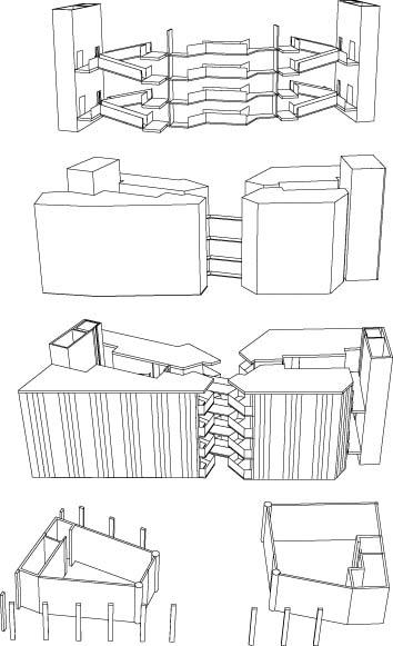
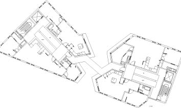
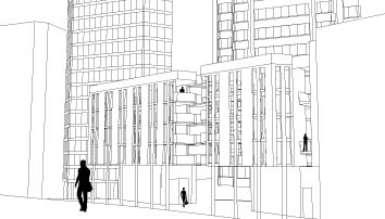
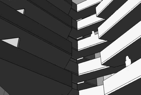

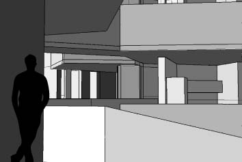
The project turned out quite well and I got a lot of positive feedback from our critics. They really liked the split in the building, they thought that the space in the middle created a centre to the awkward site, it helped to give the building a sense of community by having every unit open into the centre. They were less impressed by the façade treatment, they thought it should have been more expressive than what I had done. Here are some pictures from our final crit: 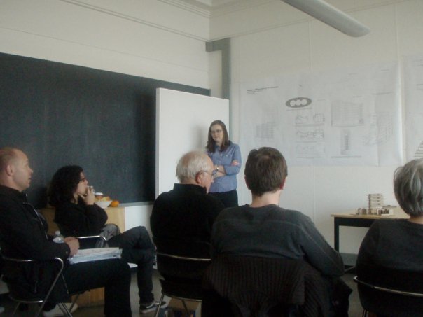


No Comments
Block this user
Are you sure you want to block this user and hide all related comments throughout the site?
Archinect
This is your first comment on Archinect. Your comment will be visible once approved.