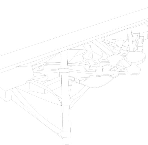
With such a thorough site analysis having been completed for our third project it was no surprise when we were immediately given the challenge to create a new intervention to replace the courtyard that currently exits on the site.
This project asked us to create a new public space between the buildings based on one of the many factors that affects it. The site is in such an interesting spot many people chose to investigate environmental factors such as light or air circulation, which are both limited and change greatly over the course of the year. Other popular investigations were of the views from within the site to the streets surrounding it and access into and through the site.
Since the site is in the interior of a city block and very rarely a destination, I chose to investigate the access through the site. I found that many residents and office workers traverse the courtyard as a short cut to the street level amenities on the opposite side of the block. I was interested in using the space as a vehicle to increase the efficiency with which they could cross to the other side. After an afternoon of loitering and watching people cut through the courtyard I found that there were about ten points of entrance from the surrounding streets. I mapped the most frequently used and the celerity of each different pathway’s user. With this information I created a matrix determining the pathways with high speed and high usage all the way to those with low speed and low usage. Each type of pathway was assigned different properties in plan and section that I thought would appeal to the user and how they were crossing, with an eye towards efficiency. For example, the most frequently used crossings whose users walked the quickest (high frequency; high speed) were assigned wider paths, with a consistent ramp that allowed them to quickly cross the sloped site. For the pathways where users walked at a leisurely pace, less often (low frequency, low speed) the pathways were more narrow, curved and stepped, so as not to interfere with the more ‘important’, highly used ones.
The result was absolutely hideous, the space became very mechanical looking, but I suppose that this embraced the idea that it is not a destination and that my intention was to move people through. 
Some of the other final results were much more attractive than mine. For example, some that investigated the minimal and ever-changing lighting in the space, created really interesting seating arrangements at different elevations. What was most interesting to me though, was how different the projects from each of the three first year studio sections became. In Oliver Neumann’s studio we were very interested in a more pragmatic, landscape intervention, focusing on how it would affect the user. George Wagner’s studio’s projects became very analytical and focused on gathering information and reinterpreting and mapping it in different ways. Finally, John Bass’s studio approached the space very structurally and abstractly bringing built forms into it.
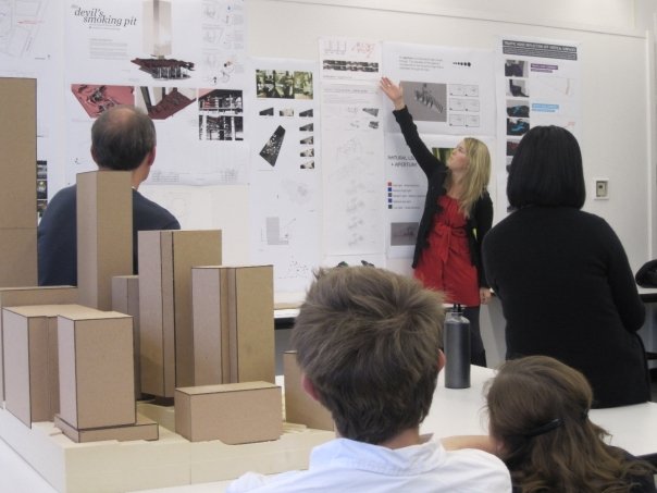
We presented the projects in an exhibition where a few students from each of the studio sections talked about their project and the direction the entire group took. Here are some photos: 


No Comments
Block this user
Are you sure you want to block this user and hide all related comments throughout the site?
Archinect
This is your first comment on Archinect. Your comment will be visible once approved.