Aug '08 - Dec '10
We had the new-student orientation on Friday, and thanks to a Facebook page for all incoming Fall 2008 Columbia architecture students I met lots of the new class all on day one.
As orientation and classes approached, members planned dinners, drinks and lunches with open invites for all. When the time eventually came for orientation, many students already knew the names and faces of lots of others.
Meeting everyone then became a hurried routine of fleshing out the details- past education, studio placement, where home used to be, how we arrived at architecture... Every few minutes, you would meet someone else and start the routine over.
I guess this is how social networking sites are supposed to work.
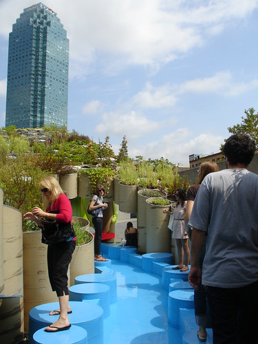
I finally got to go see Public Farm 1 at PS1 this weekend. I had heard it was a little bit of a letdown, and though I loved the idea and the overall design of the barrels, there were indeed some shortcomings.
A large part of the whole space just seemed vacant, for one. What bothered me more though were the whimsical additions of barnyard animal recordings and video, exhibited in bright colors and shapes. These two issues gave the whole work an overall feeling of rushed incompletion.
The structure that was finished I enjoyed very much though. It was basically linear when viewed from above, but from the side the shape was a wide V. Starting underneath on one end, you could pass through to the other, through the center of the V (and now above the planting barrels), then back underneath them into the smaller adjacent yard. I would have just liked to see more material, I guess, with more fluctuation between above and below.
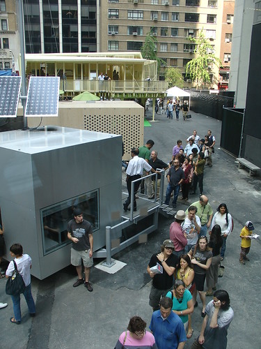
I also saw Home Delivery: Fabricating the Modern Dwelling at MoMA and was instantly impressed. As I've mentioned, homes are my primary interest at the moment, and pre-fab homes especially have interested me for a long time.
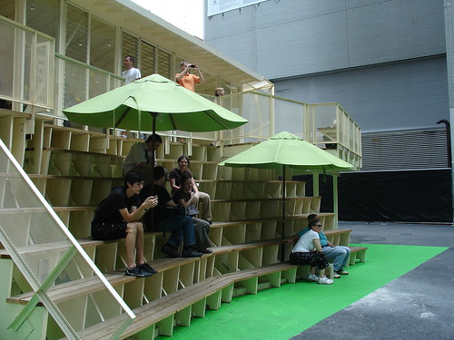
There were plenty of diagrams and models to keep me occupied for a while indoors, but outside there were five full size house models fully open to walk through, on and around.
A major element of all the houses was sustainability, but I enjoyed seeing how varied each dwelling was from all the others in terms of size and design.
My favorite was the BURST*008 house:


3 Comments
Sweet pick for a favorite at MoMA! I'm a bit biased, though... read my last blog entry about a week ago to find out why.
Your first image, of the PS1 installation, has one of my best friends and her mom in it! Apparently my friend's mom (left side, foreground) said "this is art? that's it, i'm becoming an artist! this is bullshit!" Ha ha. Nice images, and I look forward to future posts.
Amazing that there is this double coincidence in one post!
Block this user
Are you sure you want to block this user and hide all related comments throughout the site?
Archinect
This is your first comment on Archinect. Your comment will be visible once approved.