Aug '08 - Dec '10
On wednesday Brad Cloepfil of Allied Works Architecture lectured about a number of his works and notions of occupation.
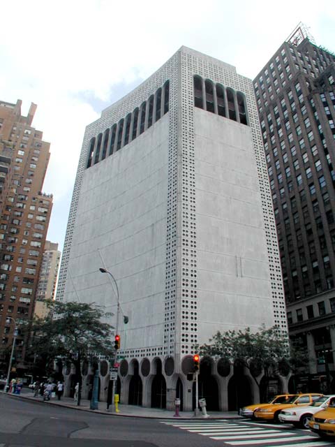
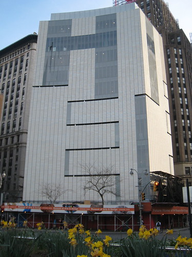
If you're keeping score, AWA controversially redesigned the Museum of Arts and Design here in New York City, at 2 Columbus Circle in Manhattan.
To make a long story short, the building before the redesign, designed by Edward Durrell Stone, was long considered ugly in its blocky, massive concrete form, from the day it was unveiled in 1964.
Over time the city and critics became (understandably) fond of the little building, but ultimately failed at keeping the Museum of Arts and Design from having it redesigned inside and out.
The new design is considered equally ugly by most viewers- just as blocky, cold and crude as the previous. However, I'm not here to discuss that issue.
The very first question asked of Cloepfil concerned the latest and most controversial change to the facade. After the design was finalized, and after almost all of the construction completed, a horizontal band of windows was added between two vertical bands of windows, effectively making the building spell out "HI" when viewed from the street (some have said it spells "HE" when read downward).
To critics this was a fitting last shot, however spiteful.
To Cloepfil though it was something more. The band was added at the insistence of a major Museum donor, and thought AWA tried to rework it a number of different ways to not spell HI, in the end, without the architects' assent, the Museum had it built anyway. Cloepfil stated he has never felt more violated in any way.
I never believed that a building must remain exactly as it was designed for its whole life. There are many users in a building, and their own changes, large or small, always add a richer history to the structure, even if radical.
In this case though, and maybe it was Cloepfils delivery, I actually felt sincere dismay at the horizontal addition. The building is yet to be opened to the public, and the final design has not and will not be realized for even a single second.
Maybe because I worked in museums for a number of years my aggravation is heightened. Make no mistakes, museums are businesses, at least in the United States. I understand they must perpetually seek funding, but in the process, when bowing to the whims of major donors, as in this case, they continue to uphold old social and class divisions that they've always been accused of perpetrating and are working so hard to change now.
It's a disheartening phenomenon.
I found the whole lecture to be clear and straightforward, and I thoroughly enjoyed his tone. When asked why he primarily designs in grids, he answered that he not only instantly gravitates towards this basic form, but he believes the grid, absent in nature, doesn't hide the fact that what you're looking at is a building.
I kept thinking of this when I went to the Whitney Museum of American Art yesterday to see the Buckminster Fuller show. No grids there, though, as Fuller said in an early video, we do not live in a "sugar cube world."
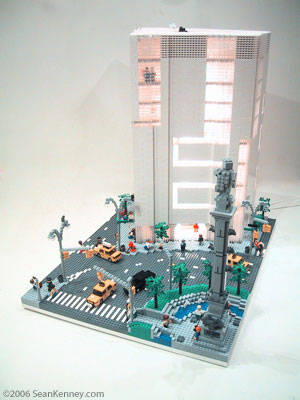
Oh, here's the new MAD design as AWA wanted it, in case you're curious.


4 Comments
Much nicer...
legos!
Great write-up, Greg. I haven't been following the project closely, but I did not realize that the Hi windows were added w/o Cloepfil's involvement. That's appalling.
Cloepfil's building is really sucky with or without the HI up top. I hate walking past it, which I have to do frequently. I didn't think Edward Durrell Stone's design was ugly...I liked it. Too bad. This is not an improvement.
Block this user
Are you sure you want to block this user and hide all related comments throughout the site?
Archinect
This is your first comment on Archinect. Your comment will be visible once approved.