
Aug '05 - Jan '11
Last Winter we had the "Comprehensive Studio" with John McMorrough and Mike Cadwell. The project was a housing block in downtown Columbus. Each team of two had a "theme" that was to be explored in the project.
My partner Zhishan Wang and I were assigned Deep Green. This of course meant exploring ecologically sound principles. Our professors were hoping to use calculation and maximization as a driving principle for design decisions, so in many ways we were doing a systems project on acid. It was difficult to decide whether to allow the green systems to overtake the project or whether to "conceal and reveal"... 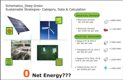

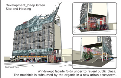
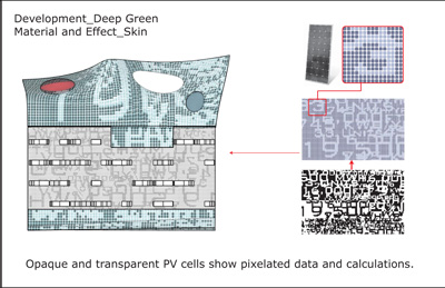
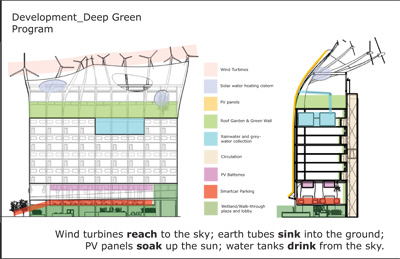

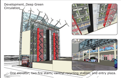
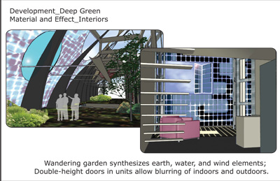
As you can see, we maximized the biological and technological aspects of the projects in creating our "Urban Power Plant." The idea was to make reference to post-industrial reclamation efforts at the same time as contributing to the contemporary discourse of skin as force-receptor, skin and structure as power-generators; space of the ground and space of the roof as both public and private, technical and natural; etc.
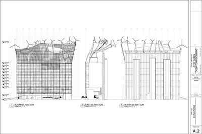
All of our classes (studio, structures, systems, theory) were integrated with this project, which was orchestrated beautifully by our professors. Reviews were juried by a panel of architects and professionals in relevant fields, including systems and structures. We did a full set of schematic drawings and a series of diagrams for the project. 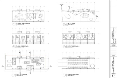


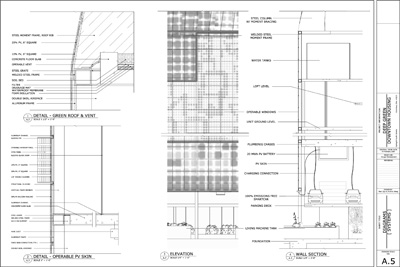
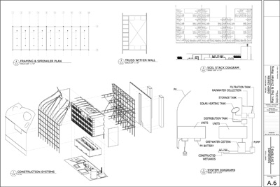

Scogin & Elam were on our review. Scogin wished it could have been more understated, while Elam was the one who dubbed it the "Urban Power Plant." It was quite an interesting discussion, though if I did it all again I would have taken the project in a completely different direction. Sometimes that happens... either way, it was a fantastic learning experience.


7 Comments
I am very impressed by your project, and it seems much like a contradiction seeming like a building that should be there for environmental reasons, yet that shouldn't for more social ones.
The level of detail in the plans and diagramms is great.
Very thoughtful, and data-driven, or so it seems.
nice to see some green poetry.
What a cool project, really well presented, too.
John McMorrough's great, he was at Yale the first year I was there, and although I never had him as a critic, he was razor sharp on reviews. I've got a ton of respect for that guy.
He once called me out for improper use of the term 'supergraphics', looks like that's still an area of interest for him, given that pixelated data-display facade.
Did you analyze the avg wind speeds for your site? I ask because I'm curious about wind speeds in urban areas and the applicability for wind power-- it seems like a no go in most cases, not enough to justify itself. Since your whole building-- formally and conceptually-- hinges on it, I'm guessing either you have some good info or a realistic analysis wasn't part of the studio scope
randscraper>
Yes, we did do an analysis of average wind speeds... I don't have the numbers in front of me, but our energy calculations were based on wind data specific to the site. Granted, the wind power is not enough to power the whole building, but it is just one component of the energy solution.
The swoop in the facade not only generates an aerofoil effect for the turbines but also tilts the PV panels to a more efficient orientation, which is about 15 degrees upward for southern exposure (don't quote me on that exact figure). So the formal gesture has double utility and isn't predicated entirely on wind power efficiency.
sevensixfive>
John is indeed still interested in "supergraphics", as he gave a lecture at the Columbus Art Museum to that effect, but the facade was actually developed by us independently... we were looking at a lot of Herzog & de Meuron, which should be obvious.
architechnophila>
You say: "...it seems much like a contradiction seeming like a building that should be there for environmental reasons, yet that shouldn't for more social ones."
Can you elaborate? I'm not sure I understand what you mean. Are you making reference to the deleterious nature of "loft condo" development in "urban renewal" schemes?
take it or leave it i think it looks a lot better now than i thought it did at the time of our review....
i'm looking forward to the new renderings of this... but if i were you i would focus on the garden space under the roof canopy, on the parking level and the ground floor pseudo-plaza, as the apartment interiors don't seem especially compelling.
and don't forget the "Pompidou-at-Dusk" rendering!
Block this user
Are you sure you want to block this user and hide all related comments throughout the site?
Archinect
This is your first comment on Archinect. Your comment will be visible once approved.