
Aug '05 - Jan '11
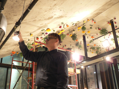
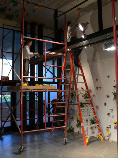
SO it's been a long time. Just finished midterms, which went smoothly. My gallery assistant position kicked off in a big way with a Ken Smith (landscape architect who did MoMA rooftop garden) installation that was nothing short of back-breaking. In an attempt to convey ordered randomness, Ken had us chalk line a 12" x 12" grid on all surfaces of the gallery, including the 16' ceilings. Then a "random" process was used to 9 different kinds of flowers in a sequence at one of 9 positions of each square. I was wrecked after this installation, after putting about 40 hours of climbing, reaching, taping, scaffolding, and braindeadizing into it in about 6 days. The results might be fascinating, but I wouldn't know. Given the pain it inflicted on me, I'm not capable of stepping back to appreciate it objectively... err...
The good news is that I don't have another installation to do until next quarter. In other news, we've been doing a series of large scale drawings in construction class. The first one was 12' x 24', a wall section at 1:1 scale. The drawing below was not our team's, so I claim no responsibility for the errors in the representation of the foundation. But you get the idea.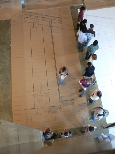
Peter Eisenman was here this weekend for the grand reopening of the Wexner Center and he gave a talk on Tuesday. It was packed. The talk was divided into 3 parts:
I. Backpatting
Here the director of the Wexner Center winks and cloys at Eisenman while he pulls out a special gift in commemoration of the reopening. "Oh, Peter, you shouldn't have..." "But will they understand what this is?" Yada, yada, yada.
II. Talk Titled "Architecture Against Itself"
Here Eisenman gives us a dry run of a speech he's preparing for some other occasion, which he does not name, but which is surely more important than this one. In any case, it was an interesting talk. The main thrust was that architecture should deny the gratification of expectations. He spent much of the time railing against the modern-day attention span and showed his fogeyism by using "Ghostbusters 8" and "Return of Alien Invaders 2" as hyperboles that were supposed to illustrate the publics willingness to consume "easy" fare. Great point but how dated.
More interesting were his analyses of Bresson's film "Pickpocket," in which the camera lingers on closed doors and takes long gazes at scenes of daily life and the intangible symbolism that it carries. His commentary on the iPod phenomenon was rudimentary, a ploy to pigeonhole technology as a harbinger of passivity.
He made a good point that the proliferation of technologies such as iPods and cellphones has brought private activities into the public sphere and create a sort of forced spectacle out of everyday life, but his dismissal of the nuances of said technologies and their social implications was less than impressive.
Meanwhile, he seemed to be claiming that, in architecture, we are moving from a Mechanical Age, in which structural achievements are fetishized and elaborated in meaningless ornament, to an Electronic Age, in which structure is subsumed into the form. He moved on from this point to show a huge cultural arts center project his firm is building in Santiago della Compostella, noting that he does not always practice what he preaches in architecture.
III. Santiago della Compostella
The complex is 6 buildings that are based on an overlay of 4 grid systems -- a medeival town plan native to the area, the cartesian grid, some other grid, and yet some other "lateral vectors" grid that was quickly glossed over. The form of the complex is essentially cracked earth -- as if a huge, dry patch of earth heaved and split, leaving just narrow fissures between the forms.
The slideshow was a bit tiresome as even Eisenman seemed to be getting bored of it. Too many construction slides.
Then came the question and answer. I asked the first question, which was basically, "Can you explain the lateral vectors -- what they represent and how were they generated?" Eisenman's response was something along the lines of... "That's a great question... it's excellent that you want to know about that. What would you say if I said... I don't know?"
He then, after letting the crowd laugh it off, wove a yarn about druid energy forces and the founding of Santiago, concluding that he hoped he had deflected the question enough to escape unharmed.
I, of course, had not just a little twinge of satisfaction from "stumping" the master, but really it was quite interesting to get this response. It means to me that either the kind of BS that we throw around in studio is happening even in the biggest firms in the world, or that Eisenman has a crack team of interns (or whatnot) working out incredibly rigorous schemes of theoretical manifestations that Eisenman doesn't quite understand. I'm guessing the latter because, in his own words, he said that he doesn't really understand computers that well. No kidding! His earlier comments on technology became clearer at this point.
Now you might sense that I was not particularly impressed with the apparent rigor of Eisenman's theory. Do I respect his work? Absolutely. I know very little of the history of theory at this point and recognize that he has been a central figure in many architectural debates of his time. But has his time come and gone? Please give me insight into this matter, as I can't base my opinion on this one lecture alone.
Finally, I'll leave you with some drawings of a my studio model that was very well received in review today. It is a house for a bibliophile. I chose to use structural ribs that are reminiscent of stacks, using platonic volumes to carve out the space. 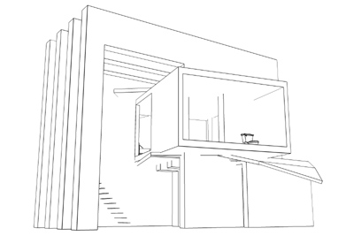
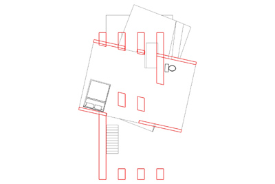

There is a contrast between solidity on transparency on opposite longitudinal sides. The enclosed, solid volume of a book (can also be seen as a television screen or data channel connected to the outside world) creates the private space and the implied, intangible (unbounded) volume of knowledge is careved out of the ribs to create the book tower in the back.


2 Comments
Marc, very interesting. Peter's a character, no? You were the one who told the story about Peter calling Jay Chatterjee on the phone while you were getting a tour right?
Also, your little house there looks great. I did something similar with ribs and carved out space once and I found the resultant forms fascinating. Do you have an actual model of that? Can you post pics?
WonderK> Yep, that was me with the Chatterjee story. I have to say that despite his curmudgeonism, I was suprised at Eisenman's sense of humor. Though most of it concerned the irony of his being able to get away with anything (leaky buildings, not knowing his own projects, etc)... I've heard that he has pretty much said, in as many words, that for a few years there he was actually writing theory so dense that didn't make much sense, but that he realized he was in a position to get away with it. Anyway...
I do have a model of that house but it was a quickie study model out of foamcore that is a bit lopsided... I'll post the final model after I present it next Monday.
Marc
Block this user
Are you sure you want to block this user and hide all related comments throughout the site?
Archinect
This is your first comment on Archinect. Your comment will be visible once approved.