
Jan '05 - Feb '07
previously: part 1/3
Unlike Friday's lunch, Saturday morning's continental breakfast did the trick. A couple bowls of fruit, a muffin, and no less than 4 cups of coffee were quickly consumed alongside some pleasant conversation with a new acquaintance (Josh, a fellow UF alumnus). Josh finished his M.Arch some years ago, and still lives and practices in Gainesville, FL - a city of about 120,000 people...
The day's agenda began with two closely related sessions on the LEED Certification process:
1
The first 1 hour presentation focused on the general nature of the LEED rating system, how it has progressed since its' inception, and what we should expect from the program in the future. Evidently LEED 3.0, due out next year, will include refinements that take regional differences into consideration. Not only will variations in climate be addressed by the updated version, but a system that takes "Dynamic Governence" into account will also be place. 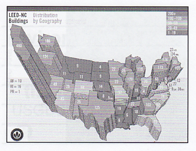
As this graph from the slideshow indicates, California is LEEDing the way...this is due in part to government incentives for energy efficient buildings.
2
The second presentation, given by Michael Carlson of Carlson Studio, was an examination of a LEED Gold Certified project completed in 2003. This project, the Twin Lakes Park Office Complex in Sarasota, FL, represented Carlson's first attempt at achieving LEED Certification.

Carlson used the project to demonstrate the numerous steps that must be taken to attain recognition from the LEED rating system. As he would illustrate, documentation is the key. By his estimation, the necessary record-keeping adds anywhere from $1.00 - 1.50 per sqft. to the project. This accounts not only for time spent by the architect, but also by the contractor, who must, among other things, take photographs to confirm that duct openings are sealed during construction and that ceiling tiles are stored in a controlled environment prior to installation.
...
3
The next session was a panel discussion which focused on an energy efficient building for a public radio station, WMNF in Tampa. This segment built upon the previous 2 sessions (outlined above). The audience's increasingly knowledgable questions were testament to the growing understanding of the issues at hand.
The panel was comprised of:
the client (station manager Vicki Santa, a charismatic woman that spoke very highly of the year-old building),
the architect (Larry Maxwell of Spacecoast Architects), and
a contractor (Travis Parker of Biltmore Construction, a company that has experience with LEED projects).
Michael Carlson (of session #2, above) acted as moderator.
In short, Maxwell designed an environmentally intelligent building for WMNF that only cost $125 per sqft. Although Maxwell is a LEED AP, he had some critical words for the rating system (the WMNF project did not go after certification). He did speek favorably of performance-based measures, such as those put forward by Ed Mazria & the 2030 Challange, which calls for all buildings to be carbon neutral by 2030 (Mazria's open letter also sets a series of shorter-term goals). I've never seen one of Mazria's presentations, but after hearing Maxwell's message, conveyed with knowledge and passion, I can imagine what one would sound like. 
sorry...this is the only 'image' of the project that I could find...if you look carefully at the exterior picture, you will notice that the punched openings are angled down and pushed in. This move reduces solar gain and improves the quality of the natural light entering the space, allowing it to bounce off the sill, onto the pitched ceiling, and finally down onto the work surfaces (these windows are in the station's library).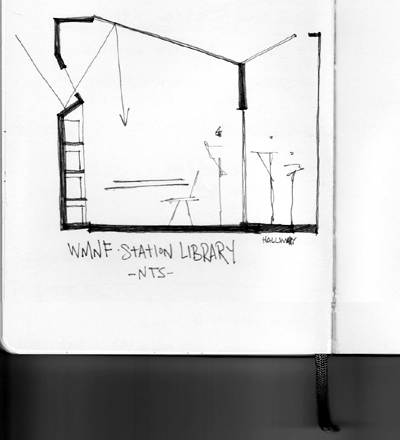 visual note-taking...my quick attempt at the inflected window
...
4
juggling elephants
keynote speaker #2, Jones Loflin, co-author of a self-help book.
...entertaining, no doubt, but...
...
5
Props to the organizers for ending with a bang...as architphil mentioned previously, the conference included a design competition. Here's some context [via]:
Design Problem Summary
Program: Urban Infill Housing (Multi-Family)
Objective: To create an innovative design for a mid-block urban infill lot
Type: Single phase open design problem
Architectural Jury:
David Lewis, Principal, Lewis.Tsurumaki.Lewis Architects
(Director of M.Arch program at Parsons The New School for Design)
Michael Bell, Principal, Michael Bell Architects
(Associate Professor at Columbia University)
Stella Betts, Principal, Leven Betts Studio
(Adjunct Professor at Parsons The New School for Design)
Panelist: Tim Clemmons, Principal, clemmonsArchitecture
Clemmons, an architect practicing in St. Petersburg, explores each project's potential to promote community. He has realized a number of housing units in St. Petersburg, including at least one in the vicinity of the competition's site. His firm is acting as associate architect on a local condominium project designed by Perkins + Will.
Panelist: John Hixenbaugh, AICP - Zoning Official, City of St. Petersburg
Hixenbaugh, a city planner, negotiates a broad set of community concerns in his role as a zoning official. A google search of his name quickly demonstrates this fact. On one hand, he appeases a small group of citizens pissed off about an unsightly tire store, and on the other, attempts to discourages retail giant Wal-Mart from setting up shop in St. Pete...
*please excuse the journalistic license...I really don't know what I'm talking about.
Panel Moderator: David Risinger, The Audubon Partnership
Risinger, a landscape architect by education, collaborates in a partnership that "leverages the creativity, skills and experience of three seasoned professionals to help communities, organizations and individuals develop sustainability practices to achieve their own goals."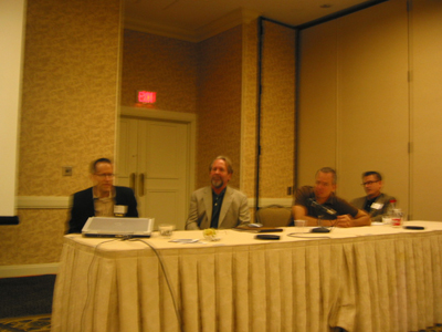 Attainable Housing Panel: from left to right, David Lewis (juror, jury representative), David Risinger (panel moderator), Tim Clemmons (panel), John Hixenbaugh (panel). The Jury was held previous to the conference. Only Lewis was in attendance.
The final session began with each member of the panel outlining a specific series of considerations that exist within the what was continually referred to as the attainable housing problem. Numerous aspects, from the exciting notion of a public land trust to the commonplace concerns regarding appropriate density and architectural character, were brought up, bounced around, and left to linger in the mind's of the captivated audience. Each panelist spoke from their area of expertise, setting up a strong base from which to view the design proposals (of which there were four).
The entries were judged according to 5 criteria
(from memory and rough notes, perhaps not perfectly accurate):
1. Context/Contextual Response
2. Material Invention (attainable and sustainable)
3. Build-ability
4. Program (usability)
5. Transportation considerations
Of the 4 entries,
one included 6 units, 2-3 stories tall.*
one included 8 units, 3 stories tall.*
one included 3 units, 2 stories tall.*
one was 11+ stories tall and included a whole bunch of units.**
*typical construction materials
**shipping containers
...And the winner is..........The Humpback House, by architphil!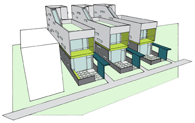
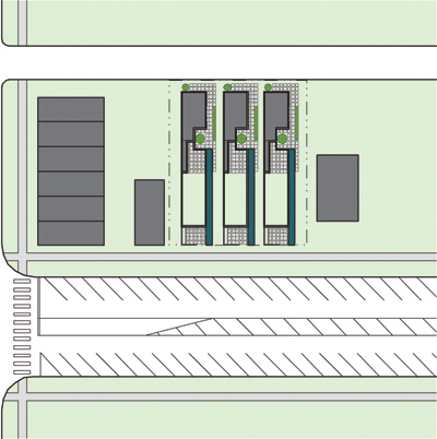
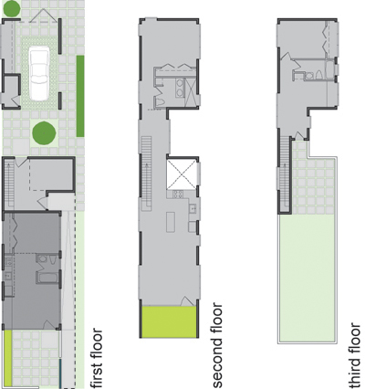

The jury (and members of the panel) commended this entry for maintaining a scale appropriate to the neighborhood while not sacrificing density (2-3 stories, considerate of the allowable FAR for the site, 6 units). Also, the smaller 'live/work unit' opens up numerous possibilities for occupation (studio apartment, work space for the larger living unit, potential for multi-generation family). One criticism was that there was no graphic evidence of the initial (pre form-making) analysis. How do you address the givens? When asked, architphil was able to demonstrate an understanding of the site's codified reality, but the jurors wanted diagrams! Don't we all...
This was the case for all of the entries. They wanted to see the set-up.
Thank you to all the participants. Your efforts greatly added to the quality of the conference.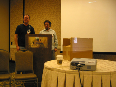 architphil (on the right) being awarded a full set of ARE studyguides (in the carboard box on the table). Congratulations, Phil...now email me your other rendering so I can add it to the blog!
*disclaimer: I apologize for any factual inaccuracy. Some of what is written above relies a bit too heavily on my poor short-term memory.
So, that pretty much sums up the conference's 16 hours of focused program activity. Just after 5pm...I looked down at my agenda to see what I was supposed to do next...
"Dining by Design" (Optional Event)
Translation: happy hour at Cafe Alma, + hearty finger food off to the side (meatballs, small crabcakes, stuffed mushrooms)...
Of the 100+ people in attendance, just over a dozen showed up to happy hour. After an hour eight or so of us sat down for some real dinner. Two restaurants and three hours later I returned to my hotel room full of dinner, desert and alcohol.
11 Comments
great reporting again! i don't see any "factual inaccuracies"... i find it really interesting that a lot of people skipped elephant man... and to think that some of the steering committee wanted him as the main keynote speaker and no david lewis... shudder... that being said, the people that did attend said that he was actually pretty good, or at least better than they were expecting... meanwhile i was next door fighting with a computer that kept crashing while i was trying to piece together all of the powerpoint presentations for the design competition panel...
also, i've been working on a couple fancy diagrams to illustrate some of the concepts that i talked about verbally/textually... with only about 2 weeks for the competition there wasn't much time to produce both the project and the background for the ideas in the project... at least not in a pretty/presentable form...
here is an image from each of the other 3 competition entries...
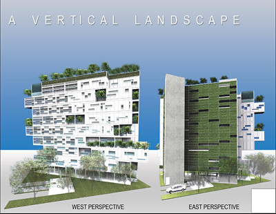
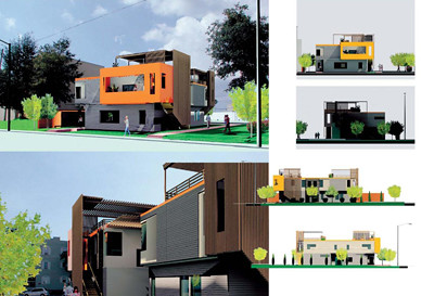
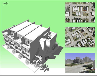
the tall one built with shipping containers
the three unit one that highlights separate entries for each unit
the 8 unit one which is probably the best density for the site
sweet.
nice report AP, thanks.
congratulations to architphil.
the 'vertical landscape' project uses shipping containers? As in the steel crates that are put on flat beds and cargo ships?
I would say you've done some rather kick butt reporting AP. As they say 'if architecture dosen't work out' maybe you have a career in journalism. Ha! Kidding of course. And I know you know that because you know me but the rest of the world here dosen't know me and I don't need 20 flame mails about how harsh I am when its really just a disease called sarcasm and the only cure is more cow bell.
architphil. i was at the conference and the session on affordable housing was great but the competition entries gave the discussion a ton of life. I really liked the flexibility of your design having the live/work studio and the occupiable roof.
As far as the elephant guy goes. I was there for the whole thing and while it was a good presentation I was just a little suprised because I wasn't expecting it. For the steering committee: I would rather have one David Lewis than 20 elephant guys.
24out1in: yes. :/
i think the best 'if architecture doesn't work out' statement of all time was Prof. Sanders telling Stella (a very talented classmate of ours who had a propensity for modeling with colorful wax), "if architecture doesn't work out, you would be a great candle maker."
Great recap of the weekend and the seminars. I am curious - did anyone attend the Accessibility Session (it ran opposite the LEED / USGBC track)? I heard it was entertaining, but I didn't hear much else.....
I attended the Accessibility Session. It was very entertaining. Most of the information should be common knowledge after a year or so of work in an office but there were some good reminders and guidelines on what to do to be on the safe side when sizing rooms where turnarounds are tight and to make sure things get acctually get built in accordance with ADA. For example not specifying the fixture height be mounted on the outer limits of what is allowable and code interpretation. There were some great DOH! moments from audience members who asked questions. Some drawings were going to need changing uppon return to the office.
Many pictures were shown of non-compliant attempted solutions that were really rediculous. Most regarding wheelchair ramps.
Block this user
Are you sure you want to block this user and hide all related comments throughout the site?
Archinect
This is your first comment on Archinect. Your comment will be visible once approved.