
Jan '05 - Feb '07
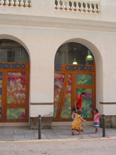 on our first visit to the market we arrived too late to get inside...so, a couple days later we returned, this time in the morning.
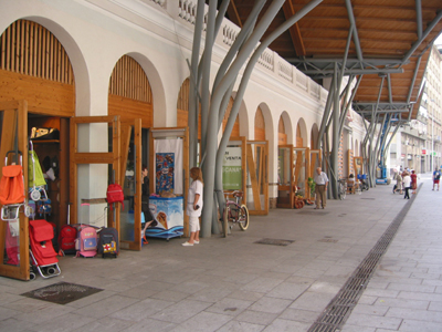
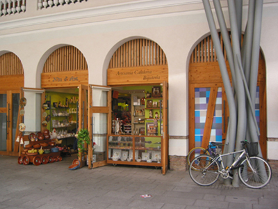 the colorful roof pattern is echoed everywhere - in the goods being sold, in people's clothing, on the signage. At first glance the bold roof can be shocking, but the longer you sit there and watch the activity beneath it, the more you realize that it is a thoughtful complement to the city, the site and the specific program.
 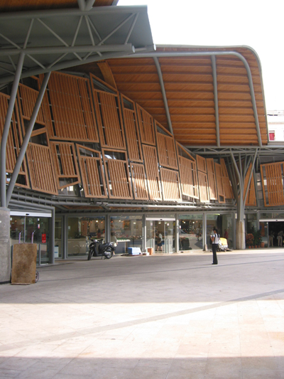 around back, between the market and the attached housing (to the right, outside of the image frame). The residential portion of the project (also by EMBT) is for senior citizens. Although the housing is adjacent to the public spaces of the market, it also has its own smaller, private courtyard.
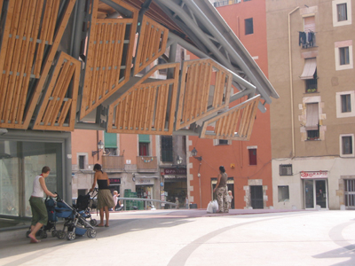
 headed inside...
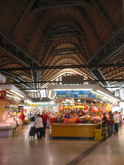
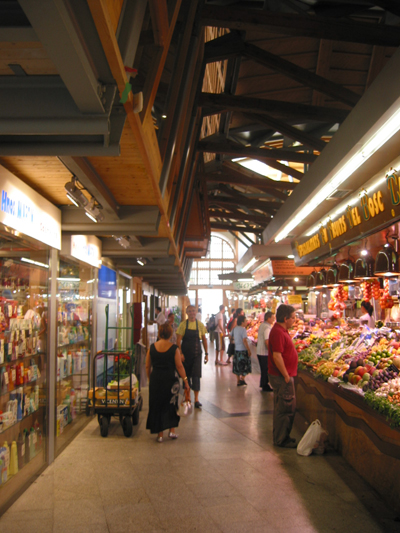
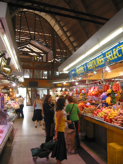 below the roof, within the walls. While the bold roof energizes the building's exterior, it gives the inside an entirely different character. The arching overhead plane is secondary to the experience of the space inside. The deep shadow it creates is calming. The focus is on the fruit stand, the butcher's case and people - shoppers and merchants. These things define the scale of the experience.
 an earlier scheme shows the roof extending further than it does in the realized version.
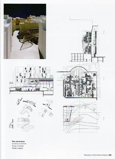 source for 3 scans above: EMBT Arquitectes, Paco Asensio, ed. 2003 teNeues Publishing Group
3 Comments
nice pics thanks a-ron
thanks buddy...
I love that beam that juts out in the rear of the market. Still remember trying to get the perspective right when I was sketching that thing.
Block this user
Are you sure you want to block this user and hide all related comments throughout the site?
Archinect
This is your first comment on Archinect. Your comment will be visible once approved.